Content from Introduction to RNA-seq
Last updated on 2025-11-13 | Edit this page
Estimated time 100 minutes
Overview
Questions
- What are the different choices to consider when planning an RNA-seq experiment?
- How does one process the raw fastq files to generate a table with read counts per gene and sample?
- Where does one find information about annotated genes for a given organism?
- What are the typical steps in an RNA-seq analysis?
Objectives
- Explain what RNA-seq is.
- Describe some of the most common design choices that have to be made before running an RNA-seq experiment.
- Provide an overview of the procedure to go from the raw data to the read count matrix that will be used for downstream analysis.
- Show some common types of results and visualizations generated in RNA-seq analyses.
What are we measuring in an RNA-seq experiment?
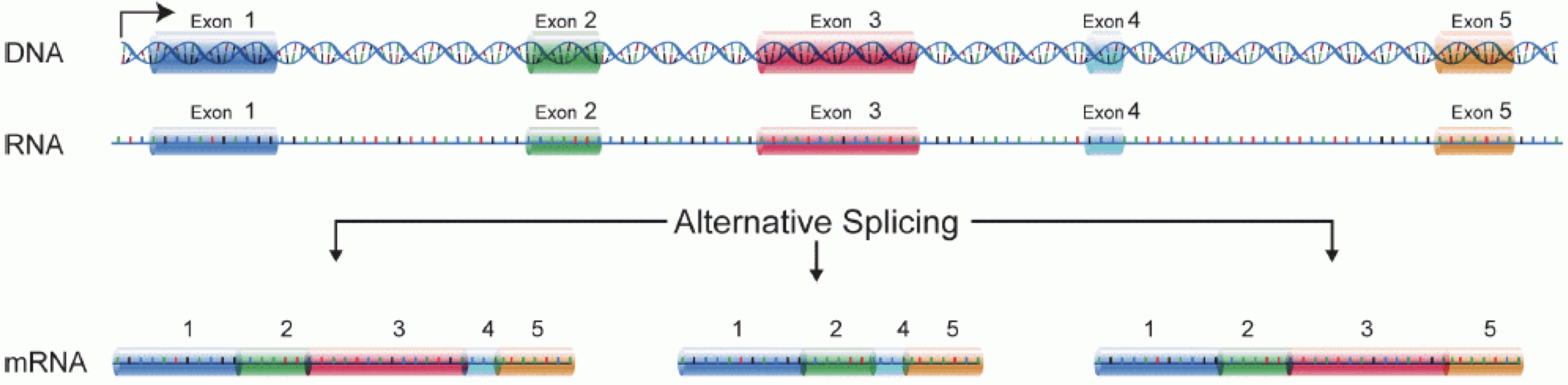
In order to produce an RNA molecule, a stretch of DNA is first transcribed into mRNA. Subsequently, intronic regions are spliced out, and exonic regions are combined into different isoforms of a gene.
(figure adapted from Martin & Wang (2011)).
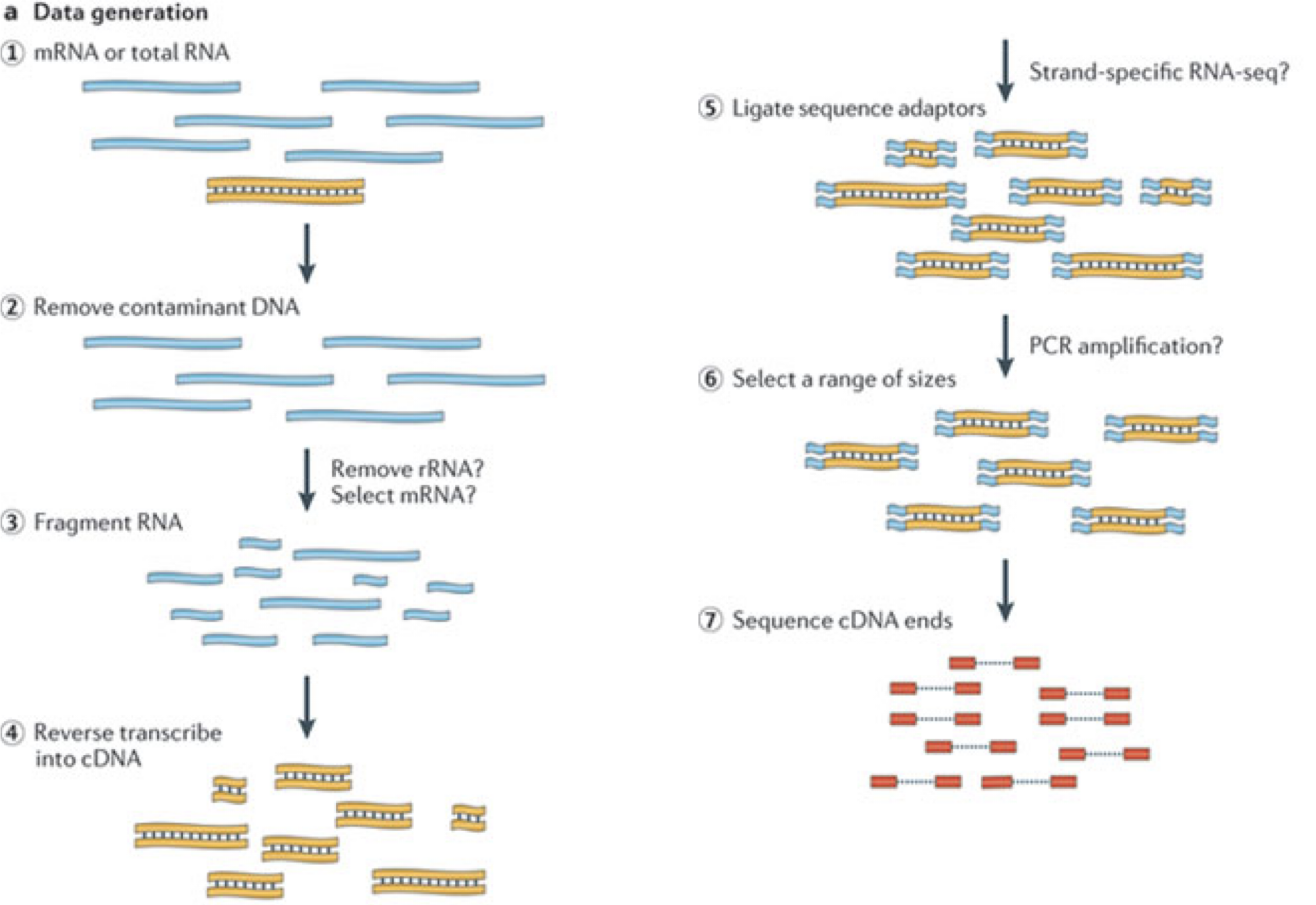
In a typical RNA-seq experiment, RNA molecules are first collected from a sample of interest. After a potential enrichment for molecules with polyA tails (predominantly mRNA), or depletion of otherwise highly abundant ribosomal RNA, the remaining molecules are fragmented into smaller pieces (there are also long-read protocols where entire molecules are considered, but those are not the focus of this lesson). It is important to keep in mind that because of the splicing excluding intronic sequences, an RNA molecule (and hence a generated fragment) may not correspond to an uninterrupted region of the genome. The RNA fragments are then reverse transcribed into cDNA, whereafter sequencing adapters are added to each end. These adapters allow the fragments to attach to the flow cell. Once attached, each fragment will be heavily amplified to generate a cluster of identical sequences on the flow cell. The sequencer then determines the sequence of the first 50-200 nucleotides of the cDNA fragments in each such cluster, starting from one end, which corresponds to a read. Many data sets are generated with so called paired-end protocols, in which the fragments are read from both ends. Millions of such reads (or pairs of reads) will be generated in an experiment, and these will be represented in a (pair of) FASTQ files. Each read is represented by four consecutive lines in such a file: first a line with a unique read identifier, next the inferred sequence of the read, then another identifier line, and finally a line containing the base quality for each inferred nucleotide, representing the probability that the nucleotide in the corresponding position has been correctly identified.
Challenge: Discuss the following points with your neighbor
- What are potential advantages and disadvantages of paired-end protocols compared to only sequencing one end of a fragment?
- What quality assessment can you think of that would be useful to perform on the FASTQ files with read sequences?
Experimental design considerations
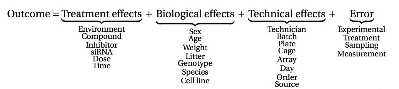
Before starting to collect data, it is essential to take some time to think about the design of the experiment. Experimental design concerns the organization of experiments with the purpose of making sure that the right type of data, and enough of it, is available to answer the questions of interest as efficiently as possible. Aspects such as which conditions or sample groups to consider, how many replicates to collect, and how to plan the data collection in practice are important questions to consider. Many high-throughput biological experiments (including RNA-seq) are sensitive to ambient conditions, and it is often difficult to directly compare measurements that have been done on different days, by different analysts, in different centers, or using different batches of reagents. For this reason, it is very important to design experiments properly, to make it possible to disentangle different types of (primary and secondary) effects.
(figure from Lazic (2017)).
Challenge: Discuss with your neighbor
- Why is it essential to have replicates?
Importantly, not all replicates are equally useful, from a statistical point of view. One common way to classify the different types of replicates is as ‘biological’ and ‘technical’, where the latter are typically used to test the reproducibility of the measurement device, while biological replicates inform about the variability between different samples from a population of interest. Another scheme classifies replicates (or units) into ‘biological’, ‘experimental’ and ‘observational’. Here, biological units are entities we want to make inferences about (e.g., animals, persons). Replication of biological units is required to make a general statement of the effect of a treatment - we can not draw a conclusion about the effect of drug on a population of mice by studying a single mouse only. Experimental units are the smallest entities that can be independently assigned to a treatment (e.g., animal, litter, cage, well). Only replication of experimental units constitute true replication. Observational units, finally, are entities at which measurements are made.
To explore the impact of experimental design on the ability to answer questions of interest, we are going to use an interactive application, provided in the ConfoundingExplorer package.
Challenge
Launch the ConfoundingExplorer application and familiarize yourself with the interface.
Challenge
- For a balanced design (equal distribution of replicates between the two groups in each batch), what is the effect of increasing the strength of the batch effect? Does it matter whether one adjusts for the batch effect or not?
- For an increasingly unbalanced design (most or all replicates of one group coming from one batch), what is the effect of increasing the strength of the batch effect? Does it matter whether one adjusts for the batch effect or not?
RNA-seq quantification: from reads to count matrix
The read sequences contained in the FASTQ files from the sequencer are typically not directly useful as they are, since we do not have the information about which gene or transcript they originate from. Thus, the first processing step is to attempt to identify the location of origin for each read, and use this to obtain an estimate of the number of reads originating from a gene (or another features, such as an individual transcript). This can then be used as a proxy for the abundance, or expression level, of the gene. There is a plethora of RNA quantification pipelines, and the most common approaches can be categorized into three main types:
Align reads to the genome, and count the number of reads that map within the exons of each gene. This is the one of simplest methods. For species for which the transcriptome is poorly annotated, this would be the preferred approach. Example:
STARalignment to GRCm39 +RsubreadfeatureCountsAlign reads to the transcriptome, quantify transcript expression, and summarize transcript expression into gene expression. This approach can produce accurate quantification results (independent benchmarking), particularly for high-quality samples without DNA contamination. Example: RSEM quantification using
rsem-calculate-expression --staron the GENCODE GRCh38 transcriptome +tximportPseudoalign reads against the transcriptome, using the corresponding genome as a decoy, quantifying transcript expression in the process, and summarize the transcript-level expression into gene-level expression. The advantages of this approach include: computational efficiency, mitigation of the effect of DNA contamination, and GC bias correction. Example:
salmon quant --gcBias+tximport
At typical sequencing read depth, gene expression quantification is often more accurate than transcript expression quantification. However, differential gene expression analyses can be improved by having access also to transcript-level quantifications.
Other tools used in RNA-seq quantification include: TopHat2, bowtie2, kallisto, HTseq, among many others.
The choice of an appropriate RNA-seq quantification depends on the quality of the transcriptome annotation, the quality of the RNA-seq library preparation, the presence of contaminating sequences, among many factors. Often, it can be informative to compare the quantification results of multiple approaches.
Because the best quantification method is species- and experiment-dependent, and often requires large amounts of computing resources, this workshop will not cover any specifics of how to generate the counts. Instead, we recommend checking out the references above and consulting with a local bioinformatics expert if you need help.
Challenge: Discuss the following points with your neighbor
- Which of the mentioned RNA-Seq quantification tools have you heard about? Do you know other pros and cons of the methods?
- Have you done your own RNA-Seq experiment? If so, what quantification tool did you use and why did you choose it?
- Do you have access to specific tools / local bioinformatics expert / computational resources for quantification? If you don’t, how might you gain access?
Finding the reference sequences
In order to quantify abundances of known genes or transcripts from RNA-seq data, we need a reference database informing us of the sequence of these features, to which we can then compare our reads. This information can be obtained from different online repositories. It is highly recommended to choose one of these for a particular project, and not mix information from different sources. Depending on the quantification tool you have chosen, you will need different types of reference information. If you are aligning your reads to the genome and investigating the overlap with known annotated features, you will need the full genome sequence (provided in a fasta file) and a file that tells you the genomic location of each annotated feature (typically provided in a gtf file). If you are mapping your reads to the transcriptome, you will instead need a file with the sequence of each transcript (again, a fasta file).
- If you are working with mouse or human samples, the GENCODE project provides well-curated reference files.
- Ensembl provides reference files for a large set of organisms, including plants and fungi.
- UCSC also provides reference files for many organisms.
Challenge
Download the latest mouse transcriptome fasta file from GENCODE. What
do the entries look like? Tip: to read the file into R, consider the
readDNAStringSet() function from the
Biostrings package.
Where are we heading towards in this workshop?
During the coming two days, we will discuss and practice how to perform differential expression analysis with Bioconductor, and how to interpret the results. We will start from a count matrix, and thus assume that the initial quality assessment and quantification of gene expression have already been done. The outcome of a differential expression analysis is often represented using graphical representations, such as MA plots and heatmaps (see below for examples).
In the following episodes we will learn, among other things, how to generate and interpret these plots. It is also common to perform follow-up analyses to investigate whether there is a functional relationship among the top-ranked genes, so called gene set (enrichment) analysis, which will also be covered in a later episode.
- RNA-seq is a technique of measuring the amount of RNA expressed within a cell/tissue and state at a given time.
- Many choices have to be made when planning an RNA-seq experiment, such as whether to perform poly-A selection or ribosomal depletion, whether to apply a stranded or an unstranded protocol, and whether to sequence the reads in a single-end or paired-end fashion. Each of the choices have consequences for the processing and interpretation of the data.
- Many approaches exist for quantification of RNA-seq data. Some methods align reads to the genome and count the number of reads overlapping gene loci. Other methods map reads to the transcriptome and use a probabilistic approach to estimate the abundance of each gene or transcript.
- Information about annotated genes can be accessed via several sources, including Ensembl, UCSC and GENCODE.
Content from RStudio Project and Experimental Data
Last updated on 2025-11-13 | Edit this page
Estimated time 30 minutes
Overview
Questions
- How do you use RStudio project to manage your analysis project?
- What is the most effective way to organize directories for an analysis project?
- How to download a dataset from the internet and save it as a file.
Objectives
- Create an RStudio project and the directories required for storing the files pertinent to an analysis project.
- Download the data set that will be used for the subsequent episodes.
Introduction
Typically, an analysis project begins with dataset files, a handful
of R scripts and output files in a directory. As the project advances,
complexity inevitably rises with the addition of more scripts, output
files, and possibly new datasets. The complexity is further amplified
when dealing with multiple versions of scripts and output files,
necessitating efficient organisation. If these are not well-managed from
the beginning, resuming the project after a break, or sharing the
project with someone else becomes challenging and time-consuming, as we
struggle to recall the project’s status and navigate the directory tree.
Additionally, without proper organisation, the project’s complexity
could lead to frequent use of the setwd function to switch
between different working directories, resulting in a disorganised
workspace.
In this lesson, we will first focus on an effective strategy for managing the files, both used and generated by our data analysis project, within a working directory.
What is a working directory?
A working directory in R is the default location on your computer where R looks for files to load or store any data you wish to save. More information can be found in our Introduction to data analysis with R and Bioconductor lesson.
Secondly, we will also learn how to leverage RStudio projects, a feature built-in to RStudio for managing our analysis project.
What is RStudio?
RStudio is a freely available integrated development environment (IDE), widely used by scientists and software developers for developing software or analysing datasets in R. If you require assistance with RStudio or its general usage, please refer to our Introduction to data analysis with R and Bioconductor lesson.
Finally, in this lesson, we will also learn to use the R function
download.file to download the data for the subsequent
episodes.
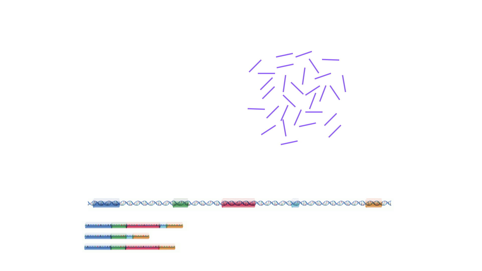
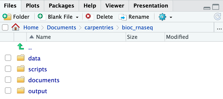
Structuring your working directory
For a more streamlined workflow, we suggest storing all files associated with an analysis in a specific directory, which will serve as your project’s working directory. Initially, this working directory should contain four distinct directories:
-
data: dedicated to storing raw data. This folder should ideally only house raw data and not be modified unless you receive a new dataset (even then, if you have the storage capacity, we suggest you retain the previous dataset as well in case you need it again in the future). For RNA-seq data analysis, this directory will typically contain*.fastqfiles and any related metadata files for the experiment. -
scripts: for storing the R scripts you’ve written and utilised for analysing the data. -
documents: for storing documents related to your analysis, such as a manuscript outline or meeting notes with your team. -
output: for storing intermediate or final results generated by the R scripts in thescriptsdirectory. Importantly, if you carry out data cleaning or pre-processing, the output should ideally be stored in this directory, as these no longer represent raw data.
As your project grows in complexity, you might find it necessary to create more directories or sub-directories. Nevertheless, the aforementioned four directories should serve as the foundation of your working directory.
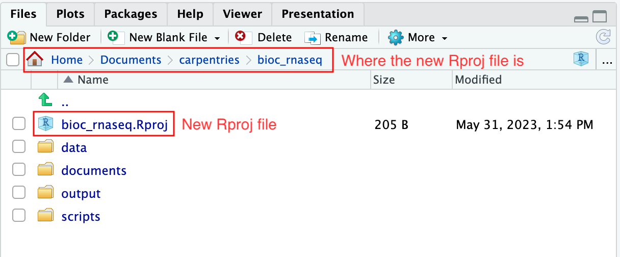
Create the directories for subsequent episodes
Create a directory on your computer to serve as the working directory
for the rest of this episode and lesson (the workshop example uses a
directory called bio_rnaseq). Then, within this chosen
directory, create the four fundamental directories previously discussed
(data, scripts, documents, and
output).
Using RStudio project to manage your working directory
As previously highlighted, RStudio project is a feature built-into
RStudio for managing your analysis project. It does so by storing
project-specific settings in an .Rproj file stored in your
project’s working directory. Loading these settings up into RStudio by
either opening the .Rproj file directly or through
RStudio’s open project option (from the menu bar, select
File > Open Project...) will automatically
set your working directory in R to the location of the
.Rproj file, essentially your project’s working
directory.
To create an RStudio project:
- Start RStudio.
- Navigate to the menu bar and select
File>New Project.... - Choose
Existing Directory. - Click
Browse...button, and select the directory you have previously chosen as the working directory for the analysis (i.e., the directory where the 4 essential directories reside). - Click
Create Projectat the bottom right of the window.
Upon completion of the steps above, you will find a
.Rproj file within your project’s working directory.
Moreover, the heading of your RStudio console should now also display
the absolute path of your project’s working directory, i.e., where the
.Rproj file resides, indicating that RStudio has set this
directory as your working directory in R.
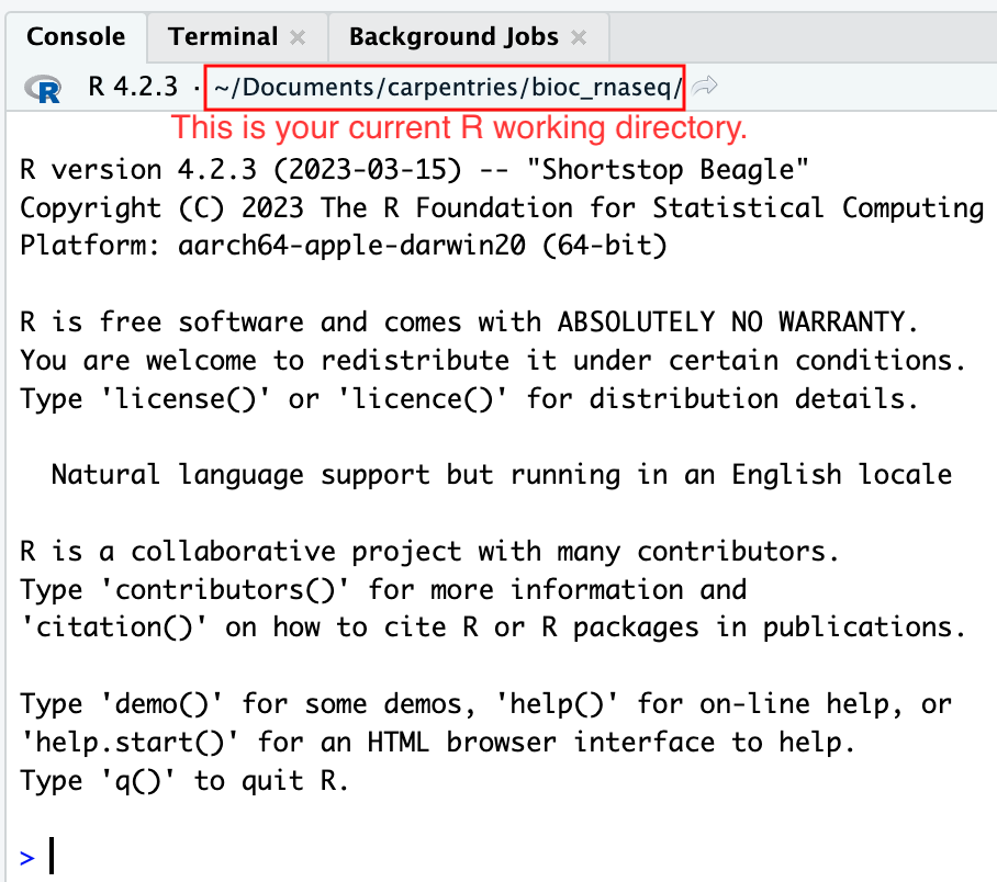
From this point forward, any R code that you execute that involves reading data from a file or saving data in a file will, by default, be directed to a path relative to your project’s working directory.
If you wish to close the project, perhaps to open another project,
create a new one, or take a break from the project, you can do so by
using to File > Close Project option
located in the menu bar. To open the project back up, either
double-click on the .Rproj file in the working directory, or open up
RStudio and using the File > Open Project
option in the menu bar.
Download the RNA-seq data for subsequent episodes
Finally, we will learn how to use R to download the RNA-seq data required for the subsequent episodes of the lesson. The dataset we will be using was generated to investigate the impact upper-respiratory infection have on changes in RNA transcription in the cerebellum and spinal cord of mice. This dataset was produced as part of the following study:
Blackmore, Stephen, et al. “Influenza infection triggers disease in a genetic model of experimental autoimmune encephalomyelitis.” Proceedings of the National Academy of Sciences 114.30 (2017): E6107-E6116.
The dataset is available at Gene Expression Omnibus (GEO), under the accession number GSE96870. Downloading data from GEO is not straightforward (and won’t be covered in this lesson). Hence, we have made the data available on our GitHub repository for easier access.
To download the files, we will use the R function
download.file, which necessitates at least two parameters:
url and destfile. The url
parameter is used to specify the address on the internet to download the
data from. The destfile parameter indicates where to save
the downloaded file and what the downloaded file should be named.
Let’s download one of the four data files needed for the remainder of
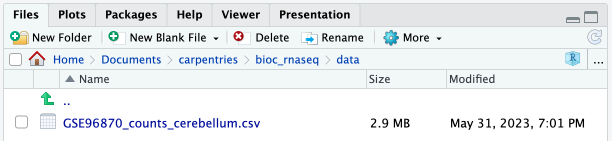
this lesson. The data file is located at https://github.com/carpentries-incubator/bioc-rnaseq/raw/main/episodes/data/GSE96870_counts_cerebellum.csv.
We shall save the downloaded file in the data folder of our
working directory with the name
GSE96870_counts_cerebellum.csv.
R
download.file(
    url = "https://github.com/carpentries-incubator/bioc-rnaseq/raw/main/episodes/data/GSE96870_counts_cerebellum.csv",
    destfile = "data/GSE96870_counts_cerebellum.csv"
)
If you navigate to the data folder in your working
directory, you should now find a file named
GSE96870_counts_cerebellum.csv.
Download the remaining data set files
There are three more data set files we need to download for the remainder of this lesson.
| URL | Filename |
|---|---|
| https://github.com/carpentries-incubator/bioc-rnaseq/raw/main/episodes/data/GSE96870_coldata_cerebellum.csv | GSE96870_coldata_cerebellum.csv |
| https://github.com/carpentries-incubator/bioc-rnaseq/raw/main/episodes/data/GSE96870_coldata_all.csv | GSE96870_coldata_all.csv |
| https://github.com/carpentries-incubator/bioc-rnaseq/raw/main/episodes/data/GSE96870_rowranges.tsv | GSE96870_rowranges.tsv |
Use the download.file function to download the files
into the data folder in your working directory.
R
download.file(
    url = "https://github.com/carpentries-incubator/bioc-rnaseq/raw/main/episodes/data/GSE96870_coldata_cerebellum.csv",
    destfile = "data/GSE96870_coldata_cerebellum.csv"
)

download.file(
    url = "https://github.com/carpentries-incubator/bioc-rnaseq/raw/main/episodes/data/GSE96870_coldata_all.csv",
    destfile = "data/GSE96870_coldata_all.csv"
)

download.file(
    url = "https://github.com/carpentries-incubator/bioc-rnaseq/raw/main/episodes/data/GSE96870_rowranges.tsv",
    destfile = "data/GSE96870_rowranges.tsv"
)
- Proper organisation of the files required for your project in a working directory is crucial for maintaining order and ensuring easy access in the future.
- RStudio project serves as a valuable tool for managing your project’s working directory and facilitating analysis.
- The
download.filefunction in R can be used for downloading datasets from the internet.
Content from Importing and annotating quantified data into R
Last updated on 2025-11-13 | Edit this page
Estimated time 120 minutes
Overview
Questions
- How can one import quantified gene expression data into an object suitable for downstream statistical analysis in R?
- What types of gene identifiers are typically used, and how are mappings between them done?
Objectives
- Learn how to import the quantifications into a SummarizedExperiment object.
- Learn how to add additional gene annotations to the object.
Load packages
In this episode we will use some functions from add-on R packages. In
order to use them, we need to load them from our
library:
R
suppressPackageStartupMessages({
    library(AnnotationDbi)
    library(org.Mm.eg.db)
    library(hgu95av2.db)
    library(SummarizedExperiment)
})
If you get any error messages about
there is no package called 'XXXX' it means you have not
installed the package/s yet for this version of R. See the bottom of the
Summary
and Setup to install all the necessary packages for this workshop.
If you have to install, remember to re-run the library
commands above to load them.
Load data
In the last episode, we used R to download 4 files from the internet and saved them on our computer. But we do not have these files loaded into R yet so that we can work with them. The original experimental design in Blackmore et al. 2017 was fairly complex: 8 week old male and female C57BL/6 mice were collected at Day 0 (before influenza infection), Day 4 and Day 8 after influenza infection. From each mouse, cerebellum and spinal cord tissues were taken for RNA-seq. There were originally 4 mice per ‘Sex x Time x Tissue’ group, but a few were lost along the way resulting in a total of 45 samples. For this workshop, we are going to simplify the analysis by only using the 22 cerebellum samples. Expression quantification was done using STAR to align to the mouse genome and then counting reads that map to genes. In addition to the counts per gene per sample, we also need information on which sample belongs to which Sex/Time point/Replicate. And for the genes, it is helpful to have extra information called annotation. Let’s read in the data files that we downloaded in the last episode and start to explore them:
Counts
R
counts <- read.csv("data/GSE96870_counts_cerebellum.csv",
                   row.names = 1)
dim(counts)
OUTPUT
[1] 41786 22R
# View(counts)
Genes are in rows and samples are in columns, so we have counts for
41,786 genes and 22 samples. The View() command has been
commented out for the website, but running it will open a tab in RStudio
that lets us look at the data and even sort the table by a particular
column. However, the viewer cannot change the data inside the
counts object, so we can only look, not permanently sort
nor edit the entries. When finished, close the viewer using the X in the
tab. Looks like the rownames are gene symbols and the column names are
the GEO sample IDs, which are not very informative for telling us which
sample is what.
Sample annotations
Next read in the sample annotations. Because samples are in columns
in the count matrix, we will name the object coldata:
R
coldata <- read.csv("data/GSE96870_coldata_cerebellum.csv",
                    row.names = 1)
dim(coldata)
OUTPUT
[1] 22 10R
# View(coldata)
Now samples are in rows with the GEO sample IDs as the rownames, and
we have 10 columns of information. The columns that are the most useful
for this workshop are geo_accession (GEO sample IDs again),
sex and time.
Gene annotations
The counts only have gene symbols, which while short and somewhat
recognizable to the human brain, are not always good absolute
identifiers for exactly what gene was measured. For this we need
additional gene annotations that were provided by the authors. The
count and coldata files were in comma
separated value (.csv) format, but we cannot use that for our gene
annotation file because the descriptions can contain commas that would
prevent a .csv file from being read in correctly. Instead the gene
annotation file is in tab separated value (.tsv) format. Likewise, the
descriptions can contain the single quote ' (e.g., 5’),
which by default R assumes indicates a character entry. So we have to
use a more generic function read.delim() with extra
arguments to specify that we have tab-separated data
(sep = "\t") with no quotes used (quote = "").
We also put in other arguments to specify that the first row contains
our column names (header = TRUE), the gene symbols that
should be our row.names are in the 5th column
(row.names = 5), and that NCBI’s species-specific gene ID
(i.e., ENTREZID) should be read in as character data even though they
look like numbers (colClasses argument). You can look up
this details on available arguments by simply entering the function name
starting with question mark. (e.g., ?read.delim)
R
rowranges <- read.delim("data/GSE96870_rowranges.tsv",
                        sep = "\t",
                        colClasses = c(ENTREZID = "character"),
                        header = TRUE,
                        quote = "",
                        row.names = 5)
dim(rowranges)
OUTPUT
[1] 41786 7R
# View(rowranges)
For each of the 41,786 genes, we have the seqnames
(e.g., chromosome number), start and end
positions, strand, ENTREZID, gene product
description (product) and the feature type
(gbkey). These gene-level metadata are useful for the
downstream analysis. For example, from the gbkey column, we
can check what types of genes and how many of them are in our
dataset:
R
table(rowranges$gbkey)
OUTPUT
     C_region     D_segment          exon     J_segment      misc_RNA
           20            23          4008            94          1988
         mRNA         ncRNA precursor_RNA          rRNA          tRNA
        21198         12285          1187            35           413
    V_segment
535 Challenge: Discuss the following points with your neighbor
- How are the 3 objects
counts,coldataandrowrangesrelated to each other in terms of their rows and columns? - If you only wanted to analyse the mRNA genes, what would you have to do keep just those (generally speaking, not exact codes)?
- If you decided the first two samples were outliers, what would you have to do to remove those (generally speaking, not exact codes)?
- In
counts, the rows are genes just like the rows inrowranges. The columns incountsare the samples, but this corresponds to the rows incoldata. - I would have to remember subset both the rows of
countsand the rows ofrowrangesto just the mRNA genes. - I would have to remember to subset both the columns of
countsbut the rows ofcoldatato exclude the first two samples.
You can see how keeping related information in separate objects could
easily lead to mis-matches between our counts, gene annotations and
sample annotations. This is why Bioconductor has created a specialized
S4 class called a SummarizedExperiment. The details of a
SummarizedExperiment were covered extensively at the end of
the Introduction
to data analysis with R and Bioconductor workshop. As a reminder,
let’s take a look at the figure below representing the anatomy of the
SummarizedExperiment class:

It is designed to hold any type of quantitative ’omics data
(assays) along with linked sample annotations
(colData) and feature annotations with
(rowRanges) or without (rowData) chromosome,
start and stop positions. Once these three tables are (correctly!)
linked, subsetting either samples and/or features will correctly subset
the assay, colData and rowRanges.
Additionally, most Bioconductor packages are built around the same core
data infrastructure so they will recognize and be able to manipulate
SummarizedExperiment objects. Two of the most popular
RNA-seq statistical analysis packages have their own extended S4 classes
similar to a SummarizedExperiment with the additional slots
for statistical results: DESeq2’s
DESeqDataSet and edgeR’s
DGEList. No matter which one you end up using for
statistical analysis, you can start by putting your data in a
SummarizedExperiment.
Assemble SummarizedExperiment
We will create a SummarizedExperiment from these
objects:
- The
countobject will be saved inassaysslot
- The
coldataobject with sample information will be stored incolDataslot (sample metadata)
- The
rowrangesobject describing the genes will be stored inrowRangesslot (features metadata)
Before we put them together, you ABSOLUTELY MUST MAKE SURE THE
SAMPLES AND GENES ARE IN THE SAME ORDER! Even though we saw that
count and coldata had the same number of
samples and count and rowranges had the same
number of genes, we never explicitly checked to see if they were in the
same order. One quick way to check:
R
all.equal(colnames(counts), rownames(coldata)) # samples
OUTPUT
[1] TRUER
all.equal(rownames(counts), rownames(rowranges)) # genes
OUTPUT
[1] TRUER
# If the first is not TRUE, you can match up the samples/columns in
# counts with the samples/rows in coldata like this (which is fine
# to run even if the first was TRUE):

tempindex <- match(colnames(counts), rownames(coldata))
coldata <- coldata[tempindex, ]

# Check again:
all.equal(colnames(counts), rownames(coldata))
OUTPUT
[1] TRUEChallenge
If the features (i.e., genes) in the assay (e.g.,
counts) and the gene annotation table (e.g.,
rowranges) are different, how can we fix them? Write the
codes.
R
tempindex <- match(rownames(counts), rownames(rowranges))
rowranges <- rowranges[tempindex, ]

all.equal(rownames(counts), rownames(rowranges))
Once we have verified that samples and genes are in the same order,
we can then create our SummarizedExperiment object.
R
# One final check:
stopifnot(rownames(rowranges) == rownames(counts), # features
          rownames(coldata) == colnames(counts)) # samples

se <- SummarizedExperiment(
    assays = list(counts = as.matrix(counts)),
    rowRanges = as(rowranges, "GRanges"),
    colData = coldata
)
Because matching the genes and samples is so important, the
SummarizedExperiment() constructor does some internal check
to make sure they contain the same number of genes/samples and the
sample/row names match. If not, you will get some error messages:
R
# wrong number of samples:

bad1 <- SummarizedExperiment(
    assays = list(counts = as.matrix(counts)),
    rowRanges = as(rowranges, "GRanges"),
    colData = coldata[1:3,]
)
ERROR
Error in validObject(.Object): invalid class "SummarizedExperiment" object:
    nb of cols in 'assay' (22) must equal nb of rows in 'colData' (3)
R
# same number of genes but in different order:

bad2 <- SummarizedExperiment(
  assays = list(counts = as.matrix(counts)),
  rowRanges = as(rowranges[c(2:nrow(rowranges), 1),], "GRanges"),
  colData = coldata
)
ERROR
Error in SummarizedExperiment(assays = list(counts = as.matrix(counts)), : the rownames and colnames of the supplied assay(s) must be NULL or identical
  to those of the RangedSummarizedExperiment object (or derivative) to
  construct
A brief recap of how to access the various data slots in a
SummarizedExperiment and how to make some
manipulations:
R
# Access the counts
head(assay(se))
OUTPUT
             GSM2545336 GSM2545337 GSM2545338 GSM2545339 GSM2545340 GSM2545341
Xkr4               1891       2410       2159       1980       1977       1945
LOC105243853          0          0          1          4          0          0
LOC105242387        204        121        110        120        172        173
LOC105242467         12          5          5          5          2          6
Rp1                   2          2          0          3          2          1
Sox17               251        239        218        220        261        232
             GSM2545342 GSM2545343 GSM2545344 GSM2545345 GSM2545346 GSM2545347
Xkr4               1757       2235       1779       1528       1644       1585
LOC105243853          1          3          3          0          1          3
LOC105242387        177        130        131        160        180        176
LOC105242467          3          2          2          2          1          2
Rp1                   3          1          1          2          2          2
Sox17               179        296        233        271        205        230
             GSM2545348 GSM2545349 GSM2545350 GSM2545351 GSM2545352 GSM2545353
Xkr4               2275       1881       2584       1837       1890       1910
LOC105243853          1          0          0          1          1          0
LOC105242387        161        154        124        221        272        214
LOC105242467          2          4          7          1          3          1
Rp1                   3          6          5          3          5          1
Sox17               302        286        325        201        267        322
             GSM2545354 GSM2545362 GSM2545363 GSM2545380
Xkr4               1771       2315       1645       1723
LOC105243853          0          1          0          1
LOC105242387        124        189        223        251
LOC105242467          4          2          1          4
Rp1                   3          3          1          0
Sox17               273        197        310        246
R
dim(assay(se))
OUTPUT
[1] 41786 22R
# The above works now because we only have one assay, "counts"
# But if there were more than one assay, we would have to specify
# which one like so:

head(assay(se, "counts"))
OUTPUT
             GSM2545336 GSM2545337 GSM2545338 GSM2545339 GSM2545340 GSM2545341
Xkr4               1891       2410       2159       1980       1977       1945
LOC105243853          0          0          1          4          0          0
LOC105242387        204        121        110        120        172        173
LOC105242467         12          5          5          5          2          6
Rp1                   2          2          0          3          2          1
Sox17               251        239        218        220        261        232
             GSM2545342 GSM2545343 GSM2545344 GSM2545345 GSM2545346 GSM2545347
Xkr4               1757       2235       1779       1528       1644       1585
LOC105243853          1          3          3          0          1          3
LOC105242387        177        130        131        160        180        176
LOC105242467          3          2          2          2          1          2
Rp1                   3          1          1          2          2          2
Sox17               179        296        233        271        205        230
             GSM2545348 GSM2545349 GSM2545350 GSM2545351 GSM2545352 GSM2545353
Xkr4               2275       1881       2584       1837       1890       1910
LOC105243853          1          0          0          1          1          0
LOC105242387        161        154        124        221        272        214
LOC105242467          2          4          7          1          3          1
Rp1                   3          6          5          3          5          1
Sox17               302        286        325        201        267        322
             GSM2545354 GSM2545362 GSM2545363 GSM2545380
Xkr4               1771       2315       1645       1723
LOC105243853          0          1          0          1
LOC105242387        124        189        223        251
LOC105242467          4          2          1          4
Rp1                   3          3          1          0
Sox17               273        197        310        246
R
# Access the sample annotations
colData(se)
OUTPUT
DataFrame with 22 rows and 10 columns
                     title geo_accession     organism         age         sex
               <character>   <character>  <character> <character> <character>
GSM2545336 CNS_RNA-seq_10C    GSM2545336 Mus musculus     8 weeks      Female
GSM2545337 CNS_RNA-seq_11C    GSM2545337 Mus musculus     8 weeks      Female
GSM2545338 CNS_RNA-seq_12C    GSM2545338 Mus musculus     8 weeks      Female
GSM2545339 CNS_RNA-seq_13C    GSM2545339 Mus musculus     8 weeks      Female
GSM2545340 CNS_RNA-seq_14C    GSM2545340 Mus musculus     8 weeks        Male
...                    ...           ...          ...         ...         ...
GSM2545353  CNS_RNA-seq_3C    GSM2545353 Mus musculus     8 weeks      Female
GSM2545354  CNS_RNA-seq_4C    GSM2545354 Mus musculus     8 weeks        Male
GSM2545362  CNS_RNA-seq_5C    GSM2545362 Mus musculus     8 weeks      Female
GSM2545363  CNS_RNA-seq_6C    GSM2545363 Mus musculus     8 weeks        Male
GSM2545380  CNS_RNA-seq_9C    GSM2545380 Mus musculus     8 weeks      Female
             infection      strain        time      tissue     mouse
           <character> <character> <character> <character> <integer>
GSM2545336  InfluenzaA     C57BL/6        Day8  Cerebellum        14
GSM2545337 NonInfected     C57BL/6        Day0  Cerebellum         9
GSM2545338 NonInfected     C57BL/6        Day0  Cerebellum        10
GSM2545339  InfluenzaA     C57BL/6        Day4  Cerebellum        15
GSM2545340  InfluenzaA     C57BL/6        Day4  Cerebellum        18
...                ...         ...         ...         ...       ...
GSM2545353 NonInfected     C57BL/6        Day0  Cerebellum         4
GSM2545354 NonInfected     C57BL/6        Day0  Cerebellum         2
GSM2545362  InfluenzaA     C57BL/6        Day4  Cerebellum        20
GSM2545363  InfluenzaA     C57BL/6        Day4  Cerebellum        12
GSM2545380  InfluenzaA     C57BL/6        Day8  Cerebellum        19
R
dim(colData(se))
OUTPUT
[1] 22 10R
# Access the gene annotations
head(rowData(se))
OUTPUT
DataFrame with 6 rows and 3 columns
                ENTREZID                product       gbkey
             <character>            <character> <character>
Xkr4              497097 X Kell blood group p..        mRNA
LOC105243853   105243853 uncharacterized LOC1..       ncRNA
LOC105242387   105242387 uncharacterized LOC1..       ncRNA
LOC105242467   105242467 lipoxygenase homolog..        mRNA
Rp1                19888 retinitis pigmentosa..        mRNA
Sox17              20671 SRY (sex determining..        mRNA
R
dim(rowData(se))
OUTPUT
[1] 41786 3R
# Make better sample IDs that show sex, time and mouse ID:

se$Label <- paste(se$sex, se$time, se$mouse, sep = "_")
se$Label
OUTPUT
 [1] "Female_Day8_14" "Female_Day0_9"  "Female_Day0_10" "Female_Day4_15"
 [5] "Male_Day4_18"   "Male_Day8_6"    "Female_Day8_5"  "Male_Day0_11"
 [9] "Female_Day4_22" "Male_Day4_13"   "Male_Day8_23"   "Male_Day8_24"
[13] "Female_Day0_8"  "Male_Day0_7"    "Male_Day4_1"    "Female_Day8_16"
[17] "Female_Day4_21" "Female_Day0_4"  "Male_Day0_2"    "Female_Day4_20"
[21] "Male_Day4_12"   "Female_Day8_19"
R
colnames(se) <- se$Label

# Our samples are not in order based on sex and time
se$Group <- paste(se$sex, se$time, sep = "_")
se$Group
OUTPUT
 [1] "Female_Day8" "Female_Day0" "Female_Day0" "Female_Day4" "Male_Day4"
 [6] "Male_Day8"   "Female_Day8" "Male_Day0"   "Female_Day4" "Male_Day4"
[11] "Male_Day8"   "Male_Day8"   "Female_Day0" "Male_Day0"   "Male_Day4"
[16] "Female_Day8" "Female_Day4" "Female_Day0" "Male_Day0"   "Female_Day4"
[21] "Male_Day4"   "Female_Day8"
R
# change this to factor data with the levels in order
# that we want, then rearrange the se object:

se$Group <- factor(se$Group, levels = c("Female_Day0","Male_Day0",
                                        "Female_Day4","Male_Day4",
                                        "Female_Day8","Male_Day8"))
se <- se[, order(se$Group)]
colData(se)
OUTPUT
DataFrame with 22 rows and 12 columns
                         title geo_accession     organism         age
                   <character>   <character>  <character> <character>
Female_Day0_9  CNS_RNA-seq_11C    GSM2545337 Mus musculus     8 weeks
Female_Day0_10 CNS_RNA-seq_12C    GSM2545338 Mus musculus     8 weeks
Female_Day0_8  CNS_RNA-seq_27C    GSM2545348 Mus musculus     8 weeks
Female_Day0_4   CNS_RNA-seq_3C    GSM2545353 Mus musculus     8 weeks
Male_Day0_11   CNS_RNA-seq_20C    GSM2545343 Mus musculus     8 weeks
...                        ...           ...          ...         ...
Female_Day8_16  CNS_RNA-seq_2C    GSM2545351 Mus musculus     8 weeks
Female_Day8_19  CNS_RNA-seq_9C    GSM2545380 Mus musculus     8 weeks
Male_Day8_6    CNS_RNA-seq_17C    GSM2545341 Mus musculus     8 weeks
Male_Day8_23   CNS_RNA-seq_25C    GSM2545346 Mus musculus     8 weeks
Male_Day8_24   CNS_RNA-seq_26C    GSM2545347 Mus musculus     8 weeks
                       sex   infection      strain        time      tissue
               <character> <character> <character> <character> <character>
Female_Day0_9       Female NonInfected     C57BL/6        Day0  Cerebellum
Female_Day0_10      Female NonInfected     C57BL/6        Day0  Cerebellum
Female_Day0_8       Female NonInfected     C57BL/6        Day0  Cerebellum
Female_Day0_4       Female NonInfected     C57BL/6        Day0  Cerebellum
Male_Day0_11          Male NonInfected     C57BL/6        Day0  Cerebellum
...                    ...         ...         ...         ...         ...
Female_Day8_16      Female  InfluenzaA     C57BL/6        Day8  Cerebellum
Female_Day8_19      Female  InfluenzaA     C57BL/6        Day8  Cerebellum
Male_Day8_6           Male  InfluenzaA     C57BL/6        Day8  Cerebellum
Male_Day8_23          Male  InfluenzaA     C57BL/6        Day8  Cerebellum
Male_Day8_24          Male  InfluenzaA     C57BL/6        Day8  Cerebellum
                   mouse          Label       Group
               <integer>    <character>    <factor>
Female_Day0_9          9  Female_Day0_9 Female_Day0
Female_Day0_10        10 Female_Day0_10 Female_Day0
Female_Day0_8          8  Female_Day0_8 Female_Day0
Female_Day0_4          4  Female_Day0_4 Female_Day0
Male_Day0_11          11   Male_Day0_11 Male_Day0
...                  ...            ...         ...
Female_Day8_16        16 Female_Day8_16 Female_Day8
Female_Day8_19        19 Female_Day8_19 Female_Day8
Male_Day8_6            6    Male_Day8_6 Male_Day8
Male_Day8_23          23   Male_Day8_23 Male_Day8
Male_Day8_24          24   Male_Day8_24 Male_Day8
R
# Finally, also factor the Label column to keep in order in plots:

se$Label <- factor(se$Label, levels = se$Label)
Challenge
- How many samples are there for each level of the
Infectionvariable? - Create 2 objects named
se_infectedandse_noninfectedcontaining a subset ofsewith only infected and non-infected samples, respectively. Then, calculate the mean expression levels of the first 500 genes for each object, and use thesummary()function to explore the distribution of expression levels for infected and non-infected samples based on these genes. - How many samples represent female mice infected with Influenza A on day 8?
R
# 1
table(se$infection)
OUTPUT
 InfluenzaA NonInfected
         15           7
R
# 2
se_infected <- se[, se$infection == "InfluenzaA"]
se_noninfected <- se[, se$infection == "NonInfected"]

means_infected <- rowMeans(assay(se_infected)[1:500, ])
means_noninfected <- rowMeans(assay(se_noninfected)[1:500, ])

summary(means_infected)
OUTPUT
     Min.   1st Qu.    Median      Mean   3rd Qu.      Max.
0.000e+00 1.333e-01 2.867e+00 7.641e+02 3.374e+02 1.890e+04
R
summary(means_noninfected)
OUTPUT
     Min.   1st Qu.    Median      Mean   3rd Qu.      Max.
0.000e+00 1.429e-01 3.143e+00 7.710e+02 3.666e+02 2.001e+04
R
# 3
ncol(se[, se$sex == "Female" & se$infection == "InfluenzaA" & se$time == "Day8"])
OUTPUT
[1] 4Save SummarizedExperiment
This was a bit of code and time to create our
SummarizedExperiment object. We will need to keep using it
throughout the workshop, so it can be useful to save it as an actual
single file on our computer to read it back in to R’s memory if we have
to shut down RStudio. To save an R-specific file we can use the
saveRDS() function and later read it back into R using the
readRDS() function.
R
saveRDS(se, "data/GSE96870_se.rds")
rm(se) # remove the object!
se <- readRDS("data/GSE96870_se.rds")
Data provenance and reproducibility
We have now created an external .rds file that represents our RNA-Seq data in a format that can be read into R and used by various packages for our analyses. But we should still keep a record of the codes that created the .rds file from the 3 files we downloaded from the internet. But what is the provenance of those files - i.e, where did they come from and how were they made? The original counts and gene information were deposited in the GEO public database, accession number GSE96870. But these counts were generated by running alignment/quantification programs on the also-deposited fastq files that hold the sequence base calls and quality scores, which in turn were generated by a specific sequencing machine using some library preparation method on RNA extracted from samples collected in a particular experiment. Whew!
If you conducted the original experiment ideally you would have the
complete record of where and how the data were generated. But you might
use publicly-available data sets so the best you can do is to keep track
of what original files you got from where and what manipulations you
have done to them. Using R codes to keep track of everything is an
excellent way to be able to reproduce the entire analysis from the
original input files. The exact results you get can differ depending on
the R version, add-on package versions and even what operating system
you use, so make sure to keep track of all this information as well by
running sessionInfo() and recording the output (see example
at end of lesson).
Challenge: How to subset to mRNA genes
Before, we conceptually discussed subsetting to only the mRNA genes.
Now that we have our SummarizedExperiment object, it
becomes much easier to write the codes to subset se to a
new object called se_mRNA that contains only the genes/rows
where the rowData(se)$gbkey is equal to mRNA. Write the
codes and then check you correctly got the 21,198 mRNA genes:
R
se_mRNA <- se[rowData(se)$gbkey == "mRNA" , ]
dim(se_mRNA)
OUTPUT
[1] 21198 22Gene Annotations
Depending on who generates your count data, you might not have a nice file of additional gene annotations. There may only be the count row names, which could be gene symbols or ENTREZIDs or another database’s ID. Characteristics of gene annotations differ based on their annotation strategies and information sources. For example, RefSeq human gene models (i.e., Entrez from NCBI) are well supported and broadly used in various studies. The UCSC Known Genes dataset is based on protein data from Swiss-Prot/TrEMBL (UniProt) and the associated mRNA data from GenBank, and serves as a foundation for the UCSC Genome Browser. Ensembl genes contain both automated genome annotation and manual curation.
You can find more information in Bioconductor Annotation Workshop material.
Bioconductor has many packages and functions that can help you to get additional annotation information for your genes. The available resources are covered in more detail in Episode 7 Gene set enrichment analysis.
Here, we will introduce one of the gene ID mapping functions,
mapIds:
mapIds(annopkg, keys, column, keytype, ..., multiVals)Where
-
annopkg is the annotation package
-
keys are the IDs that we know
-
column is the value we want
- keytype is the type of key used
R
mapIds(org.Mm.eg.db, keys = "497097", column = "SYMBOL", keytype = "ENTREZID")
OUTPUT
'select()' returned 1:1 mapping between keys and columnsOUTPUT
497097
"Xkr4"
Different from the select() function,
mapIds() function handles 1:many mapping between keys and
columns through an additional argument, multiVals. The
below example demonstrate this functionality using the
hgu95av2.db package, an Affymetrix Human Genome U95 Set
annotation data.
R
keys <- head(keys(hgu95av2.db, "ENTREZID"))
last <- function(x){x[[length(x)]]}

mapIds(hgu95av2.db, keys = keys, column = "ALIAS", keytype = "ENTREZID")
OUTPUT
'select()' returned 1:many mapping between keys and columnsOUTPUT
       10       100      1000     10000 100008586     10001
   "AAC2"    "ADA1"   "ACOGS"    "MPPH"     "AL4"   "ARC33"
R
# When there is 1:many mapping, the default behavior was
# to output the first match. This can be changed to a function,
# which we defined above to give us the last match:

mapIds(hgu95av2.db, keys = keys, column = "ALIAS", keytype = "ENTREZID", multiVals = last)
OUTPUT
'select()' returned 1:many mapping between keys and columnsOUTPUT
       10       100      1000     10000 100008586     10001
   "NAT2"     "ADA"    "CDH2"    "AKT3" "GAGE12F"    "MED6"
R
# Or we can get back all the many mappings:

mapIds(hgu95av2.db, keys = keys, column = "ALIAS", keytype = "ENTREZID", multiVals = "list")
OUTPUT
'select()' returned 1:many mapping between keys and columnsOUTPUT
$`10`
[1] "AAC2"  "NAT-2" "PNAT"  "NAT2"

$`100`
[1] "ADA1" "ADA"

$`1000`
[1] "ACOGS"  "ADHD8"  "ARVD14" "CD325"  "CDHN"   "CDw325" "NCAD"   "CDH2"

$`10000`
[1] "MPPH"         "MPPH2"        "PKB-GAMMA"    "PKBG"         "PRKBG"
[6] "RAC-PK-gamma" "RAC-gamma"    "STK-2"        "AKT3"

$`100008586`
[1] "AL4"     "CT4.7"   "GAGE-7"  "GAGE-7B" "GAGE-8"  "GAGE7"   "GAGE7B"
[8] "GAGE12F"

$`10001`
[1] "ARC33"     "NY-REN-28" "MED6"
Session info
R
sessionInfo()
OUTPUT
R version 4.5.2 (2025-10-31)
Platform: x86_64-pc-linux-gnu
Running under: Ubuntu 22.04.5 LTS

Matrix products: default
BLAS:   /usr/lib/x86_64-linux-gnu/blas/libblas.so.3.10.0
LAPACK: /usr/lib/x86_64-linux-gnu/lapack/liblapack.so.3.10.0  LAPACK version 3.10.0

locale:
 [1] LC_CTYPE=C.UTF-8       LC_NUMERIC=C           LC_TIME=C.UTF-8
 [4] LC_COLLATE=C.UTF-8     LC_MONETARY=C.UTF-8    LC_MESSAGES=C.UTF-8
 [7] LC_PAPER=C.UTF-8       LC_NAME=C              LC_ADDRESS=C
[10] LC_TELEPHONE=C         LC_MEASUREMENT=C.UTF-8 LC_IDENTIFICATION=C

time zone: UTC
tzcode source: system (glibc)

attached base packages:
[1] stats4    stats     graphics  grDevices utils     datasets  methods
[8] base

other attached packages:
 [1] hgu95av2.db_3.13.0          org.Hs.eg.db_3.21.0
 [3] org.Mm.eg.db_3.21.0         AnnotationDbi_1.70.0
 [5] SummarizedExperiment_1.38.1 Biobase_2.68.0
 [7] MatrixGenerics_1.20.0       matrixStats_1.5.0
 [9] GenomicRanges_1.60.0        GenomeInfoDb_1.44.3
[11] IRanges_2.42.0              S4Vectors_0.46.0
[13] BiocGenerics_0.54.1         generics_0.1.4
[15] knitr_1.50

loaded via a namespace (and not attached):
 [1] Matrix_1.7-4            bit_4.6.0               jsonlite_2.0.0
 [4] compiler_4.5.2          BiocManager_1.30.26     renv_1.1.5
 [7] crayon_1.5.3            blob_1.2.4              Biostrings_2.76.0
[10] png_0.1-8               fastmap_1.2.0           yaml_2.3.10
[13] lattice_0.22-7          R6_2.6.1                XVector_0.48.0
[16] S4Arrays_1.8.1          DelayedArray_0.34.1     GenomeInfoDbData_1.2.14
[19] DBI_1.2.3               rlang_1.1.6             KEGGREST_1.48.1
[22] cachem_1.1.0            xfun_0.54               bit64_4.6.0-1
[25] memoise_2.0.1           SparseArray_1.8.1       RSQLite_2.4.3
[28] cli_3.6.5               grid_4.5.2              vctrs_0.6.5
[31] evaluate_1.0.5          abind_1.4-8             httr_1.4.7
[34] pkgconfig_2.0.3 tools_4.5.2 UCSC.utils_1.4.0 - Depending on the gene expression quantification tool used, there are
different ways (often distributed in Bioconductor packages) to read the
output into a
SummarizedExperimentorDGEListobject for further processing in R. - Stable gene identifiers such as Ensembl or Entrez IDs should preferably be used as the main identifiers throughout an RNA-seq analysis, with gene symbols added for easier interpretation.
Content from Exploratory analysis and quality control
Last updated on 2025-11-13 | Edit this page
Estimated time 180 minutes
Overview
Questions
- Why is exploratory analysis an essential part of an RNA-seq analysis?
- How should one preprocess the raw count matrix for exploratory
analysis?
- Are two dimensions sufficient to represent your data?
Objectives
- Learn how to explore the gene expression matrix and perform common quality control steps.
- Learn how to set up an interactive application for exploratory analysis.
Load packages
Assuming you just started RStudio again, load some packages we will
use in this lesson along with the SummarizedExperiment
object we created in the last lesson.
R
suppressPackageStartupMessages({
    library(SummarizedExperiment)
    library(DESeq2)
    library(vsn)
    library(ggplot2)
    library(ComplexHeatmap)
    library(RColorBrewer)
    library(hexbin)
    library(iSEE)
})
R
se <- readRDS("data/GSE96870_se.rds")
Remove unexpressed genes
Exploratory analysis is crucial for quality control and to get to know our data. It can help us detect quality problems, sample swaps and contamination, as well as give us a sense of the most salient patterns present in the data. In this episode, we will learn about two common ways of performing exploratory analysis for RNA-seq data; namely clustering and principal component analysis (PCA). These tools are in no way limited to (or developed for) analysis of RNA-seq data. However, there are certain characteristics of count assays that need to be taken into account when they are applied to this type of data. First of all, not all mouse genes in the genome will be expressed in our Cerebellum samples. There are many different threshold you could use to say whether a gene’s expression was detectable or not; here we are going to use a very minimal one that if a gene does not have more than 5 counts total across all samples, there is simply not enough data to be able to do anything with it anyway.
R
nrow(se)
OUTPUT
[1] 41786R
# Remove genes/rows that do not have > 5 total counts
se <- se[rowSums(assay(se, "counts")) > 5, ]
nrow(se)
OUTPUT
[1] 27430Challenge: What kind of genes survived this filtering?
Last episode we discussed subsetting down to only mRNA genes. Here we subsetted based on a minimal expression level.
- How many of each type of gene survived the filtering?
- Compare the number of genes that survived filtering using different thresholds.
- What are pros and cons of more aggressive filtering? What are important considerations?
R
table(rowData(se)$gbkey)
OUTPUT
     C_region          exon     J_segment      misc_RNA          mRNA
           14          1765            14          1539         16859
        ncRNA precursor_RNA          rRNA          tRNA     V_segment
         6789           362             2            64            22
R
nrow(se) # represents the number of genes using 5 as filtering threshold
OUTPUT
[1] 27430R
length(which(rowSums(assay(se, "counts")) > 10))
OUTPUT
[1] 25736R
length(which(rowSums(assay(se, "counts")) > 20))
OUTPUT
[1] 23860- Cons: Risk of removing interesting information Pros:
- Not or lowly expressed genes are unlikely to be biological meaningful.
- Reduces number of statistical tests (multiple testing).
- More reliable estimation of mean-variance relationship
Potential considerations: - Is a gene expressed in both groups? - How many samples of each group express a gene?
Library size differences
Differences in the total number of reads assigned to genes between samples typically occur for technical reasons. In practice, it means that we can not simply compare a gene’s raw read count directly between samples and conclude that a sample with a higher read count also expresses the gene more strongly - the higher count may be caused by an overall higher number of reads in that sample. In the rest of this section, we will use the term library size to refer to the total number of reads assigned to genes for a sample. First we should compare the library sizes of all samples.
R
# Add in the sum of all counts

se$libSize <-  colSums(assay(se))

# Plot the libSize by using R's native pipe |>
# to extract the colData, turn it into a regular
# data frame then send to ggplot:

colData(se) |>
  as.data.frame() |>
  ggplot(aes(x = Label, y = libSize / 1e6, fill = Group)) +
         geom_bar(stat = "identity") + theme_bw() +
         labs(x = "Sample", y = "Total count in millions") +
         theme(axis.text.x = element_text(angle = 45, hjust = 1, vjust = 1))
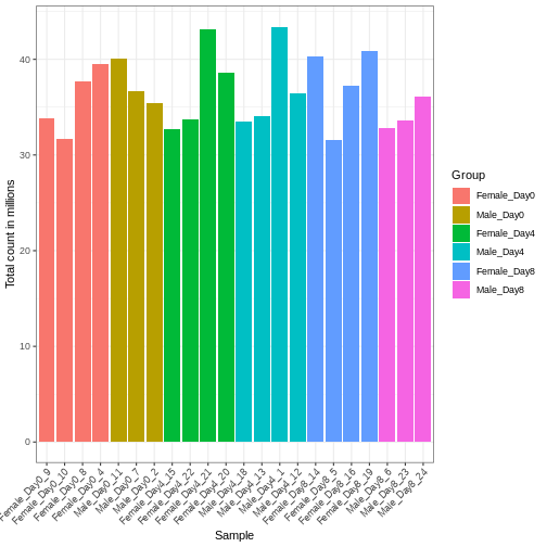
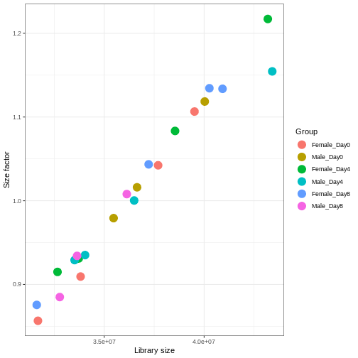
We need to adjust for the differences in library size between samples, to avoid drawing incorrect conclusions. The way this is typically done for RNA-seq data can be described as a two-step procedure. First, we estimate size factors - sample-specific correction factors such that if the raw counts were to be divided by these factors, the resulting values would be more comparable across samples. Next, these size factors are incorporated into the statistical analysis of the data. It is important to pay close attention to how this is done in practice for a given analysis method. Sometimes the division of the counts by the size factors needs to be done explicitly by the analyst. Other times (as we will see for the differential expression analysis) it is important that they are provided separately to the analysis tool, which will then use them appropriately in the statistical model.
With DESeq2, size factors are calculated using the
estimateSizeFactors() function. The size factors estimated
by this function combines an adjustment for differences in library sizes
with an adjustment for differences in the RNA composition of the
samples. The latter is important due to the compositional nature of
RNA-seq data. There is a fixed number of reads to distribute between the
genes, and if a single (or a few) very highly expressed gene consume a
large part of the reads, all other genes will consequently receive very
low counts. We now switch our SummarizedExperiment object
over to a DESeqDataSet as it has the internal structure to
store these size factors. We also need to tell it our main experiment
design, which is sex and time:
R
dds <- DESeq2::DESeqDataSet(se, design = ~ sex + time)
WARNING
Warning in DESeq2::DESeqDataSet(se, design = ~sex + time): some variables in
design formula are characters, converting to factors
R
dds <- estimateSizeFactors(dds)

# Plot the size factors against library size
# and look for any patterns by group:

ggplot(data.frame(libSize = colSums(assay(dds)),
                  sizeFactor = sizeFactors(dds),
                  Group = dds$Group),
       aes(x = libSize, y = sizeFactor, col = Group)) +
    geom_point(size = 5) + theme_bw() +
    labs(x = "Library size", y = "Size factor")
Transform data
There is a rich literature on methods for exploratory analysis. Most of these work best in situations where the variance of the input data (here, each gene) is relatively independent of the average value. For read count data such as RNA-seq, this is not the case. In fact, the variance increases with the average read count.
R
meanSdPlot(assay(dds), ranks = FALSE)
WARNING
Warning: `aes_string()` was deprecated in ggplot2 3.0.0.
ℹ Please use tidy evaluation idioms with `aes()`.
ℹ See also `vignette("ggplot2-in-packages")` for more information.
ℹ The deprecated feature was likely used in the vsn package.
  Please report the issue to the authors.
This warning is displayed once every 8 hours.
Call `lifecycle::last_lifecycle_warnings()` to see where this warning was
generated.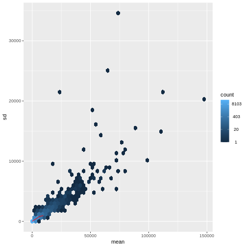
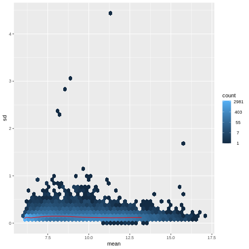
There are two ways around this: either we develop methods specifically adapted to count data, or we adapt (transform) the count data so that the existing methods are applicable. Both ways have been explored; however, at the moment the second approach is arguably more widely applied in practice. We can transform our data using DESeq2’s variance stabilizing transformation and then verify that it has removed the correlation between average read count and variance.
R
vsd <- DESeq2::vst(dds, blind = TRUE)
meanSdPlot(assay(vsd), ranks = FALSE)
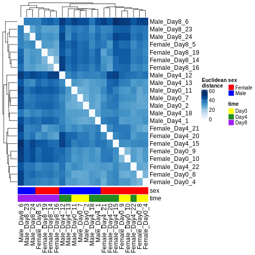
Heatmaps and clustering
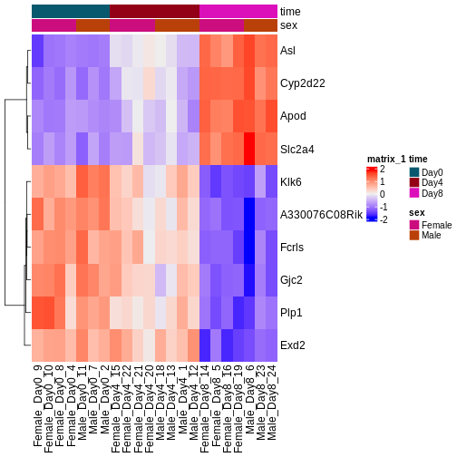
There are many ways to cluster samples based on their similarity of expression patterns. One simple way is to calculate Euclidean distances between all pairs of samples (longer distance = more different) and then display the results with both a branching dendrogram and a heatmap to visualize the distances in color. From this, we infer that the Day 8 samples are more similar to each other than the rest of the samples, although Day 4 and Day 0 do not separate distinctly. Instead, males and females reliably separate.
R
dst <- dist(t(assay(vsd)))
colors <- colorRampPalette(brewer.pal(9, "Blues"))(255)
ComplexHeatmap::Heatmap(
    as.matrix(dst),
    col = colors,
    name = "Euclidean\ndistance",
    cluster_rows = hclust(dst),
    cluster_columns = hclust(dst),
    bottom_annotation = columnAnnotation(
        sex = vsd$sex,
        time = vsd$time,
        col = list(sex = c(Female = "red", Male = "blue"),
                   time = c(Day0 = "yellow", Day4 = "forestgreen", Day8 = "purple")))
)
PCA
Principal component analysis is a dimensionality reduction method, which projects the samples into a lower-dimensional space. This lower-dimensional representation can be used for visualization, or as the input for other analysis methods. The principal components are defined in such a way that they are orthogonal, and that the projection of the samples into the space they span contains as much variance as possible. It is an unsupervised method in the sense that no external information about the samples (e.g., the treatment condition) is taken into account. In the plot below we represent the samples in a two-dimensional principal component space. For each of the two dimensions, we indicate the fraction of the total variance that is represented by that component. By definition, the first principal component will always represent more of the variance than the subsequent ones. The fraction of explained variance is a measure of how much of the ‘signal’ in the data that is retained when we project the samples from the original, high-dimensional space to the low-dimensional space for visualization.
R
pcaData <- DESeq2::plotPCA(vsd, intgroup = c("sex", "time"),
                           returnData = TRUE)
OUTPUT
using ntop=500 top features by varianceR
percentVar <- round(100 * attr(pcaData, "percentVar"))
ggplot(pcaData, aes(x = PC1, y = PC2)) +
    geom_point(aes(color = sex, shape = time), size = 5) +
    theme_minimal() +
    xlab(paste0("PC1: ", percentVar[1], "% variance")) +
    ylab(paste0("PC2: ", percentVar[2], "% variance")) +
    coord_fixed() +
    scale_color_manual(values = c(Male = "blue", Female = "red"))
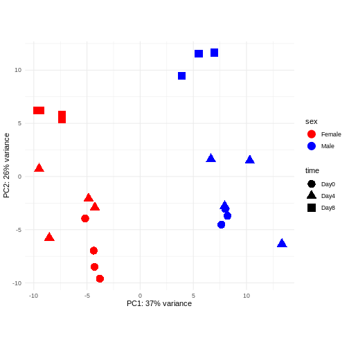
Challenge: Discuss the following points with your neighbour
Assume you are mainly interested in expression changes associated with the time after infection (Reminder Day0 -> before infection). What do you need to consider in downstream analysis?
Consider an experimental design where you have multiple samples from the same donor. You are still interested in differences by time and observe the following PCA plot. What does this PCA plot suggest?
OUTPUT
using ntop=500 top features by variance
The major signal in this data (37% variance) is associated with sex. As we are not interested in sex-specific changes over time, we need to adjust for this in downstream analysis (see next episodes) and keep it in mind for further exploratory downstream analysis. A possible way to do so is to remove genes on sex chromosomes.
- A strong donor effect, that needs to be accounted for.
- What does PC1 (37% variance) represent? Looks like 2 donor groups?
- No association of PC1 and PC2 with time –> no or weak transcriptional effect of time –> Check association with higher PCs (e.g., PC3,PC4, ..)
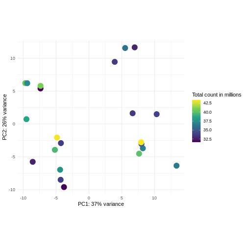
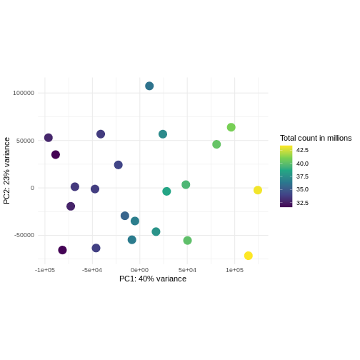
Challenge: Plot the PCA colored by library sizes.
Compare before and after variance stabilizing transformation.
Hint: The DESeq2::plotPCA expect an object of the
class DESeqTransform as input. You can transform a
SummarizedExperiment object using
plotPCA(DESeqTransform(se))
R
pcaDataVst <- DESeq2::plotPCA(vsd, intgroup = c("libSize"),
                              returnData = TRUE)
OUTPUT
using ntop=500 top features by varianceR
percentVar <- round(100 * attr(pcaDataVst, "percentVar"))
ggplot(pcaDataVst, aes(x = PC1, y = PC2)) +
    geom_point(aes(color = libSize / 1e6), size = 5) +
    theme_minimal() +
    xlab(paste0("PC1: ", percentVar[1], "% variance")) +
    ylab(paste0("PC2: ", percentVar[2], "% variance")) +
    coord_fixed() +
    scale_color_continuous("Total count in millions", type = "viridis")
R
pcaDataCts <- DESeq2::plotPCA(DESeqTransform(se), intgroup = c("libSize"),
                              returnData = TRUE)
OUTPUT
using ntop=500 top features by varianceR
percentVar <- round(100 * attr(pcaDataCts, "percentVar"))
ggplot(pcaDataCts, aes(x = PC1, y = PC2)) +
    geom_point(aes(color = libSize / 1e6), size = 5) +
    theme_minimal() +
    xlab(paste0("PC1: ", percentVar[1], "% variance")) +
    ylab(paste0("PC2: ", percentVar[2], "% variance")) +
    coord_fixed() +
    scale_color_continuous("Total count in millions", type = "viridis")
Interactive exploratory data analysis
Often it is useful to look at QC plots in an interactive way to directly explore different experimental factors or get insides from someone without coding experience. Useful tools for interactive exploratory data analysis for RNA-seq are Glimma and iSEE
Challenge: Interactively explore our data using iSEE
R
## Convert DESeqDataSet object to a SingleCellExperiment object, in order to
## be able to store the PCA representation
sce <- as(dds, "SingleCellExperiment")

## Add PCA to the 'reducedDim' slot
stopifnot(rownames(pcaData) == colnames(sce))
reducedDim(sce, "PCA") <- as.matrix(pcaData[, c("PC1", "PC2")])

## Add variance-stabilized data as a new assay
stopifnot(colnames(vsd) == colnames(sce))
assay(sce, "vsd") <- assay(vsd)

app <- iSEE(sce)
shiny::runApp(app)
Session info
R
sessionInfo()
OUTPUT
R version 4.5.2 (2025-10-31)
Platform: x86_64-pc-linux-gnu
Running under: Ubuntu 22.04.5 LTS

Matrix products: default
BLAS:   /usr/lib/x86_64-linux-gnu/blas/libblas.so.3.10.0
LAPACK: /usr/lib/x86_64-linux-gnu/lapack/liblapack.so.3.10.0  LAPACK version 3.10.0

locale:
 [1] LC_CTYPE=C.UTF-8       LC_NUMERIC=C           LC_TIME=C.UTF-8
 [4] LC_COLLATE=C.UTF-8     LC_MONETARY=C.UTF-8    LC_MESSAGES=C.UTF-8
 [7] LC_PAPER=C.UTF-8       LC_NAME=C              LC_ADDRESS=C
[10] LC_TELEPHONE=C         LC_MEASUREMENT=C.UTF-8 LC_IDENTIFICATION=C

time zone: UTC
tzcode source: system (glibc)

attached base packages:
[1] grid      stats4    stats     graphics  grDevices utils     datasets
[8] methods   base

other attached packages:
 [1] iSEE_2.20.0                 SingleCellExperiment_1.30.1
 [3] hexbin_1.28.5               RColorBrewer_1.1-3
 [5] ComplexHeatmap_2.24.1       ggplot2_4.0.0
 [7] vsn_3.76.0                  DESeq2_1.48.2
 [9] SummarizedExperiment_1.38.1 Biobase_2.68.0
[11] MatrixGenerics_1.20.0       matrixStats_1.5.0
[13] GenomicRanges_1.60.0        GenomeInfoDb_1.44.3
[15] IRanges_2.42.0              S4Vectors_0.46.0
[17] BiocGenerics_0.54.1         generics_0.1.4

loaded via a namespace (and not attached):
 [1] rlang_1.1.6             magrittr_2.0.4          shinydashboard_0.7.3
 [4] clue_0.3-66             GetoptLong_1.0.5        otel_0.2.0
 [7] compiler_4.5.2          mgcv_1.9-3              png_0.1-8
[10] vctrs_0.6.5             pkgconfig_2.0.3         shape_1.4.6.1
[13] crayon_1.5.3            fastmap_1.2.0           XVector_0.48.0
[16] labeling_0.4.3          promises_1.5.0          shinyAce_0.4.4
[19] UCSC.utils_1.4.0        preprocessCore_1.70.0   xfun_0.54
[22] cachem_1.1.0            jsonlite_2.0.0          listviewer_4.0.0
[25] later_1.4.4             DelayedArray_0.34.1     BiocParallel_1.42.2
[28] parallel_4.5.2          cluster_2.1.8.1         R6_2.6.1
[31] bslib_0.9.0             limma_3.64.3            jquerylib_0.1.4
[34] Rcpp_1.1.0              iterators_1.0.14        knitr_1.50
[37] httpuv_1.6.16           Matrix_1.7-4            splines_4.5.2
[40] igraph_2.2.1            tidyselect_1.2.1        abind_1.4-8
[43] yaml_2.3.10             doParallel_1.0.17       codetools_0.2-20
[46] affy_1.86.0             miniUI_0.1.2            lattice_0.22-7
[49] tibble_3.3.0            shiny_1.11.1            withr_3.0.2
[52] S7_0.2.0                evaluate_1.0.5          circlize_0.4.16
[55] pillar_1.11.1           affyio_1.78.0           BiocManager_1.30.26
[58] renv_1.1.5              DT_0.34.0               foreach_1.5.2
[61] shinyjs_2.1.0           scales_1.4.0            xtable_1.8-4
[64] glue_1.8.0              tools_4.5.2             colourpicker_1.3.0
[67] locfit_1.5-9.12         colorspace_2.1-2        nlme_3.1-168
[70] GenomeInfoDbData_1.2.14 vipor_0.4.7             cli_3.6.5
[73] viridisLite_0.4.2       S4Arrays_1.8.1          dplyr_1.1.4
[76] gtable_0.3.6            rintrojs_0.3.4          sass_0.4.10
[79] digest_0.6.37           SparseArray_1.8.1       ggrepel_0.9.6
[82] rjson_0.2.23            htmlwidgets_1.6.4       farver_2.1.2
[85] htmltools_0.5.8.1       lifecycle_1.0.4         shinyWidgets_0.9.0
[88] httr_1.4.7              GlobalOptions_0.1.2     statmod_1.5.1
[91] mime_0.13 - Exploratory analysis is essential for quality control and to detect potential problems with a data set.
- Different classes of exploratory analysis methods expect differently preprocessed data. The most commonly used methods expect counts to be normalized and log-transformed (or similar- more sensitive/sophisticated), to be closer to homoskedastic. Other methods work directly on the raw counts.
Content from Differential expression analysis
Last updated on 2025-11-13 | Edit this page
Estimated time 105 minutes
Overview
Questions
- What are the steps performed in a typical differential expression analysis?
- How does one interpret the output of DESeq2?
Objectives
- Explain the steps involved in a differential expression analysis.
- Explain how to perform these steps in R, using DESeq2.
Differential expression inference
A major goal of RNA-seq data analysis is the quantification and statistical inference of systematic changes between experimental groups or conditions (e.g., treatment vs. control, timepoints, tissues). This is typically performed by identifying genes with differential expression pattern using between- and within-condition variability and thus requires biological replicates (multiple sample of the same condition). Multiple software packages exist to perform differential expression analysis. Comparative studies have shown some concordance of differentially expressed (DE) genes, but also variability between tools with no tool consistently outperforming all others (see Soneson and Delorenzi, 2013). In the following we will explain and conduct differential expression analysis using the DESeq2 software package. The edgeR package implements similar methods following the same main assumptions about count data. Both packages show a general good and stable performance with comparable results.
The DESeqDataSet
To run DESeq2 we need to represent our count data as
object of the DESeqDataSet class. The
DESeqDataSet is an extension of the
SummarizedExperiment class (see section Importing and annotating quantified data
into R ) that stores a design formula in addition to the
count assay(s) and feature (here gene) and sample metadata. The
design formula expresses the variables which will be used in
modeling. These are typically the variable of interest (group variable)
and other variables you want to account for (e.g., batch effect
variables). A detailed explanation of design formulas and
related design matrices will follow in the section about extra exploration of design matrices.
Objects of the DESeqDataSet class can be build from count
matrices, SummarizedExperiment
objects, transcript
abundance files or htseq
count files.
Load packages
R
suppressPackageStartupMessages({
    library(SummarizedExperiment)
    library(DESeq2)
    library(ggplot2)
    library(ExploreModelMatrix)
    library(cowplot)
    library(ComplexHeatmap)
    library(apeglm)
})
Load data
Let’s load in our SummarizedExperiment object again. In
the last episode for quality control exploration, we removed ~35% genes
that had 5 or fewer counts because they had too little information in
them. For DESeq2 statistical analysis, we do not technically have to
remove these genes because by default it will do some independent
filtering, but it can reduce the memory size of the
DESeqDataSet object resulting in faster computation. Plus,
we do not want these genes cluttering up some of the visualizations.
R
se <- readRDS("data/GSE96870_se.rds")
se <- se[rowSums(assay(se, "counts")) > 5, ]
Create DESeqDataSet
The design matrix we will use in this example is
~ sex + time. This will allow us test the difference
between males and females (averaged over time point) and the difference
between day 0, 4 and 8 (averaged over males and females). If we wanted
to test other comparisons (e.g., Female.Day8 vs. Female.Day0 and also
Male.Day8 vs. Male.Day0) we could use a different design matrix to more
easily extract those pairwise comparisons.
R
dds <- DESeq2::DESeqDataSet(se,
                            design = ~ sex + time)
WARNING
Warning in DESeq2::DESeqDataSet(se, design = ~sex + time): some variables in
design formula are characters, converting to factorsThe function to generate a DESeqDataSet needs to be
adapted depending on the input type, e.g,
R
#From SummarizedExperiment object
ddsSE <- DESeqDataSet(se, design = ~ sex + time)

#From count matrix
dds <- DESeqDataSetFromMatrix(countData = assays(se)$counts,
                              colData = colData(se),
                              design = ~ sex + time)
Normalization
DESeq2 and edgeR make the following
assumptions:
- most genes are not differentially expressed
- the probability of a read mapping to a specific gene is the same for all samples within the same group
As shown in the previous section
on exploratory data analysis the total counts of a sample (even from the
same condition) depends on the library size (total number of reads
sequenced). To compare the variability of counts from a specific gene
between and within groups we first need to account for library sizes and
compositional effects. Recall the estimateSizeFactors()
function from the previous section:
R
dds <- estimateSizeFactors(dds)
DESeq2 uses the “Relative Log Expression” (RLE) method to calculate sample-wise size factors tĥat account for read depth and library composition. edgeR uses the “Trimmed Mean of M-Values” (TMM) method to account for library size differences and compositional effects. edgeR’s normalization factors and DESeq2’s size factors yield similar results, but are not equivalent theoretical parameters.
Statistical modeling
DESeq2 and edgeR model RNA-seq counts as
negative binomial distribution to account for a limited
number of replicates per group, a mean-variance dependency (see exploratory data analysis) and a
skewed count distribution.
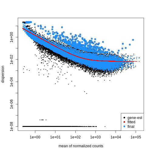
Dispersion
The within-group variance of the counts for a gene following a negative binomial distribution with mean \(\mu\) can be modeled as:
\(var = \mu + \theta \mu^2\)
\(\theta\) represents the
gene-specific dispersion, a measure of variability or
spread in the data. As a second step, we need to estimate gene-wise
dispersions to get the expected within-group variance and test for group
differences. Good dispersion estimates are challenging with a few
samples per group only. Thus, information from genes with similar
expression pattern are “borrowed”. Gene-wise dispersion estimates are
shrinked towards center values of the observed distribution of
dispersions. With DESeq2 we can get dispersion estimates
using the estimateDispersions() function. We can visualize
the effect of shrinkage using plotDispEsts():
R
dds <- estimateDispersions(dds)
OUTPUT
gene-wise dispersion estimatesOUTPUT
mean-dispersion relationshipOUTPUT
final dispersion estimatesR
plotDispEsts(dds)
Testing
We can use the nbinomWaldTest()function of
DESeq2 to fit a generalized linear model (GLM) and
compute log2 fold changes (synonymous with “GLM coefficients”,
“beta coefficients” or “effect size”) corresponding to the variables of
the design matrix. The design matrix is directly
related to the design formula and automatically derived from
it. Assume a design formula with one variable (~ treatment)
and two factor levels (treatment and control). The mean expression \(\mu_{j}\) of a specific gene in sample
\(j\) will be modeled as following:
\(log(μ_j) = β_0 + x_j β_T\),
with \(β_T\) corresponding to the log2 fold change of the treatment groups, \(x_j\) = 1, if \(j\) belongs to the treatment group and \(x_j\) = 0, if \(j\) belongs to the control group.
Finally, the estimated log2 fold changes are scaled by their standard error and tested for being significantly different from 0 using the Wald test.
R
dds <- nbinomWaldTest(dds)
Note
Standard differential expression analysis as performed above is
wrapped into a single function, DESeq(). Running the first
code chunk is equivalent to running the second one:
R
dds <- DESeq(dds)
R
dds <- estimateSizeFactors(dds)
dds <- estimateDispersions(dds)
dds <- nbinomWaldTest(dds)
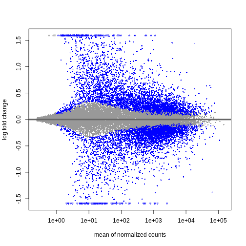
Explore results for specific contrasts
The results() function can be used to extract gene-wise
test statistics, such as log2 fold changes and (adjusted) p-values. The
comparison of interest can be defined using contrasts, which are linear
combinations of the model coefficients (equivalent to combinations of
columns within the design matrix) and thus directly related to
the design formula. A detailed explanation of design matrices and how to
use them to specify different contrasts of interest can be found in the
section on the exploration of design
matrices. In the results() function a contrast can be
represented by the variable of interest (reference variable) and the
related level to compare using the contrast argument. By
default the reference variable will be the last
variable of the design formula, the reference level
will be the first factor level and the last level will be used
for comparison. You can also explicitly specify a contrast by the
name argument of the results() function. Names
of all available contrasts can be accessed using
resultsNames().
Challenge
What will be the default contrast, reference
level and “last level” for comparisons when
running results(dds) for the example used in this
lesson?
Hint: Check the design formula used to build the object.
In the lesson example the last variable of the design formula is
time. The reference level (first in
alphabetical order) is Day0 and the last
level is Day8
R
levels(dds$time)
OUTPUT
[1] "Day0" "Day4" "Day8"No worries, if you had difficulties to identify the default contrast
the output of the results() function explicitly states the
contrast it is referring to (see below)!
To explore the output of the results() function we can
use the summary() function and order results by
significance (p-value). Here we assume that we are interested in changes
over time (“variable of interest”), more specifically genes
with differential expression between Day0 (“reference
level”) and Day8 (“level to compare”). The model we used
included the sex variable (see above). Thus our results
will be “corrected” for sex-related differences.
R
## Day 8 vs Day 0
resTime <- results(dds, contrast = c("time", "Day8", "Day0"))
summary(resTime)
OUTPUT
out of 27430 with nonzero total read count
adjusted p-value < 0.1
LFC > 0 (up)       : 4472, 16%
LFC < 0 (down)     : 4282, 16%
outliers [1]       : 10, 0.036%
low counts [2]     : 3723, 14%
(mean count < 1)
[1] see 'cooksCutoff' argument of ?results
[2] see 'independentFiltering' argument of ?results
R
# View(resTime)
head(resTime[order(resTime$pvalue), ])
OUTPUT
log2 fold change (MLE): time Day8 vs Day0
Wald test p-value: time Day8 vs Day0
DataFrame with 6 rows and 6 columns
               baseMean log2FoldChange     lfcSE      stat      pvalue
              <numeric>      <numeric> <numeric> <numeric>   <numeric>
Asl             701.343       1.117332 0.0594128   18.8062 6.71212e-79
Apod          18765.146       1.446981 0.0805056   17.9737 3.13229e-72
Cyp2d22        2550.480       0.910202 0.0556002   16.3705 3.10712e-60
Klk6            546.503      -1.671897 0.1057395  -15.8115 2.59339e-56
Fcrls           184.235      -1.947016 0.1277235  -15.2440 1.80488e-52
A330076C08Rik   107.250      -1.749957 0.1155125  -15.1495 7.63434e-52
                     padj
                <numeric>
Asl           1.59057e-74
Apod          3.71130e-68
Cyp2d22       2.45431e-56
Klk6          1.53639e-52
Fcrls         8.55406e-49
A330076C08Rik 3.01518e-48Both of the below ways of specifying the contrast are essentially
equivalent. The name parameter can be accessed using
resultsNames().
R
resTime <- results(dds, contrast = c("time", "Day8", "Day0"))
resTime <- results(dds, name = "time_Day8_vs_Day0")
Challenge
Explore the DE genes between males and females independent of time.
Hint: You don’t need to fit the GLM again. Use
resultsNames() to get the correct contrast.
R
## Male vs Female
resSex <- results(dds, contrast = c("sex", "Male", "Female"))
summary(resSex)
OUTPUT
out of 27430 with nonzero total read count
adjusted p-value < 0.1
LFC > 0 (up)       : 51, 0.19%
LFC < 0 (down)     : 70, 0.26%
outliers [1]       : 10, 0.036%
low counts [2]     : 8504, 31%
(mean count < 6)
[1] see 'cooksCutoff' argument of ?results
[2] see 'independentFiltering' argument of ?results
R
head(resSex[order(resSex$pvalue), ])
OUTPUT
log2 fold change (MLE): sex Male vs Female
Wald test p-value: sex Male vs Female
DataFrame with 6 rows and 6 columns
               baseMean log2FoldChange     lfcSE      stat       pvalue
              <numeric>      <numeric> <numeric> <numeric>    <numeric>
Xist         22603.0359      -11.60429  0.336282  -34.5076 6.16852e-261
Ddx3y         2072.9436       11.87241  0.397493   29.8683 5.08722e-196
Eif2s3y       1410.8750       12.62513  0.565194   22.3377 1.58997e-110
Kdm5d          692.1672       12.55386  0.593607   21.1484  2.85293e-99
Uty            667.4375       12.01728  0.593573   20.2457  3.87772e-91
LOC105243748    52.9669        9.08325  0.597575   15.2002  3.52699e-52
                     padj
                <numeric>
Xist         1.16684e-256
Ddx3y        4.81149e-192
Eif2s3y      1.00253e-106
Kdm5d         1.34915e-95
Uty           1.46702e-87
LOC105243748 1.11194e-48Multiple testing correction
Due to the high number of tests (one per gene) our DE results will contain a substantial number of false positives. For example, if we tested 20,000 genes at a threshold of \(\alpha = 0.05\) we would expect 1,000 significant DE genes with no differential expression.
To account for this expected high number of false positives, we can
correct our results for multiple testing. By default
DESeq2 uses the Benjamini-Hochberg
procedure to calculate adjusted p-values (padj) for
DE results.
Independent Filtering and log-fold shrinkage
We can visualize the results in many ways. A good check is to explore
the relationship between log2fold changes, significant DE
genes and the genes mean count. DESeq2
provides a useful function to do so, plotMA().
R
plotMA(resTime)
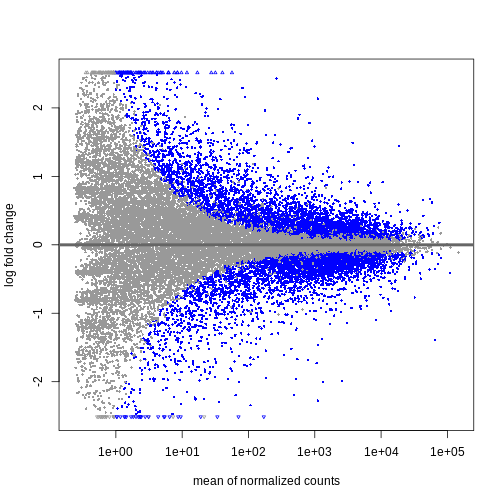
We can see that genes with a low mean count tend to have larger log fold changes. This is caused by counts from lowly expressed genes tending to be very noisy. We can shrink the log fold changes of these genes with low mean and high dispersion, as they contain little information.
R
resTimeLfc <- lfcShrink(dds, coef = "time_Day8_vs_Day0", res = resTime)
OUTPUT
using 'apeglm' for LFC shrinkage. If used in published research, please cite:
    Zhu, A., Ibrahim, J.G., Love, M.I. (2018) Heavy-tailed prior distributions for
    sequence count data: removing the noise and preserving large differences.
    Bioinformatics. https://doi.org/10.1093/bioinformatics/bty895
R
plotMA(resTimeLfc)
 Shrinkage of log fold changes is useful for visualization and ranking of
genes, but for result exploration typically the
Shrinkage of log fold changes is useful for visualization and ranking of
genes, but for result exploration typically the
independentFiltering argument is used to remove lowly
expressed genes.
Challenge
By default independentFiltering is set to
TRUE. What happens without filtering lowly expressed genes?
Use the summary() function to compare the results. Most of
the lowly expressed genes are not significantly differential expressed
(blue in the above MA plots). What could cause the difference in the
results then?
R
resTimeNotFiltered <- results(dds,
                              contrast = c("time", "Day8", "Day0"),
                              independentFiltering = FALSE)
summary(resTime)
OUTPUT
out of 27430 with nonzero total read count
adjusted p-value < 0.1
LFC > 0 (up)       : 4472, 16%
LFC < 0 (down)     : 4282, 16%
outliers [1]       : 10, 0.036%
low counts [2]     : 3723, 14%
(mean count < 1)
[1] see 'cooksCutoff' argument of ?results
[2] see 'independentFiltering' argument of ?results
R
summary(resTimeNotFiltered)
OUTPUT
out of 27430 with nonzero total read count
adjusted p-value < 0.1
LFC > 0 (up)       : 4324, 16%
LFC < 0 (down)     : 4129, 15%
outliers [1]       : 10, 0.036%
low counts [2]     : 0, 0%
(mean count < 0)
[1] see 'cooksCutoff' argument of ?results
[2] see 'independentFiltering' argument of ?results
Genes with very low counts are not likely to see significant differences typically due to high dispersion. Filtering of lowly expressed genes thus increased detection power at the same experiment-wide false positive rate.
Visualize selected set of genes
The amount of DE genes can be overwhelming and a ranked list of genes can still be hard to interpret with regards to an experimental question. Visualizing gene expression can help to detect expression pattern or group of genes with related functions. We will perform systematic detection of over represented groups of genes in a later section. Before this visualization can already help us to get a good intuition about what to expect.
We will use transformed data (see exploratory data analysis) and the top differentially expressed genes for visualization. A heatmap can reveal expression pattern across sample groups (columns) and automatically orders genes (rows) according to their similarity.
R
# Transform counts
vsd <- vst(dds, blind = TRUE)

# Get top DE genes
genes <- resTime[order(resTime$pvalue), ] |>
         head(10) |>
         rownames()
heatmapData <- assay(vsd)[genes, ]

# Scale counts for visualization
heatmapData <- t(scale(t(heatmapData)))

# Add annotation
heatmapColAnnot <- data.frame(colData(vsd)[, c("time", "sex")])
heatmapColAnnot <- HeatmapAnnotation(df = heatmapColAnnot)

# Plot as heatmap
ComplexHeatmap::Heatmap(heatmapData,
                        top_annotation = heatmapColAnnot,
                        cluster_rows = TRUE, cluster_columns = FALSE)
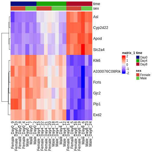
Challenge
Check the heatmap and top DE genes. Do you find something expected/unexpected in terms of change across all 3 time points?
Output results
We may want to to output our results out of R to have a stand-alone
file. The format of resTime only has the gene symbols as
rownames, so let us join the gene annotation information, and then write
out as .csv file:
R
head(as.data.frame(resTime))
head(as.data.frame(rowRanges(se)))

temp <- cbind(as.data.frame(rowRanges(se)),
              as.data.frame(resTime))

write.csv(temp, file = "output/Day8vsDay0.csv")
- With DESeq2, the main steps of a differential expression analysis (size factor estimation, dispersion estimation, calculation of test statistics) are wrapped in a single function: DESeq().
- Independent filtering of lowly expressed genes is often beneficial.
Content from Extra exploration of design matrices
Last updated on 2025-11-13 | Edit this page
Estimated time 60 minutes
Overview
Questions
- How can one translate biological questions and comparisons to statistical terms suitable for use with RNA-seq analysis packages?
Objectives
- Explain the formula notation and design matrices.
- Explore different designs and learn how to interpret coefficients.
Loading required packages and reading data
We start by loading a few packages that will be needed in this episode. In particular, the ExploreModelMatrix package provides resources for exploring design matrices in a graphical fashion, for easier interpretation.
R
suppressPackageStartupMessages({
    library(SummarizedExperiment)
    library(ExploreModelMatrix)
    library(dplyr)
    library(DESeq2)
})
Next, we read the metadata table for our data set. Because we want to explore many different design matrices, we will read in the 4th file we downloaded but haven’t used yet: that for both Cerebellum and Spinal Cord samples (45 samples total). As seen in previous episodes, the metadata contains information about the age, sex, infection status, time of measurement and tissue of the collected samples. Note that Day0 always corresponds to non-infected samples, and that infected samples are collected on days 4 and 8. Moreover, all mice have the same age (8 weeks). Hence, in the first part of this episode we consider only the sex, tissue and time variables further.
R
meta <- read.csv("data/GSE96870_coldata_all.csv", row.names = 1)
# Here, for brevity we only print the first rows of the data.frame
head(meta)
OUTPUT
                     title geo_accession     organism     age    sex
GSM2545336 CNS_RNA-seq_10C    GSM2545336 Mus musculus 8 weeks Female
GSM2545337 CNS_RNA-seq_11C    GSM2545337 Mus musculus 8 weeks Female
GSM2545338 CNS_RNA-seq_12C    GSM2545338 Mus musculus 8 weeks Female
GSM2545339 CNS_RNA-seq_13C    GSM2545339 Mus musculus 8 weeks Female
GSM2545340 CNS_RNA-seq_14C    GSM2545340 Mus musculus 8 weeks   Male
GSM2545341 CNS_RNA-seq_17C    GSM2545341 Mus musculus 8 weeks   Male
             infection  strain time     tissue mouse
GSM2545336  InfluenzaA C57BL/6 Day8 Cerebellum    14
GSM2545337 NonInfected C57BL/6 Day0 Cerebellum     9
GSM2545338 NonInfected C57BL/6 Day0 Cerebellum    10
GSM2545339  InfluenzaA C57BL/6 Day4 Cerebellum    15
GSM2545340  InfluenzaA C57BL/6 Day4 Cerebellum    18
GSM2545341  InfluenzaA C57BL/6 Day8 Cerebellum     6
R
table(meta$time, meta$infection)
OUTPUT
       InfluenzaA NonInfected
  Day0          0          15
  Day4         16           0
  Day8         14           0
R
table(meta$age)
OUTPUT
8 weeks
     45
We can start by visualizing the number of observations for each combination of the three predictor variables.
R
vd <- VisualizeDesign(sampleData = meta,
                      designFormula = ~ tissue + time + sex)
vd$cooccurrenceplots
OUTPUT
$`tissue = Cerebellum`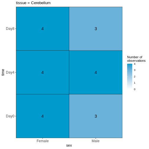
OUTPUT
$`tissue = Spinalcord`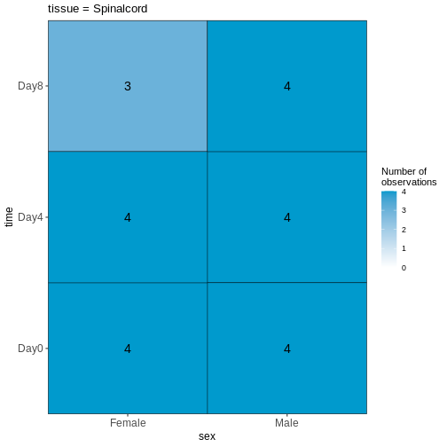
Challenge
Based on this visualization, would you say that the data set is balanced, or are there combinations of predictor variables that are severely over- or underrepresented?
Compare males and females, non-infected spinal cord
Next, we will set up our first design matrix. Here, we will focus on
the uninfected (Day0) spinal cord samples, and our aim is to compare the
male and female mice. Thus, we first subset the metadata to only the
samples of interest, and next set up and visualize the design matrix
with a single predictor variable (sex). By defining the design formula
as ~ sex, we tell R to include an intercept in the design.
This intercept will represent the ‘baseline’ level of the predictor
variable, which in this case is selected to be the Female mice. If not
explicitly specified, R will order the values of the predictor in
alphabetical order and select the first one as the reference or baseline
level.
R
## Subset metadata
meta_noninf_spc <- meta %>% filter(time == "Day0" &
                                       tissue == "Spinalcord")
meta_noninf_spc
OUTPUT
                     title geo_accession     organism     age    sex
GSM2545356 CNS_RNA-seq_574    GSM2545356 Mus musculus 8 weeks   Male
GSM2545357 CNS_RNA-seq_575    GSM2545357 Mus musculus 8 weeks   Male
GSM2545358 CNS_RNA-seq_583    GSM2545358 Mus musculus 8 weeks Female
GSM2545361 CNS_RNA-seq_590    GSM2545361 Mus musculus 8 weeks   Male
GSM2545364 CNS_RNA-seq_709    GSM2545364 Mus musculus 8 weeks Female
GSM2545365 CNS_RNA-seq_710    GSM2545365 Mus musculus 8 weeks Female
GSM2545366 CNS_RNA-seq_711    GSM2545366 Mus musculus 8 weeks Female
GSM2545367 CNS_RNA-seq_713    GSM2545367 Mus musculus 8 weeks   Male
             infection  strain time     tissue mouse
GSM2545356 NonInfected C57BL/6 Day0 Spinalcord     2
GSM2545357 NonInfected C57BL/6 Day0 Spinalcord     3
GSM2545358 NonInfected C57BL/6 Day0 Spinalcord     4
GSM2545361 NonInfected C57BL/6 Day0 Spinalcord     7
GSM2545364 NonInfected C57BL/6 Day0 Spinalcord     8
GSM2545365 NonInfected C57BL/6 Day0 Spinalcord     9
GSM2545366 NonInfected C57BL/6 Day0 Spinalcord    10
GSM2545367 NonInfected C57BL/6 Day0 Spinalcord    11
R
## Use ExploreModelMatrix to create a design matrix and visualizations, given
## the desired design formula.
vd <- VisualizeDesign(sampleData = meta_noninf_spc,
                      designFormula = ~ sex)
vd$designmatrix
OUTPUT
           (Intercept) sexMale
GSM2545356           1       1
GSM2545357           1       1
GSM2545358           1       0
GSM2545361           1       1
GSM2545364           1       0
GSM2545365           1       0
GSM2545366           1       0
GSM2545367           1       1
R
vd$plotlist
OUTPUT
[[1]]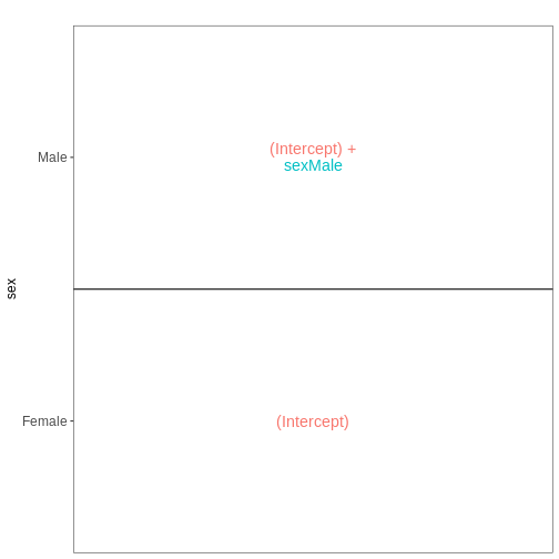
R
## Note that we can also generate the design matrix like this
model.matrix(~ sex, data = meta_noninf_spc)
OUTPUT
           (Intercept) sexMale
GSM2545356           1       1
GSM2545357           1       1
GSM2545358           1       0
GSM2545361           1       1
GSM2545364           1       0
GSM2545365           1       0
GSM2545366           1       0
GSM2545367           1       1
attr(,"assign")
[1] 0 1
attr(,"contrasts")
attr(,"contrasts")$sex
[1] "contr.treatment"Challenge
With this design, what is the interpretation of the
sexMale coefficient?
Challenge
Set up the design formula to compare male and female spinal cord samples from Day0 as above, but instruct R to not include an intercept in the model. How does this change the interpretation of the coefficients? What contrast would have to be specified to compare the mean expression of a gene between male and female mice?
R
meta_noninf_spc <- meta %>% filter(time == "Day0" &
                                       tissue == "Spinalcord")
meta_noninf_spc
OUTPUT
                     title geo_accession     organism     age    sex
GSM2545356 CNS_RNA-seq_574    GSM2545356 Mus musculus 8 weeks   Male
GSM2545357 CNS_RNA-seq_575    GSM2545357 Mus musculus 8 weeks   Male
GSM2545358 CNS_RNA-seq_583    GSM2545358 Mus musculus 8 weeks Female
GSM2545361 CNS_RNA-seq_590    GSM2545361 Mus musculus 8 weeks   Male
GSM2545364 CNS_RNA-seq_709    GSM2545364 Mus musculus 8 weeks Female
GSM2545365 CNS_RNA-seq_710    GSM2545365 Mus musculus 8 weeks Female
GSM2545366 CNS_RNA-seq_711    GSM2545366 Mus musculus 8 weeks Female
GSM2545367 CNS_RNA-seq_713    GSM2545367 Mus musculus 8 weeks   Male
             infection  strain time     tissue mouse
GSM2545356 NonInfected C57BL/6 Day0 Spinalcord     2
GSM2545357 NonInfected C57BL/6 Day0 Spinalcord     3
GSM2545358 NonInfected C57BL/6 Day0 Spinalcord     4
GSM2545361 NonInfected C57BL/6 Day0 Spinalcord     7
GSM2545364 NonInfected C57BL/6 Day0 Spinalcord     8
GSM2545365 NonInfected C57BL/6 Day0 Spinalcord     9
GSM2545366 NonInfected C57BL/6 Day0 Spinalcord    10
GSM2545367 NonInfected C57BL/6 Day0 Spinalcord    11
R
vd <- VisualizeDesign(sampleData = meta_noninf_spc,
                      designFormula = ~ 0 + sex)
vd$designmatrix
OUTPUT
           sexFemale sexMale
GSM2545356         0       1
GSM2545357         0       1
GSM2545358         1       0
GSM2545361         0       1
GSM2545364         1       0
GSM2545365         1       0
GSM2545366         1       0
GSM2545367         0       1
R
vd$plotlist
OUTPUT
[[1]]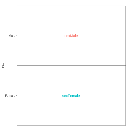
Challenge
Set up the design formula to compare the three time points (Day0,
Day4, Day8) in the male spinal cord samples, and visualize it using
ExploreModelMatrix.
R
meta_male_spc <- meta %>% filter(sex == "Male" & tissue == "Spinalcord")
meta_male_spc
OUTPUT
                     title geo_accession     organism     age  sex   infection
GSM2545355 CNS_RNA-seq_571    GSM2545355 Mus musculus 8 weeks Male  InfluenzaA
GSM2545356 CNS_RNA-seq_574    GSM2545356 Mus musculus 8 weeks Male NonInfected
GSM2545357 CNS_RNA-seq_575    GSM2545357 Mus musculus 8 weeks Male NonInfected
GSM2545360 CNS_RNA-seq_589    GSM2545360 Mus musculus 8 weeks Male  InfluenzaA
GSM2545361 CNS_RNA-seq_590    GSM2545361 Mus musculus 8 weeks Male NonInfected
GSM2545367 CNS_RNA-seq_713    GSM2545367 Mus musculus 8 weeks Male NonInfected
GSM2545368 CNS_RNA-seq_728    GSM2545368 Mus musculus 8 weeks Male  InfluenzaA
GSM2545369 CNS_RNA-seq_729    GSM2545369 Mus musculus 8 weeks Male  InfluenzaA
GSM2545372 CNS_RNA-seq_733    GSM2545372 Mus musculus 8 weeks Male  InfluenzaA
GSM2545373 CNS_RNA-seq_735    GSM2545373 Mus musculus 8 weeks Male  InfluenzaA
GSM2545378 CNS_RNA-seq_742    GSM2545378 Mus musculus 8 weeks Male  InfluenzaA
GSM2545379 CNS_RNA-seq_743    GSM2545379 Mus musculus 8 weeks Male  InfluenzaA
            strain time     tissue mouse
GSM2545355 C57BL/6 Day4 Spinalcord     1
GSM2545356 C57BL/6 Day0 Spinalcord     2
GSM2545357 C57BL/6 Day0 Spinalcord     3
GSM2545360 C57BL/6 Day8 Spinalcord     6
GSM2545361 C57BL/6 Day0 Spinalcord     7
GSM2545367 C57BL/6 Day0 Spinalcord    11
GSM2545368 C57BL/6 Day4 Spinalcord    12
GSM2545369 C57BL/6 Day4 Spinalcord    13
GSM2545372 C57BL/6 Day8 Spinalcord    17
GSM2545373 C57BL/6 Day4 Spinalcord    18
GSM2545378 C57BL/6 Day8 Spinalcord    23
GSM2545379 C57BL/6 Day8 Spinalcord    24
R
vd <- VisualizeDesign(sampleData = meta_male_spc, designFormula = ~ time)
vd$designmatrix
OUTPUT
           (Intercept) timeDay4 timeDay8
GSM2545355           1        1        0
GSM2545356           1        0        0
GSM2545357           1        0        0
GSM2545360           1        0        1
GSM2545361           1        0        0
GSM2545367           1        0        0
GSM2545368           1        1        0
GSM2545369           1        1        0
GSM2545372           1        0        1
GSM2545373           1        1        0
GSM2545378           1        0        1
GSM2545379           1        0        1
R
vd$plotlist
OUTPUT
[[1]]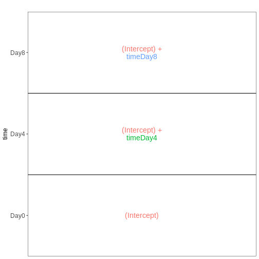
Factorial design without interactions
Next, we again consider only non-infected mice, but fit a model incorporating both sex and tissue as predictors. We assume that the tissue differences are the same for both male and female mice, and consequently fit an additive model, without interaction terms.
R
meta_noninf <- meta %>% filter(time == "Day0")
meta_noninf
OUTPUT
                     title geo_accession     organism     age    sex
GSM2545337 CNS_RNA-seq_11C    GSM2545337 Mus musculus 8 weeks Female
GSM2545338 CNS_RNA-seq_12C    GSM2545338 Mus musculus 8 weeks Female
GSM2545343 CNS_RNA-seq_20C    GSM2545343 Mus musculus 8 weeks   Male
GSM2545348 CNS_RNA-seq_27C    GSM2545348 Mus musculus 8 weeks Female
GSM2545349 CNS_RNA-seq_28C    GSM2545349 Mus musculus 8 weeks   Male
GSM2545353  CNS_RNA-seq_3C    GSM2545353 Mus musculus 8 weeks Female
GSM2545354  CNS_RNA-seq_4C    GSM2545354 Mus musculus 8 weeks   Male
GSM2545356 CNS_RNA-seq_574    GSM2545356 Mus musculus 8 weeks   Male
GSM2545357 CNS_RNA-seq_575    GSM2545357 Mus musculus 8 weeks   Male
GSM2545358 CNS_RNA-seq_583    GSM2545358 Mus musculus 8 weeks Female
GSM2545361 CNS_RNA-seq_590    GSM2545361 Mus musculus 8 weeks   Male
GSM2545364 CNS_RNA-seq_709    GSM2545364 Mus musculus 8 weeks Female
GSM2545365 CNS_RNA-seq_710    GSM2545365 Mus musculus 8 weeks Female
GSM2545366 CNS_RNA-seq_711    GSM2545366 Mus musculus 8 weeks Female
GSM2545367 CNS_RNA-seq_713    GSM2545367 Mus musculus 8 weeks   Male
             infection  strain time     tissue mouse
GSM2545337 NonInfected C57BL/6 Day0 Cerebellum     9
GSM2545338 NonInfected C57BL/6 Day0 Cerebellum    10
GSM2545343 NonInfected C57BL/6 Day0 Cerebellum    11
GSM2545348 NonInfected C57BL/6 Day0 Cerebellum     8
GSM2545349 NonInfected C57BL/6 Day0 Cerebellum     7
GSM2545353 NonInfected C57BL/6 Day0 Cerebellum     4
GSM2545354 NonInfected C57BL/6 Day0 Cerebellum     2
GSM2545356 NonInfected C57BL/6 Day0 Spinalcord     2
GSM2545357 NonInfected C57BL/6 Day0 Spinalcord     3
GSM2545358 NonInfected C57BL/6 Day0 Spinalcord     4
GSM2545361 NonInfected C57BL/6 Day0 Spinalcord     7
GSM2545364 NonInfected C57BL/6 Day0 Spinalcord     8
GSM2545365 NonInfected C57BL/6 Day0 Spinalcord     9
GSM2545366 NonInfected C57BL/6 Day0 Spinalcord    10
GSM2545367 NonInfected C57BL/6 Day0 Spinalcord    11
R
vd <- VisualizeDesign(sampleData = meta_noninf,
                      designFormula = ~ sex + tissue)
vd$designmatrix
OUTPUT
           (Intercept) sexMale tissueSpinalcord
GSM2545337           1       0                0
GSM2545338           1       0                0
GSM2545343           1       1                0
GSM2545348           1       0                0
GSM2545349           1       1                0
GSM2545353           1       0                0
GSM2545354           1       1                0
GSM2545356           1       1                1
GSM2545357           1       1                1
GSM2545358           1       0                1
GSM2545361           1       1                1
GSM2545364           1       0                1
GSM2545365           1       0                1
GSM2545366           1       0                1
GSM2545367           1       1                1
R
vd$plotlist
OUTPUT
[[1]]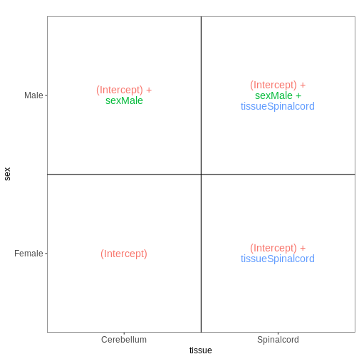
Factorial design with interactions
In the previous model, we assumed that the tissue differences were the same for both male and female mice. To allow for the estimation of sex-specific tissue differences (at the expense of having one additional coefficient to estimate from the data), we can include an interaction term in the model.
R
meta_noninf <- meta %>% filter(time == "Day0")
meta_noninf
OUTPUT
                     title geo_accession     organism     age    sex
GSM2545337 CNS_RNA-seq_11C    GSM2545337 Mus musculus 8 weeks Female
GSM2545338 CNS_RNA-seq_12C    GSM2545338 Mus musculus 8 weeks Female
GSM2545343 CNS_RNA-seq_20C    GSM2545343 Mus musculus 8 weeks   Male
GSM2545348 CNS_RNA-seq_27C    GSM2545348 Mus musculus 8 weeks Female
GSM2545349 CNS_RNA-seq_28C    GSM2545349 Mus musculus 8 weeks   Male
GSM2545353  CNS_RNA-seq_3C    GSM2545353 Mus musculus 8 weeks Female
GSM2545354  CNS_RNA-seq_4C    GSM2545354 Mus musculus 8 weeks   Male
GSM2545356 CNS_RNA-seq_574    GSM2545356 Mus musculus 8 weeks   Male
GSM2545357 CNS_RNA-seq_575    GSM2545357 Mus musculus 8 weeks   Male
GSM2545358 CNS_RNA-seq_583    GSM2545358 Mus musculus 8 weeks Female
GSM2545361 CNS_RNA-seq_590    GSM2545361 Mus musculus 8 weeks   Male
GSM2545364 CNS_RNA-seq_709    GSM2545364 Mus musculus 8 weeks Female
GSM2545365 CNS_RNA-seq_710    GSM2545365 Mus musculus 8 weeks Female
GSM2545366 CNS_RNA-seq_711    GSM2545366 Mus musculus 8 weeks Female
GSM2545367 CNS_RNA-seq_713    GSM2545367 Mus musculus 8 weeks   Male
             infection  strain time     tissue mouse
GSM2545337 NonInfected C57BL/6 Day0 Cerebellum     9
GSM2545338 NonInfected C57BL/6 Day0 Cerebellum    10
GSM2545343 NonInfected C57BL/6 Day0 Cerebellum    11
GSM2545348 NonInfected C57BL/6 Day0 Cerebellum     8
GSM2545349 NonInfected C57BL/6 Day0 Cerebellum     7
GSM2545353 NonInfected C57BL/6 Day0 Cerebellum     4
GSM2545354 NonInfected C57BL/6 Day0 Cerebellum     2
GSM2545356 NonInfected C57BL/6 Day0 Spinalcord     2
GSM2545357 NonInfected C57BL/6 Day0 Spinalcord     3
GSM2545358 NonInfected C57BL/6 Day0 Spinalcord     4
GSM2545361 NonInfected C57BL/6 Day0 Spinalcord     7
GSM2545364 NonInfected C57BL/6 Day0 Spinalcord     8
GSM2545365 NonInfected C57BL/6 Day0 Spinalcord     9
GSM2545366 NonInfected C57BL/6 Day0 Spinalcord    10
GSM2545367 NonInfected C57BL/6 Day0 Spinalcord    11
R
## Define a design including an interaction term
## Note that ~ sex * tissue is equivalent to
## ~ sex + tissue + sex:tissue
vd <- VisualizeDesign(sampleData = meta_noninf,
                      designFormula = ~ sex * tissue)
vd$designmatrix
OUTPUT
           (Intercept) sexMale tissueSpinalcord sexMale:tissueSpinalcord
GSM2545337           1       0                0                        0
GSM2545338           1       0                0                        0
GSM2545343           1       1                0                        0
GSM2545348           1       0                0                        0
GSM2545349           1       1                0                        0
GSM2545353           1       0                0                        0
GSM2545354           1       1                0                        0
GSM2545356           1       1                1                        1
GSM2545357           1       1                1                        1
GSM2545358           1       0                1                        0
GSM2545361           1       1                1                        1
GSM2545364           1       0                1                        0
GSM2545365           1       0                1                        0
GSM2545366           1       0                1                        0
GSM2545367           1       1                1                        1
R
vd$plotlist
OUTPUT
[[1]]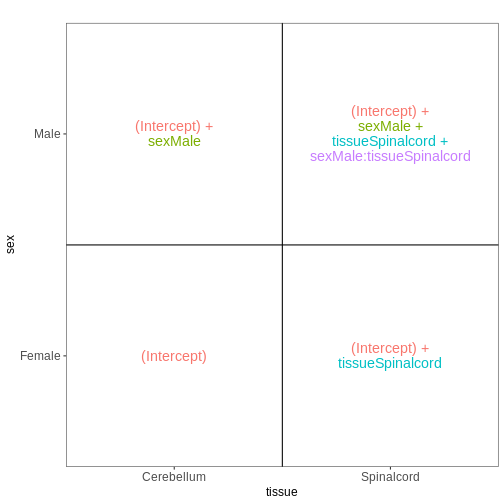
Combining multiple factors into one
Sometimes, for experiments with multiple factors, it is easier to interpret coefficients and set up contrasts of interest if the factors are combined into one. Let’s consider the previous example again, using this approach:
R
meta_noninf <- meta %>% filter(time == "Day0")
meta_noninf$sex_tissue <- paste0(meta_noninf$sex, "_", meta_noninf$tissue)
meta_noninf
OUTPUT
                     title geo_accession     organism     age    sex
GSM2545337 CNS_RNA-seq_11C    GSM2545337 Mus musculus 8 weeks Female
GSM2545338 CNS_RNA-seq_12C    GSM2545338 Mus musculus 8 weeks Female
GSM2545343 CNS_RNA-seq_20C    GSM2545343 Mus musculus 8 weeks   Male
GSM2545348 CNS_RNA-seq_27C    GSM2545348 Mus musculus 8 weeks Female
GSM2545349 CNS_RNA-seq_28C    GSM2545349 Mus musculus 8 weeks   Male
GSM2545353  CNS_RNA-seq_3C    GSM2545353 Mus musculus 8 weeks Female
GSM2545354  CNS_RNA-seq_4C    GSM2545354 Mus musculus 8 weeks   Male
GSM2545356 CNS_RNA-seq_574    GSM2545356 Mus musculus 8 weeks   Male
GSM2545357 CNS_RNA-seq_575    GSM2545357 Mus musculus 8 weeks   Male
GSM2545358 CNS_RNA-seq_583    GSM2545358 Mus musculus 8 weeks Female
GSM2545361 CNS_RNA-seq_590    GSM2545361 Mus musculus 8 weeks   Male
GSM2545364 CNS_RNA-seq_709    GSM2545364 Mus musculus 8 weeks Female
GSM2545365 CNS_RNA-seq_710    GSM2545365 Mus musculus 8 weeks Female
GSM2545366 CNS_RNA-seq_711    GSM2545366 Mus musculus 8 weeks Female
GSM2545367 CNS_RNA-seq_713    GSM2545367 Mus musculus 8 weeks   Male
             infection  strain time     tissue mouse        sex_tissue
GSM2545337 NonInfected C57BL/6 Day0 Cerebellum     9 Female_Cerebellum
GSM2545338 NonInfected C57BL/6 Day0 Cerebellum    10 Female_Cerebellum
GSM2545343 NonInfected C57BL/6 Day0 Cerebellum    11   Male_Cerebellum
GSM2545348 NonInfected C57BL/6 Day0 Cerebellum     8 Female_Cerebellum
GSM2545349 NonInfected C57BL/6 Day0 Cerebellum     7   Male_Cerebellum
GSM2545353 NonInfected C57BL/6 Day0 Cerebellum     4 Female_Cerebellum
GSM2545354 NonInfected C57BL/6 Day0 Cerebellum     2   Male_Cerebellum
GSM2545356 NonInfected C57BL/6 Day0 Spinalcord     2   Male_Spinalcord
GSM2545357 NonInfected C57BL/6 Day0 Spinalcord     3   Male_Spinalcord
GSM2545358 NonInfected C57BL/6 Day0 Spinalcord     4 Female_Spinalcord
GSM2545361 NonInfected C57BL/6 Day0 Spinalcord     7   Male_Spinalcord
GSM2545364 NonInfected C57BL/6 Day0 Spinalcord     8 Female_Spinalcord
GSM2545365 NonInfected C57BL/6 Day0 Spinalcord     9 Female_Spinalcord
GSM2545366 NonInfected C57BL/6 Day0 Spinalcord    10 Female_Spinalcord
GSM2545367 NonInfected C57BL/6 Day0 Spinalcord    11   Male_Spinalcord
R
vd <- VisualizeDesign(sampleData = meta_noninf,
                      designFormula = ~ 0 + sex_tissue)
vd$designmatrix
OUTPUT
           sex_tissueFemale_Cerebellum sex_tissueFemale_Spinalcord
GSM2545337                           1                           0
GSM2545338                           1                           0
GSM2545343                           0                           0
GSM2545348                           1                           0
GSM2545349                           0                           0
GSM2545353                           1                           0
GSM2545354                           0                           0
GSM2545356                           0                           0
GSM2545357                           0                           0
GSM2545358                           0                           1
GSM2545361                           0                           0
GSM2545364                           0                           1
GSM2545365                           0                           1
GSM2545366                           0                           1
GSM2545367                           0                           0
           sex_tissueMale_Cerebellum sex_tissueMale_Spinalcord
GSM2545337                         0                         0
GSM2545338                         0                         0
GSM2545343                         1                         0
GSM2545348                         0                         0
GSM2545349                         1                         0
GSM2545353                         0                         0
GSM2545354                         1                         0
GSM2545356                         0                         1
GSM2545357                         0                         1
GSM2545358                         0                         0
GSM2545361                         0                         1
GSM2545364                         0                         0
GSM2545365                         0                         0
GSM2545366                         0                         0
GSM2545367                         0                         1
R
vd$plotlist
OUTPUT
[[1]]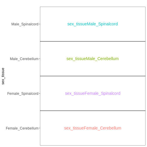
Paired design
In this particular data set the samples are paired - the same mice have contributed both the cerebellum and spinal cord samples. This information was not included in the previous models. However, accounting for it can increase power to detect tissue differences by eliminating variability in baseline expression levels between mice. Here, we define a paired design for the female non-infected mice, aimed at testing for differences between tissues after accounting for baseline differences between mice.
R
meta_fem_day0 <- meta %>% filter(sex == "Female" &
                                     time == "Day0")

# ensure that mouse is treated as a categorical variable
meta_fem_day0$mouse <- factor(meta_fem_day0$mouse)

meta_fem_day0
OUTPUT
                     title geo_accession     organism     age    sex
GSM2545337 CNS_RNA-seq_11C    GSM2545337 Mus musculus 8 weeks Female
GSM2545338 CNS_RNA-seq_12C    GSM2545338 Mus musculus 8 weeks Female
GSM2545348 CNS_RNA-seq_27C    GSM2545348 Mus musculus 8 weeks Female
GSM2545353  CNS_RNA-seq_3C    GSM2545353 Mus musculus 8 weeks Female
GSM2545358 CNS_RNA-seq_583    GSM2545358 Mus musculus 8 weeks Female
GSM2545364 CNS_RNA-seq_709    GSM2545364 Mus musculus 8 weeks Female
GSM2545365 CNS_RNA-seq_710    GSM2545365 Mus musculus 8 weeks Female
GSM2545366 CNS_RNA-seq_711    GSM2545366 Mus musculus 8 weeks Female
             infection  strain time     tissue mouse
GSM2545337 NonInfected C57BL/6 Day0 Cerebellum     9
GSM2545338 NonInfected C57BL/6 Day0 Cerebellum    10
GSM2545348 NonInfected C57BL/6 Day0 Cerebellum     8
GSM2545353 NonInfected C57BL/6 Day0 Cerebellum     4
GSM2545358 NonInfected C57BL/6 Day0 Spinalcord     4
GSM2545364 NonInfected C57BL/6 Day0 Spinalcord     8
GSM2545365 NonInfected C57BL/6 Day0 Spinalcord     9
GSM2545366 NonInfected C57BL/6 Day0 Spinalcord    10
R
vd <- VisualizeDesign(sampleData = meta_fem_day0,
                      designFormula = ~ mouse + tissue)
vd$designmatrix
OUTPUT
           (Intercept) mouse8 mouse9 mouse10 tissueSpinalcord
GSM2545337           1      0      1       0                0
GSM2545338           1      0      0       1                0
GSM2545348           1      1      0       0                0
GSM2545353           1      0      0       0                0
GSM2545358           1      0      0       0                1
GSM2545364           1      1      0       0                1
GSM2545365           1      0      1       0                1
GSM2545366           1      0      0       1                1
R
vd$plotlist
OUTPUT
[[1]]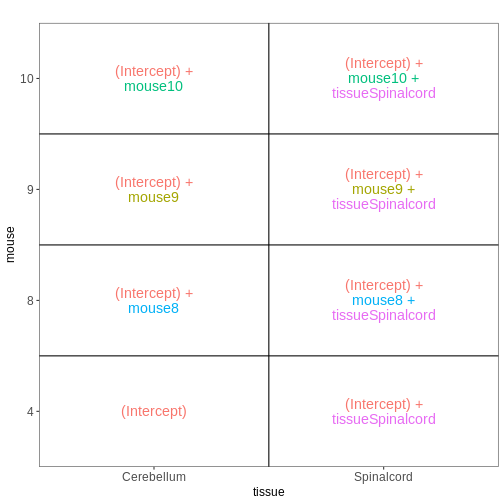
Within- and between-subject comparisons
In some situations, we need to combine the types of models considered above. For example, let’s say that we want to investigate if the tissue differences are different for infected and non-infected female mice. In this case, each mice only contributes to one of the infection groups (each mice is either infected or non-infected), but contributes both a cerebellum and a spinal cord sample. One way to view this type of design is as two paired experiments, one for each infection group (see the edgeR user guide section 3.5). We can then easily compare the two tissues in each infection group, and contrast the tissue differences between the infection groups.
R
meta_fem_day04 <- meta %>%
    filter(sex == "Female" &
               time %in% c("Day0", "Day4")) %>%
    droplevels()
# ensure that mouse is treated as a categorical variable
meta_fem_day04$mouse <- factor(meta_fem_day04$mouse)

meta_fem_day04
OUTPUT
                     title geo_accession     organism     age    sex
GSM2545337 CNS_RNA-seq_11C    GSM2545337 Mus musculus 8 weeks Female
GSM2545338 CNS_RNA-seq_12C    GSM2545338 Mus musculus 8 weeks Female
GSM2545339 CNS_RNA-seq_13C    GSM2545339 Mus musculus 8 weeks Female
GSM2545344 CNS_RNA-seq_21C    GSM2545344 Mus musculus 8 weeks Female
GSM2545348 CNS_RNA-seq_27C    GSM2545348 Mus musculus 8 weeks Female
GSM2545352 CNS_RNA-seq_30C    GSM2545352 Mus musculus 8 weeks Female
GSM2545353  CNS_RNA-seq_3C    GSM2545353 Mus musculus 8 weeks Female
GSM2545358 CNS_RNA-seq_583    GSM2545358 Mus musculus 8 weeks Female
GSM2545362  CNS_RNA-seq_5C    GSM2545362 Mus musculus 8 weeks Female
GSM2545364 CNS_RNA-seq_709    GSM2545364 Mus musculus 8 weeks Female
GSM2545365 CNS_RNA-seq_710    GSM2545365 Mus musculus 8 weeks Female
GSM2545366 CNS_RNA-seq_711    GSM2545366 Mus musculus 8 weeks Female
GSM2545371 CNS_RNA-seq_731    GSM2545371 Mus musculus 8 weeks Female
GSM2545375 CNS_RNA-seq_738    GSM2545375 Mus musculus 8 weeks Female
GSM2545376 CNS_RNA-seq_740    GSM2545376 Mus musculus 8 weeks Female
GSM2545377 CNS_RNA-seq_741    GSM2545377 Mus musculus 8 weeks Female
             infection  strain time     tissue mouse
GSM2545337 NonInfected C57BL/6 Day0 Cerebellum     9
GSM2545338 NonInfected C57BL/6 Day0 Cerebellum    10
GSM2545339  InfluenzaA C57BL/6 Day4 Cerebellum    15
GSM2545344  InfluenzaA C57BL/6 Day4 Cerebellum    22
GSM2545348 NonInfected C57BL/6 Day0 Cerebellum     8
GSM2545352  InfluenzaA C57BL/6 Day4 Cerebellum    21
GSM2545353 NonInfected C57BL/6 Day0 Cerebellum     4
GSM2545358 NonInfected C57BL/6 Day0 Spinalcord     4
GSM2545362  InfluenzaA C57BL/6 Day4 Cerebellum    20
GSM2545364 NonInfected C57BL/6 Day0 Spinalcord     8
GSM2545365 NonInfected C57BL/6 Day0 Spinalcord     9
GSM2545366 NonInfected C57BL/6 Day0 Spinalcord    10
GSM2545371  InfluenzaA C57BL/6 Day4 Spinalcord    15
GSM2545375  InfluenzaA C57BL/6 Day4 Spinalcord    20
GSM2545376  InfluenzaA C57BL/6 Day4 Spinalcord    21
GSM2545377  InfluenzaA C57BL/6 Day4 Spinalcord    22
R
design <- model.matrix(~ mouse, data = meta_fem_day04)
design <- cbind(design,
                Spc.Day0 = meta_fem_day04$tissue == "Spinalcord" &
                    meta_fem_day04$time == "Day0",
                Spc.Day4 = meta_fem_day04$tissue == "Spinalcord" &
                    meta_fem_day04$time == "Day4")
rownames(design) <- rownames(meta_fem_day04)
design
OUTPUT
           (Intercept) mouse8 mouse9 mouse10 mouse15 mouse20 mouse21 mouse22
GSM2545337           1      0      1       0       0       0       0       0
GSM2545338           1      0      0       1       0       0       0       0
GSM2545339           1      0      0       0       1       0       0       0
GSM2545344           1      0      0       0       0       0       0       1
GSM2545348           1      1      0       0       0       0       0       0
GSM2545352           1      0      0       0       0       0       1       0
GSM2545353           1      0      0       0       0       0       0       0
GSM2545358           1      0      0       0       0       0       0       0
GSM2545362           1      0      0       0       0       1       0       0
GSM2545364           1      1      0       0       0       0       0       0
GSM2545365           1      0      1       0       0       0       0       0
GSM2545366           1      0      0       1       0       0       0       0
GSM2545371           1      0      0       0       1       0       0       0
GSM2545375           1      0      0       0       0       1       0       0
GSM2545376           1      0      0       0       0       0       1       0
GSM2545377           1      0      0       0       0       0       0       1
           Spc.Day0 Spc.Day4
GSM2545337        0        0
GSM2545338        0        0
GSM2545339        0        0
GSM2545344        0        0
GSM2545348        0        0
GSM2545352        0        0
GSM2545353        0        0
GSM2545358        1        0
GSM2545362        0        0
GSM2545364        1        0
GSM2545365        1        0
GSM2545366        1        0
GSM2545371        0        1
GSM2545375        0        1
GSM2545376        0        1
GSM2545377        0        1
R
vd <- VisualizeDesign(sampleData = meta_fem_day04 %>%
                          select(time, tissue, mouse),
                      designFormula = NULL,
                      designMatrix = design, flipCoordFitted = FALSE)
vd$designmatrix
OUTPUT
           (Intercept) mouse8 mouse9 mouse10 mouse15 mouse20 mouse21 mouse22
GSM2545337           1      0      1       0       0       0       0       0
GSM2545338           1      0      0       1       0       0       0       0
GSM2545339           1      0      0       0       1       0       0       0
GSM2545344           1      0      0       0       0       0       0       1
GSM2545348           1      1      0       0       0       0       0       0
GSM2545352           1      0      0       0       0       0       1       0
GSM2545353           1      0      0       0       0       0       0       0
GSM2545358           1      0      0       0       0       0       0       0
GSM2545362           1      0      0       0       0       1       0       0
GSM2545364           1      1      0       0       0       0       0       0
GSM2545365           1      0      1       0       0       0       0       0
GSM2545366           1      0      0       1       0       0       0       0
GSM2545371           1      0      0       0       1       0       0       0
GSM2545375           1      0      0       0       0       1       0       0
GSM2545376           1      0      0       0       0       0       1       0
GSM2545377           1      0      0       0       0       0       0       1
           Spc.Day0 Spc.Day4
GSM2545337        0        0
GSM2545338        0        0
GSM2545339        0        0
GSM2545344        0        0
GSM2545348        0        0
GSM2545352        0        0
GSM2545353        0        0
GSM2545358        1        0
GSM2545362        0        0
GSM2545364        1        0
GSM2545365        1        0
GSM2545366        1        0
GSM2545371        0        1
GSM2545375        0        1
GSM2545376        0        1
GSM2545377        0        1
R
vd$plotlist
OUTPUT
$`time = Day0`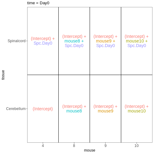
OUTPUT
$`time = Day4`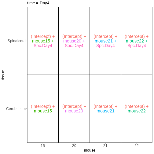
How does this relate to the DESeq2 analysis we did in the previous episode?
Now that we have learnt more about interpreting design matrices, let’s look back to the differential expression analysis we performed in the previous episode. We will repeat the main lines of code here.
R
se <- readRDS("data/GSE96870_se.rds")
se <- se[rowSums(assay(se, "counts")) > 5, ]
dds <- DESeq2::DESeqDataSet(se, design = ~ sex + time)
dds <- DESeq(dds)
OUTPUT
estimating size factorsOUTPUT
estimating dispersionsOUTPUT
gene-wise dispersion estimatesOUTPUT
mean-dispersion relationshipOUTPUT
final dispersion estimatesOUTPUT
fitting model and testingDESeq2 stores the design matrix in the object:
R
attr(dds, "modelMatrix")
OUTPUT
               Intercept sex_Male_vs_Female time_Day4_vs_Day0 time_Day8_vs_Day0
Female_Day0_9          1                  0                 0                 0
Female_Day0_10         1                  0                 0                 0
Female_Day0_8          1                  0                 0                 0
Female_Day0_4          1                  0                 0                 0
Male_Day0_11           1                  1                 0                 0
Male_Day0_7            1                  1                 0                 0
Male_Day0_2            1                  1                 0                 0
Female_Day4_15         1                  0                 1                 0
Female_Day4_22         1                  0                 1                 0
Female_Day4_21         1                  0                 1                 0
Female_Day4_20         1                  0                 1                 0
Male_Day4_18           1                  1                 1                 0
Male_Day4_13           1                  1                 1                 0
Male_Day4_1            1                  1                 1                 0
Male_Day4_12           1                  1                 1                 0
Female_Day8_14         1                  0                 0                 1
Female_Day8_5          1                  0                 0                 1
Female_Day8_16         1                  0                 0                 1
Female_Day8_19         1                  0                 0                 1
Male_Day8_6            1                  1                 0                 1
Male_Day8_23           1                  1                 0                 1
Male_Day8_24           1                  1                 0                 1
attr(,"assign")
[1] 0 1 2 2
attr(,"contrasts")
attr(,"contrasts")$sex
[1] "contr.treatment"

attr(,"contrasts")$time
[1] "contr.treatment"
The column names can be obtained via the resultsNames
function:
R
resultsNames(dds)
OUTPUT
[1] "Intercept"          "sex_Male_vs_Female" "time_Day4_vs_Day0"
[4] "time_Day8_vs_Day0"
Let’s visualize this design:
R
vd <- VisualizeDesign(sampleData = colData(dds)[, c("sex", "time")],
                      designMatrix = attr(dds, "modelMatrix"),
                      flipCoordFitted = TRUE)
vd$plotlist
OUTPUT
[[1]]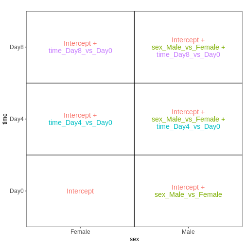
In the previous episode, we performed a test comparing Day8 samples to Day0 samples:
R
resTime <- results(dds, contrast = c("time", "Day8", "Day0"))
From the figure above, we see that this comparison is represented by
the time_Day8_vs_Day0 coefficient, which corresponds to the
fourth column in the design matrix. Thus, an alternative way of
specifying the contrast for the test would be:
R
resTimeNum <- results(dds, contrast = c(0, 0, 0, 1))
Let’s check if the results are comparable:
R
summary(resTime)
OUTPUT
out of 27430 with nonzero total read count
adjusted p-value < 0.1
LFC > 0 (up)       : 4472, 16%
LFC < 0 (down)     : 4282, 16%
outliers [1]       : 10, 0.036%
low counts [2]     : 3723, 14%
(mean count < 1)
[1] see 'cooksCutoff' argument of ?results
[2] see 'independentFiltering' argument of ?results
R
summary(resTimeNum)
OUTPUT
out of 27430 with nonzero total read count
adjusted p-value < 0.1
LFC > 0 (up)       : 4472, 16%
LFC < 0 (down)     : 4282, 16%
outliers [1]       : 10, 0.036%
low counts [2]     : 3723, 14%
(mean count < 1)
[1] see 'cooksCutoff' argument of ?results
[2] see 'independentFiltering' argument of ?results
R
## logFC
plot(resTime$log2FoldChange, resTimeNum$log2FoldChange)
abline(0, 1)
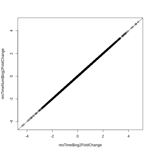
R
## -log10(p-value)
plot(-log10(resTime$pvalue), -log10(resTimeNum$pvalue))
abline(0, 1)
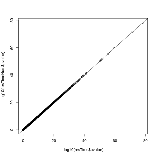
Redo DESeq2 analysis with interaction
Next, let’s look at a different setup. We still consider the sex and time predictors, but now we allow an interaction between them. In other words, we allow the time effect to be different for males and females.
R
se <- readRDS("data/GSE96870_se.rds")
se <- se[rowSums(assay(se, "counts")) > 5, ]
dds <- DESeq2::DESeqDataSet(se, design = ~ sex * time)
dds <- DESeq(dds)
OUTPUT
estimating size factorsOUTPUT
estimating dispersionsOUTPUT
gene-wise dispersion estimatesOUTPUT
mean-dispersion relationshipOUTPUT
final dispersion estimatesOUTPUT
fitting model and testingR
attr(dds, "modelMatrix")
OUTPUT
               Intercept sex_Male_vs_Female time_Day4_vs_Day0 time_Day8_vs_Day0
Female_Day0_9          1                  0                 0                 0
Female_Day0_10         1                  0                 0                 0
Female_Day0_8          1                  0                 0                 0
Female_Day0_4          1                  0                 0                 0
Male_Day0_11           1                  1                 0                 0
Male_Day0_7            1                  1                 0                 0
Male_Day0_2            1                  1                 0                 0
Female_Day4_15         1                  0                 1                 0
Female_Day4_22         1                  0                 1                 0
Female_Day4_21         1                  0                 1                 0
Female_Day4_20         1                  0                 1                 0
Male_Day4_18           1                  1                 1                 0
Male_Day4_13           1                  1                 1                 0
Male_Day4_1            1                  1                 1                 0
Male_Day4_12           1                  1                 1                 0
Female_Day8_14         1                  0                 0                 1
Female_Day8_5          1                  0                 0                 1
Female_Day8_16         1                  0                 0                 1
Female_Day8_19         1                  0                 0                 1
Male_Day8_6            1                  1                 0                 1
Male_Day8_23           1                  1                 0                 1
Male_Day8_24           1                  1                 0                 1
               sexMale.timeDay4 sexMale.timeDay8
Female_Day0_9                 0                0
Female_Day0_10                0                0
Female_Day0_8                 0                0
Female_Day0_4                 0                0
Male_Day0_11                  0                0
Male_Day0_7                   0                0
Male_Day0_2                   0                0
Female_Day4_15                0                0
Female_Day4_22                0                0
Female_Day4_21                0                0
Female_Day4_20                0                0
Male_Day4_18                  1                0
Male_Day4_13                  1                0
Male_Day4_1                   1                0
Male_Day4_12                  1                0
Female_Day8_14                0                0
Female_Day8_5                 0                0
Female_Day8_16                0                0
Female_Day8_19                0                0
Male_Day8_6                   0                1
Male_Day8_23                  0                1
Male_Day8_24                  0                1
attr(,"assign")
[1] 0 1 2 2 3 3
attr(,"contrasts")
attr(,"contrasts")$sex
[1] "contr.treatment"

attr(,"contrasts")$time
[1] "contr.treatment"
Let’s visualize this design:
R
vd <- VisualizeDesign(sampleData = colData(dds)[, c("sex", "time")],
                      designMatrix = attr(dds, "modelMatrix"),
                      flipCoordFitted = TRUE)
vd$plotlist
OUTPUT
[[1]]
Note that now, the time_Day8_vs_Day0 coefficient
represents the difference between Day8 and Day0 for the Female
samples. To get the corresponding difference for the male
samples, we need to also add the interaction effect
(sexMale.timeDay8).
R
## Day8 vs Day0, female
resTimeFemale <- results(dds, contrast = c("time", "Day8", "Day0"))

## Interaction effect (difference in Day8-Day0 effect between Male and Female)
resTimeInt <- results(dds, name = "sexMale.timeDay8")
Let’s try to fit this model with the second approach mentioned above, namely to create a single factor.
R
se <- readRDS("data/GSE96870_se.rds")
se <- se[rowSums(assay(se, "counts")) > 5, ]
se$sex_time <- paste0(se$sex, "_", se$time)
dds <- DESeq2::DESeqDataSet(se, design = ~ 0 + sex_time)
dds <- DESeq(dds)
OUTPUT
estimating size factorsOUTPUT
estimating dispersionsOUTPUT
gene-wise dispersion estimatesOUTPUT
mean-dispersion relationshipOUTPUT
final dispersion estimatesOUTPUT
fitting model and testingR
attr(dds, "modelMatrix")
OUTPUT
               sex_timeFemale_Day0 sex_timeFemale_Day4 sex_timeFemale_Day8
Female_Day0_9                    1                   0                   0
Female_Day0_10                   1                   0                   0
Female_Day0_8                    1                   0                   0
Female_Day0_4                    1                   0                   0
Male_Day0_11                     0                   0                   0
Male_Day0_7                      0                   0                   0
Male_Day0_2                      0                   0                   0
Female_Day4_15                   0                   1                   0
Female_Day4_22                   0                   1                   0
Female_Day4_21                   0                   1                   0
Female_Day4_20                   0                   1                   0
Male_Day4_18                     0                   0                   0
Male_Day4_13                     0                   0                   0
Male_Day4_1                      0                   0                   0
Male_Day4_12                     0                   0                   0
Female_Day8_14                   0                   0                   1
Female_Day8_5                    0                   0                   1
Female_Day8_16                   0                   0                   1
Female_Day8_19                   0                   0                   1
Male_Day8_6                      0                   0                   0
Male_Day8_23                     0                   0                   0
Male_Day8_24                     0                   0                   0
               sex_timeMale_Day0 sex_timeMale_Day4 sex_timeMale_Day8
Female_Day0_9                  0                 0                 0
Female_Day0_10                 0                 0                 0
Female_Day0_8                  0                 0                 0
Female_Day0_4                  0                 0                 0
Male_Day0_11                   1                 0                 0
Male_Day0_7                    1                 0                 0
Male_Day0_2                    1                 0                 0
Female_Day4_15                 0                 0                 0
Female_Day4_22                 0                 0                 0
Female_Day4_21                 0                 0                 0
Female_Day4_20                 0                 0                 0
Male_Day4_18                   0                 1                 0
Male_Day4_13                   0                 1                 0
Male_Day4_1                    0                 1                 0
Male_Day4_12                   0                 1                 0
Female_Day8_14                 0                 0                 0
Female_Day8_5                  0                 0                 0
Female_Day8_16                 0                 0                 0
Female_Day8_19                 0                 0                 0
Male_Day8_6                    0                 0                 1
Male_Day8_23                   0                 0                 1
Male_Day8_24                   0                 0                 1
attr(,"assign")
[1] 1 1 1 1 1 1
attr(,"contrasts")
attr(,"contrasts")$sex_time
[1] "contr.treatment"
We again visualize this design:
R
vd <- VisualizeDesign(sampleData = colData(dds)[, c("sex", "time")],
                      designMatrix = attr(dds, "modelMatrix"),
                      flipCoordFitted = TRUE)
vd$plotlist
OUTPUT
[[1]]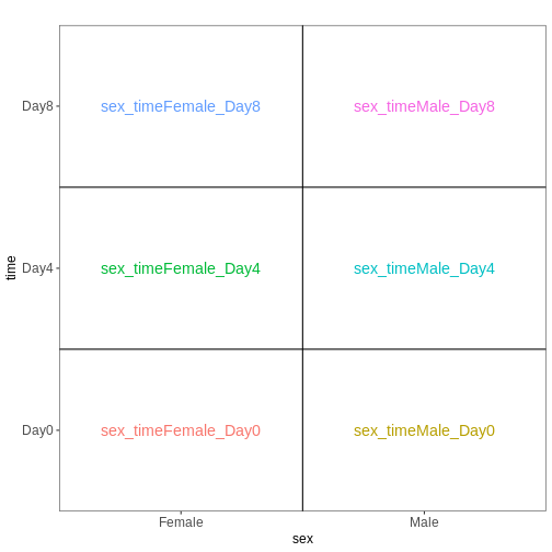
We then set up the same contrasts as above
R
## Day8 vs Day0, female
resTimeFemaleSingle <- results(dds, contrast = c("sex_time", "Female_Day8", "Female_Day0"))

## Interaction effect (difference in Day8-Day0 effect between Male and Female)
resultsNames(dds)
OUTPUT
[1] "sex_timeFemale_Day0" "sex_timeFemale_Day4" "sex_timeFemale_Day8"
[4] "sex_timeMale_Day0"   "sex_timeMale_Day4"   "sex_timeMale_Day8"
R
resTimeIntSingle <- results(dds, contrast = c(1, 0, -1, -1, 0, 1))
Check that these results agree with the ones obtained by fitting the model with the two factors and the interaction term.
R
summary(resTimeFemale)
OUTPUT
out of 27430 with nonzero total read count
adjusted p-value < 0.1
LFC > 0 (up)       : 2969, 11%
LFC < 0 (down)     : 3218, 12%
outliers [1]       : 6, 0.022%
low counts [2]     : 6382, 23%
(mean count < 3)
[1] see 'cooksCutoff' argument of ?results
[2] see 'independentFiltering' argument of ?results
R
summary(resTimeFemaleSingle)
OUTPUT
out of 27430 with nonzero total read count
adjusted p-value < 0.1
LFC > 0 (up)       : 2969, 11%
LFC < 0 (down)     : 3218, 12%
outliers [1]       : 6, 0.022%
low counts [2]     : 6382, 23%
(mean count < 3)
[1] see 'cooksCutoff' argument of ?results
[2] see 'independentFiltering' argument of ?results
R
plot(-log10(resTimeFemale$pvalue), -log10(resTimeFemaleSingle$pvalue))
abline(0, 1)
R
summary(resTimeInt)
OUTPUT
out of 27430 with nonzero total read count
adjusted p-value < 0.1
LFC > 0 (up)       : 0, 0%
LFC < 0 (down)     : 0, 0%
outliers [1]       : 6, 0.022%
low counts [2]     : 0, 0%
(mean count < 0)
[1] see 'cooksCutoff' argument of ?results
[2] see 'independentFiltering' argument of ?results
R
summary(resTimeIntSingle)
OUTPUT
out of 27430 with nonzero total read count
adjusted p-value < 0.1
LFC > 0 (up)       : 0, 0%
LFC < 0 (down)     : 0, 0%
outliers [1]       : 6, 0.022%
low counts [2]     : 0, 0%
(mean count < 0)
[1] see 'cooksCutoff' argument of ?results
[2] see 'independentFiltering' argument of ?results
R
plot(-log10(resTimeInt$pvalue), -log10(resTimeIntSingle$pvalue))
abline(0, 1)
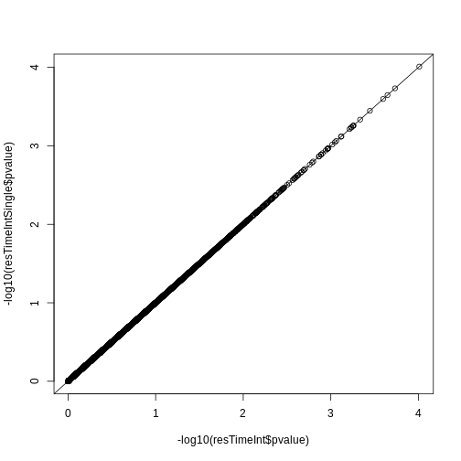
- The formula framework in R allows creation of design matrices, which details the variables expected to be associated with systematic differences in gene expression levels.
- Comparisons of interest can be defined using contrasts, which are linear combinations of the model coefficients.
Content from Gene set enrichment analysis
Last updated on 2025-11-13 | Edit this page
Estimated time 105 minutes
Overview
Questions
- What is the aim of performing gene set enrichment analysis?
- What is the method of over-representation analysis?
- What are the commonly-used gene set databases?
Objectives
- Learn the method of gene set enrichment analysis.
- Learn how to obtain gene sets from various resources in R.
- Learn how to perform gene set enrichment analysis and how to visualize enrichment results.
After we have obtained a list of differentially expressed (DE) genes, the next question naturally to ask is what biological functions these DE genes may affect. Gene set enrichment analysis (GSEA) evaluates the associations of a list of DE genes to a collection of pre-defined gene sets, where each gene set has a specific biological meaning. Once DE genes are significantly enriched in a gene set, the conclusion is made that the corresponding biological meaning (e.g. a biological process or a pathway) is significantly affected.
The definition of a gene set is very flexible and the construction of gene sets is straightforward. In most cases, gene sets are from public databases where huge efforts from scientific curators have already been made to carefully categorize genes into gene sets with clear biological meanings. Nevertheless, gene sets can also be self-defined from individual studies, such as a set of genes in a network module from a co-expression network analysis, or a set of genes that are up-regulated in a certain disease.
There are a huge amount of methods available for GSEA analysis. In this episode, we will learn the simplest but the mostly used one: the over-representation analysis (ORA). ORA is directly applied to the list of DE genes and it evaluates the association of the DE genes and the gene set by the numbers of genes in different categories.
Please note, ORA is a universal method that it can not only be applied to the DE gene list, but also any type of gene list of interest to look for their statistically associated biological meanings.
In this episode, we will start with a tiny example to illustrate the statistical method of ORA. Next we will go through several commonly-used gene set databases and how to access them in R. Then, we will learn how to perform ORA analysis with the Bioconductor package clusterProfiler. And in the end, we will learn several visualization methods on the GSEA results.
Following is a list of packages that will be used in this episode:
R
library(SummarizedExperiment)
library(DESeq2)
library(gplots)
library(microbenchmark)
library(org.Hs.eg.db)
library(org.Mm.eg.db)
library(msigdb)
library(clusterProfiler)
library(enrichplot)
library(ggplot2)
library(simplifyEnrichment)
The statistical method
To demonstrate the ORA analysis, we use a list of DE genes from a
comparison between genders. The following code performs
DESeq2 analysis which you should have already learnt in
the previous episode. In the end, we have a list of DE genes filtered by
FDR < 0.05, and save it in the object sexDEgenes.
The file data/GSE96870_se.rds contains a
RangedSummarizedExperiment that contains RNA-Seq counts
that were downloaded in Episode 2 and
constructed in Episode 3 (minimal
codes for downloading and constructing in the script download_data.R.
In the following code, there are also comments that explain every step
of the analysis.
R
library(SummarizedExperiment)
library(DESeq2)

# read the example dataset which is a `RangedSummarizedExperiment` object
se <- readRDS("data/GSE96870_se.rds")

# only restrict to mRNA (protein-coding genes)
se <- se[rowData(se)$gbkey == "mRNA"]

# construct a `DESeqDataSet` object where we also specify the experimental design
dds <- DESeqDataSet(se, design = ~ sex + time)
# perform DESeq2 analysis
dds <- DESeq(dds)
# obtain DESeq2 results, here we only want Male vs Female in the "sex" variable
resSex <- results(dds, contrast = c("sex", "Male", "Female"))
# extract DE genes with padj < 0.05
sexDE <- as.data.frame(subset(resSex, padj < 0.05))
# the list of DE genes
sexDEgenes <- rownames(sexDE)
Let’s check the number of DE genes and how they look like. It seems the number of DE genes is very small, but it is OK for this example.
R
length(sexDEgenes)
OUTPUT
[1] 54R
head(sexDEgenes)
OUTPUT
[1] "Lgr6" "Myoc" "Fibcd1" "Kcna4" "Ctxn2" "S100a9"Next we construct a gene set which contains genes on sex chromosomes
(let’s call it the “XY gene set”). Recall the
RangedSummarizedExperiment object also includes genomic
locations of genes, thus we can simply obtain sex genes by filtering the
chromosome names.
In the following code, geneGR is a GRanges
object on which seqnames() is applied to extract chromosome
names. seqnames() returns a special data format and we need
to explicitly convert it to a normal vector by
as.vector().
R
geneGR <- rowRanges(se)
totalGenes <- rownames(se)
XYGeneSet <- totalGenes[as.vector(seqnames(geneGR)) %in% c("X", "Y")]
head(XYGeneSet)
OUTPUT
[1] "Gm21950" "Gm14346" "Gm14345" "Gm14351" "Spin2-ps1" "Gm3701" R
length(XYGeneSet)
OUTPUT
[1] 1134The format of a single gene set is very straightforward, which is simply a vector. The ORA analysis is applied on the DE gene vector and gene set vector.
Before we move on, one thing worth to mention is that ORA deals with
two gene vectors. To correctly map between them, gene ID types must be
consistent in the two vectors. In this tiny example, since both DE genes
and the XY gene set are from the same object se,
they are ensured to be in the same gene ID types (the gene symbol). But
in general, DE genes and gene sets are from two different sources
(e.g. DE genes are from researcher’s experiment and gene sets are from
public databases), it is very possible that gene IDs are not consistent
in the two. Later in this episode, we will learn how to perform gene ID
conversion in the ORA analysis.
Since the DE genes and the gene set can be mathematically thought of as two sets, a natural way is to first visualize them with a Venn diagram.
R
library(gplots)
plot(venn(list("sexDEgenes"  = sexDEgenes,
               "XY gene set" = XYGeneSet)))
title(paste0("|universe| = ", length(totalGenes)))
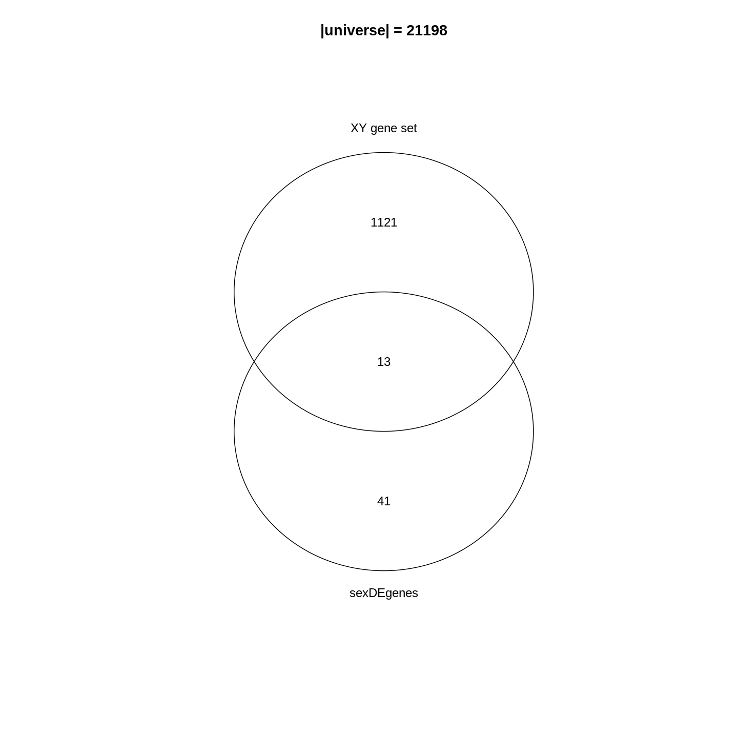
In the Venn diagram, we can observe that around 1.1% (13/1134) of genes in the XY gene set are DE. Compared to the global fraction of DE genes (54/21198 = 0.25%), it seems there is a strong relations between DE genes and the gene set. We can also compare the fraction of DE genes that belong to the gene set (13/54 = 24.1%) and the global fraction of XY gene set in the genome (1134/21198 = 5.3%). On the other hand, it is quite expected because the two events are actually biologically relevant where one is from a comparison between genders and the other is the set of gender-related genes.
Then, how to statistically measure the enrichment or over-representation? Let’s go to the next section.
Fisher’s exact test
To statistically measure the enrichment, the relationship of DE genes and the gene set is normally formatted into the following 2x2 contingency table, where in the table are the numbers of genes in different categories. \(n_{+1}\) is the size of the XY gene set (i.e. the number of member genes), \(n_{1+}\) is the number of DE genes, \(n\) is the number of total genes.
| In the gene set | Not in the gene set | Total | |
|---|---|---|---|
| DE | \(n_{11}\) | \(n_{12}\) | \(n_{1+}\) |
| Not DE | \(n_{21}\) | \(n_{22}\) | \(n_{2+}\) |
| Total | \(n_{+1}\) | \(n_{+2}\) | \(n\) |
These numbers can be obtained as in the following code1. Note we replace
+ with 0 in the R variable names.
R
n    <- nrow(se)
n_01 <- length(XYGeneSet)
n_10 <- length(sexDEgenes)
n_11 <- length(intersect(sexDEgenes, XYGeneSet))
Other values can be obtained by:
R
n_12 <- n_10 - n_11
n_21 <- n_01 - n_11
n_20 <- n    - n_10
n_02 <- n    - n_01
n_22 <- n_02 - n_12
All the values are:
R
matrix(c(n_11, n_12, n_10, n_21, n_22, n_20, n_01, n_02, n),
    nrow = 3, byrow = TRUE)
OUTPUT
     [,1]  [,2]  [,3]
[1,]   13    41    54
[2,] 1121 20023 21144
[3,] 1134 20064 21198
And we fill these numbers into the 2x2 contingency table:
| In the gene set | Not in the gene set | Total | |
|---|---|---|---|
| DE | 13 | 41 | 54 |
| Not DE | 1121 | 20023 | 21144 |
| Total | 1134 | 20064 | 21198 |
Fisher’s exact test can be used to test the associations of the two
marginal attributes, i.e. is there a dependency of a gene to be a DE
gene and to be in the XY gene set? In R, we can use the
function fisher.test() to perform the test. The input is
the top-left 2x2 sub-matrix. We specify
alternative = "greater" in the function because we are only
interested in over-representation.
R
fisher.test(matrix(c(n_11, n_12, n_21, n_22), nrow = 2, byrow = TRUE),
    alternative = "greater")
OUTPUT
	Fisher's Exact Test for Count Data

data:  matrix(c(n_11, n_12, n_21, n_22), nrow = 2, byrow = TRUE)
p-value = 3.906e-06
alternative hypothesis: true odds ratio is greater than 1
95 percent confidence interval:
 3.110607      Inf
sample estimates:
odds ratio
  5.662486
In the output, we can see the p-value is very small
(3.906e-06), then we can conclude DE genes have a very
strong enrichment in the XY gene set.
Results of the Fisher’s Exact test can be saved into an object
t, which is a simple list, and the p-value can be
obtained by t$p.value.
R
t <- fisher.test(matrix(c(n_11, n_12, n_21, n_22), nrow = 2, byrow = TRUE),
    alternative = "greater")
t$p.value
OUTPUT
[1] 3.9059e-06Odds ratio from the Fisher’s exact test is defined as follows:
\[ \mathrm{Odds\_ratio} = \frac{n_{11}/n_{21}}{n_{12}/n_{22}} = \frac{n_{11}/n_{12}}{n_{21}/n_{22}} = \frac{n_{11} * n_{22}}{n_{12} * n_{21}} \]
If there is no association between DE genes and the gene set, odds ratio is expected to be 1. And it is larger than 1 if there is an over-representation of DE genes on the gene set.
Further reading
The 2x2 contingency table can be transposed and it does not affect the Fisher’s exact test. E.g. let’s put whether genes are in the gene sets on rows, and put whether genes are DE on columns.
| DE | Not DE | Total | |
|---|---|---|---|
| In the gene set | 13 | 1121 | 1134 |
| Not in the gene set | 41 | 20023 | 20064 |
| Total | 54 | 21144 | 21198 |
And the corresponding fisher.test() is:
R
fisher.test(matrix(c(13, 1121, 41, 20023), nrow = 2, byrow = TRUE),
    alternative = "greater")
OUTPUT
	Fisher's Exact Test for Count Data

data:  matrix(c(13, 1121, 41, 20023), nrow = 2, byrow = TRUE)
p-value = 3.906e-06
alternative hypothesis: true odds ratio is greater than 1
95 percent confidence interval:
 3.110607      Inf
sample estimates:
odds ratio
  5.662486
The hypergeometric distribution
We can look at the problem from another aspect. This time we treat all genes as balls in a big box where all the genes have the same probability to be picked up. Some genes are marked as DE genes (in red in the figure) and other genes are marked as non-DE genes (in blue). We grab \(n_{+1}\) genes (the size of the gene set) from the box and we want to ask what is the probability of having \(n_{11}\) DE genes in our hand?
We first calculate the total number of ways of picking \(n_{+1}\) genes from total \(n\) genes, without distinguishing whether they are DE or not: \(\binom{n}{n_{+1}}\).
Next, in the \(n_{+1}\) genes that have been picked, there are \(n_{11}\) DE genes which can only be from the total \(n_{1+}\) DE genes. Then the number of ways of picking \(n_{11}\) DE genes from \(n_{1+}\) total DE genes is \(\binom{n_{1+}}{n_{11}}\).
Similarly, there are still \(n_{21}\) non-DE genes in our hand, which can only be from the total \(n_{2+}\) non-DE genes. Then the number of ways of picking \(n_{21}\) non-DE genes from \(n_{2+}\) total non-DE genes: \(\binom{n_{2+}}{n_{21}}\).
Since picking DE genes and picking non-DE genes are independent, the number of ways of picking \(n_{+1}\) genes which contain \(n_{11}\) DE genes and \(n_{21}\) non-DE genes is their multiplication: \(\binom{n_{1+}}{n_{11}} \binom{n_{2+}}{n_{21}}\).
And the probability \(P\) is:
\[P = \frac{\binom{n_{1+}}{n_{11}} \binom{n_{2+}}{n_{21}}}{\binom{n}{n_{+1}}} = \frac{\binom{n_{1+}}{n_{11}} \binom{n - n_{1+}}{n_{+1} -n_{11}}}{\binom{n}{n_{+1}}} \]
where in the denominator is the number of ways of picking \(n_{+1}\) genes without distinguishing whether they are DE or not.
If \(n\) (number of total genes), \(n_{1+}\) (number of DE genes) and \(n_{+1}\) (size of gene set) are all fixed values, the number of DE genes that are picked can be denoted as a random variable \(X\). Then \(X\) follows the hypergeometric distribution with parameters \(n\), \(n_{1+}\) and \(n_{+1}\), written as:
\[ X \sim \mathrm{Hyper}(n, n_{1+}, n_{+1})\]
The p-value of the enrichment is calculated as the probability of having an observation equal to or larger than \(n_{11}\) under the assumption of independence:
\[ \mathrm{Pr}( X \geqslant n_{11} ) = \sum_{x \in \{ {n_{11}, n_{11}+1, ..., \min\{n_{1+}, n_{+1}\} \}}} \mathrm{Pr}(X = x) \]
In R, the function phyper() calculates p-values
from the hypergeometric distribution. There are four arguments:
R
phyper(q, m, n, k)
which are:
-
q: the observation, -
m: number of DE genes, -
n: number of non-DE genes, -
k: size of the gene set.
phyper() calculates \(\mathrm{Pr}(X \leqslant q)\). To calculate
\(\mathrm{Pr}(X \geqslant q)\), we need
to transform it a little bit:
\[ \mathrm{Pr}(X \geqslant q) = 1 - \mathrm{Pr}(X < q) = 1 - \mathrm{Pr}(X \leqslant q-1)\]
Then, the correct use of phyper() is:
R
1 - phyper(q - 1, m, n, k)
Let’s plugin our variables:
R
1 - phyper(n_11 - 1, n_10, n_20, n_01)
OUTPUT
[1] 3.9059e-06Optionally, lower.tail argument can be specified which
directly calculates p-values from the upper tail of the
distribution.
R
phyper(n_11 - 1, n_10, n_20, n_01, lower.tail = FALSE)
OUTPUT
[1] 3.9059e-06If we switch n_01 and n_10, the
p-values are identical:
R
1 - phyper(n_11 - 1, n_01, n_02, n_10)
OUTPUT
[1] 3.9059e-06fisher.test() and phyper() give the same
p-value. Actually the two methods are identical because in
Fisher’s exact test, hypergeometric distribution is the exact
distribution of its statistic.
Let’s test the runtime of the two functions:
R
library(microbenchmark)
microbenchmark(
    fisher = fisher.test(matrix(c(n_11, n_12, n_21, n_22), nrow = 2, byrow = TRUE),
        alternative = "greater"),
    hyper = 1 - phyper(n_11 - 1, n_10, n_20, n_01)
)
OUTPUT
Unit: microseconds
   expr     min       lq      mean   median       uq     max neval
 fisher 250.987 257.6000 272.59702 264.2275 278.5735 586.372   100
  hyper   1.593   1.7635   2.67391   2.1840   3.3865   9.027   100
It is very astonishing that phyper() is hundreds of
times faster than fisher.test(). Main reason is in
fisher.test(), there are many additional calculations
besides calculating the p-value. So if you want to implement
ORA analysis by yourself, always consider to use phyper()2.
Further reading
Current tools also use Binomial distribution or chi-square test for ORA analysis. These two are just approximations. Please refer to Rivals et al., Enrichment or depletion of a GO category within a class of genes: which test? Bioinformatics 2007 which gives an overview of statistical methods used in ORA analysis.
Gene set resources
We have learnt the basic methods of ORA analysis. Now we go to the second component of the analysis: the gene sets.
Gene sets represent prior knowledge of what is the general shared biological attribute of genes in the gene set. For example, in a “cell cycle” gene set, all the genes are involved in the cell cycle process. Thus, if DE genes are significantly enriched in the “cell cycle” gene set, which means there are significantly more cell cycle genes differentially expressed than expected, we can conclude that the normal function of cell cycle process may be affected.
As we have mentioned, genes in the gene set share the same “biological attribute” where “the attribute” will be used for making conclusions. The definition of “biological attribute” is very flexible. It can be a biological process such as “cell cycle”. It can also be from a wide range of other definitions, to name a few:
- Locations in the cell, e.g. cell membrane or cell nucleus.
- Positions on chromosomes, e.g. sex chromosomes or the cytogenetic band p13 on chromome 10.
- Target genes of a transcription factor or a microRNA, e.g. all genes that are transcriptionally regulationed by NF-κB.
- Signature genes in a certain tumor type, i.e. genes that are uniquely highly expressed in a tumor type.
The MSigDB database contains gene sets in many topics. We will introduce it later in this section.
You may have encountered many different ways to name gene sets: “gene sets”, “biological terms”, “GO terms”, “GO gene sets”, “pathways”, and so on. They basically refer to the same thing, but from different aspects. As shown in the following figure, “gene set” corresponds to a vector of genes and it is the representation of the data for computation. “Biological term” is a textual entity that contains description of its biological meaning; It corresponds to the knowledge of the gene set and is for the inference of the analysis. “GO gene sets” and “pathways” specifically refer to the enrichment analysis using GO gene sets and pahtway gene sets.

Before we touch the gene set databases, we first summarize the general formats of gene sets in R. In most analysis, a gene set is simply treated as a vector of genes. Thus, naturally, a collection of gene sets can be represented as a list of vectors. In the following example, there are three gene sets with 3, 5 and 2 genes. Some genes exist in multiple gene sets.
R
lt <- list(gene_set_1 = c("gene_1", "gene_2", "gene_3"),
           gene_set_2 = c("gene_1", "gene_3", "gene_4", "gene_5", "gene_6"),
           gene_set_3 = c("gene_4", "gene_7")
)
lt
OUTPUT
$gene_set_1
[1] "gene_1" "gene_2" "gene_3"

$gene_set_2
[1] "gene_1" "gene_3" "gene_4" "gene_5" "gene_6"

$gene_set_3
[1] "gene_4" "gene_7"
It is also very common to store the relations of gene sets and genes as a two-column data frame. The order of the gene set column and the gene column, i.e. which column locates as the first column, are quite arbitrary. Different tools may require differently.
R
data.frame(gene_set = rep(names(lt), times = sapply(lt, length)),
           gene = unname(unlist(lt)))
OUTPUT
     gene_set   gene
1  gene_set_1 gene_1
2  gene_set_1 gene_2
3  gene_set_1 gene_3
4  gene_set_2 gene_1
5  gene_set_2 gene_3
6  gene_set_2 gene_4
7  gene_set_2 gene_5
8  gene_set_2 gene_6
9  gene_set_3 gene_4
10 gene_set_3 gene_7
Or genes be in the first column:
OUTPUT
     gene   gene_set
1  gene_1 gene_set_1
2  gene_2 gene_set_1
3  gene_3 gene_set_1
4  gene_1 gene_set_2
5  gene_3 gene_set_2
6  gene_4 gene_set_2
7  gene_5 gene_set_2
8  gene_6 gene_set_2
9  gene_4 gene_set_3
10 gene_7 gene_set_3
Not very often, gene sets are represented as a matrix where one dimension corresponds to gene sets and the other dimension corresponds to genes. The values in the matix are binary where a value of 1 represents the gene is a member of the corresponding gene sets. In some methods, 1 is replaced by \(w_{ij}\) to weight the effect of the genes in the gene set.
#            gene_1 gene_2 gene_3 gene_4
# gene_set_1      1      1      0      0
# gene_set_2      1      0      1      1
Challenge
Can you convert between different gene set representations? E.g. convert a list to a two-column data frame?
R
lt <- list(gene_set_1 = c("gene_1", "gene_2", "gene_3"),
           gene_set_2 = c("gene_1", "gene_3", "gene_4", "gene_5", "gene_6"),
           gene_set_3 = c("gene_4", "gene_7")
)
To convert lt to a data frame (e.g. let’s put gene sets
in the first column):
R
df = data.frame(gene_set = rep(names(lt), times = sapply(lt, length)),
                gene = unname(unlist(lt)))
df
OUTPUT
     gene_set   gene
1  gene_set_1 gene_1
2  gene_set_1 gene_2
3  gene_set_1 gene_3
4  gene_set_2 gene_1
5  gene_set_2 gene_3
6  gene_set_2 gene_4
7  gene_set_2 gene_5
8  gene_set_2 gene_6
9  gene_set_3 gene_4
10 gene_set_3 gene_7
To convert df back to the list:
R
split(df$gene, df$gene_set)
OUTPUT
$gene_set_1
[1] "gene_1" "gene_2" "gene_3"

$gene_set_2
[1] "gene_1" "gene_3" "gene_4" "gene_5" "gene_6"

$gene_set_3
[1] "gene_4" "gene_7"
Next, let’s go through gene sets from several major databases: the GO, KEGG and MSigDB databases.
Gene Ontology gene sets
Gene Ontology (GO) is the standard source for gene set enrichment analysis. GO contains three namespaces of biological process (BP), cellular components (CC) and molecular function (MF) which describe a biological entity from different aspect. The associations between GO terms and genes are integrated in the Bioconductor standard packages: the organism annotation packages. In the current Bioconductor release, there are the following organism packages:
| Package | Organism | Package | Organism |
|---|---|---|---|
| org.Hs.eg.db | Human | org.Mm.eg.db | Mouse |
| org.Rn.eg.db | Rat | org.Dm.eg.db | Fly |
| org.At.tair.db | Arabidopsis | org.Dr.eg.db | Zebrafish |
| org.Sc.sgd.db | Yeast | org.Ce.eg.db | Worm |
| org.Bt.eg.db | Bovine | org.Gg.eg.db | Chicken |
| org.Ss.eg.db | Pig | org.Mmu.eg.db | Rhesus |
| org.Cf.eg.db | Canine | org.EcK12.eg.db | E coli strain K12 |
| org.Xl.eg.db | Xenopus | org.Pt.eg.db | Chimp |
| org.Ag.eg.db | Anopheles | org.EcSakai.eg.db | E coli strain Sakai |
There are four sections in the name of an organism package. The
naming convention is: org simply means “organism”. The
second section corresponds to a specific organism, e.g. Hs
for human and Mm for mouse. The third section corresponds
to the primary gene ID type used in the package, where normally
eg is used which means “Entrez genes” because data is
mostly retrieved from the NCBI database. However, for some organisms,
the primary ID can be from its own primary database,
e.g. sgd for Yeast which corresponds to the Saccharomyces Genome Database,
the primary database for yeast. The last section is always “db”, which
simply implies it is a database package.
Taking the org.Hs.eg.db package as an example, all
the data is stored in a database object org.Hs.eg.db in the
OrgDb class. The object contains a connection to a local
SQLite database. Users can simply think org.Hs.eg.db as a
huge table that contains ID mappings between various databases. GO gene
sets are essentially mappings between GO terms and genes. Let’s try to
extract it from the org.Hs.eg.db object.
All the columns (the key column or the source column) can be obtained
by keytypes():
R
library(org.Hs.eg.db)
keytypes(org.Hs.eg.db)
OUTPUT
 [1] "ACCNUM"       "ALIAS"        "ENSEMBL"      "ENSEMBLPROT"  "ENSEMBLTRANS"
 [6] "ENTREZID"     "ENZYME"       "EVIDENCE"     "EVIDENCEALL"  "GENENAME"
[11] "GENETYPE"     "GO"           "GOALL"        "IPI"          "MAP"
[16] "OMIM"         "ONTOLOGY"     "ONTOLOGYALL"  "PATH"         "PFAM"
[21] "PMID"         "PROSITE"      "REFSEQ"       "SYMBOL"       "UCSCKG"
[26] "UNIPROT"
To get the GO gene sets, we first obtain all GO IDs under the BP
(biological process) namespace. As shown in the output from
keytype(), "ONTOLOGY" is also a valid “key
column”, thus we can query “select all GO IDs where the
corresponding ONTOLOGY is BP”, which is translated into the
following code:
R
BP_Id = mapIds(org.Hs.eg.db, keys = "BP", keytype = "ONTOLOGY",
               column = "GO", multiVals = "list")[[1]]
head(BP_Id)
OUTPUT
[1] "GO:0002764" "GO:0001553" "GO:0001869" "GO:0002438" "GO:0006953"
[6] "GO:0007584"
mapIds() maps IDs between two sources. Since a GO
namespace have more than one GO terms, we have to set
multiVals = "list" to obtain all GO terms under that
namespace. And since we only query for one GO “ONTOLOGY”, we directly
take the first element from the list returned by
mapIds().
Next we do mapping from GO IDs to gene Entrez IDs. Now the query becomes “providing a vector of GO IDs, select ENTREZIDs which correspond to every one of them”.
R
BPGeneSets = mapIds(org.Hs.eg.db, keys = BP_Id, keytype = "GOALL",
                    column = "ENTREZID", multiVals = "list")
You may have noticed there is a “GO” key column as well a “GOALL”
column in the database. As GO has a hierarchical structure where a child
term is a sub-class of a parent term. All the genes annotated to a child
term are also annotated to its parent terms. To reduce the duplicated
information when annotating genes to GO terms, genes are normally
annotated to the most specific offspring terms in the GO hierarchy.
Upstream merging of gene annotations should be done by the tools which
perform analysis. In this way, the mapping between "GO" and
"ENTREZID" only contains “primary” annotations which is not
complete, and mapping between "GOALL" and
"ENTREZID" is the correct one to use.
We filter out GO gene sets with no gene annotated.
R
BPGeneSets = BPGeneSets[sapply(BPGeneSets, length) > 0]
BPGeneSets[2:3] # BPGeneSets[[1]] is too long
OUTPUT
$`GO:0001553`
 [1] "2"     "2516"  "2661"  "2661"  "3624"  "4313"  "5156"  "5798"  "6777"
[10] "8322"  "8879"  "56729" "59338"

$`GO:0001869`
[1] "2"   "710"
In most cases, because OrgDb is a standard Bioconductor
data structure, most tools can automatically construct GO gene sets
internally. There is no need for users to touch such low-level
processings.
Further reading
Mapping between various databases can also be done with the general
select() interface. If the OrgDb object is
provided by a package such as org.Hs.eg.db, there is
also a separated object that specifically contains mapping between GO
terms and genes. Readers can check the documentation of
org.Hs.egGO2ALLEGS. Additional information on GO terms such
as GO names and long descriptions are available in the package
GO.db.
Bioconductor has already provided a large number of organism
packages. However, if the organism you are working on is not supported
there, you may consider to look for it with the
AnnotationHub package, which additionally provide
OrgDb objects for approximately 2000 organisms. The
OrgDb object can be directly used in the ORA analysis
introduced in the next section.
KEGG gene sets
A biological pathway is a series of interactions among molecules in a cell that leads to a certain product or a change in a cell3. A pathway involves a list of genes playing different roles which constructs the “pathway gene set”. KEGG pathway is the mostly used database for pathways. It provides its data via a REST API (https://rest.kegg.jp/). There are several commands to retrieve specific types of data. To retrieve the pathway gene sets, we can use the “link” command as shown in the following URL (“link” means to link genes to pathways). When you enter the URL in the web browser:
https://rest.kegg.jp/link/pathway/hsathere will be a text table which contains a column of genes and a column of pathway IDs.
hsa:10327   path:hsa00010
hsa:124 path:hsa00010
hsa:125 path:hsa00010
hsa:126 path:hsa00010
We can directly read the text output with read.table().
Wrapping the URL with the function url(), you can pretend
to directly read data from the remote web server.
R
keggGeneSets = read.table(url("https://rest.kegg.jp/link/pathway/hsa"), sep = "\t")
head(keggGeneSets)
OUTPUT
         V1            V2
1 hsa:10327 path:hsa00010
2   hsa:124 path:hsa00010
3   hsa:125 path:hsa00010
4   hsa:126 path:hsa00010
5   hsa:127 path:hsa00010
6   hsa:128 path:hsa00010
In this two-column table, the first column contains genes in the
Entrez ID type. Let’s remove the "hsa:" prefix, also we
remove the "path:" prefix for pathway IDs in the second
column.
R
keggGeneSets[, 1] = gsub("hsa:", "", keggGeneSets[, 1])
keggGeneSets[, 2] = gsub("path:", "", keggGeneSets[, 2])
head(keggGeneSets)
OUTPUT
     V1       V2
1 10327 hsa00010
2   124 hsa00010
3   125 hsa00010
4   126 hsa00010
5   127 hsa00010
6   128 hsa00010
The full pathway names can be obtained via the “list” command.
R
keggNames = read.table(url("https://rest.kegg.jp/list/pathway/hsa"), sep = "\t")
head(keggNames)
OUTPUT
        V1                                                     V2
1 hsa01100              Metabolic pathways - Homo sapiens (human)
2 hsa01200               Carbon metabolism - Homo sapiens (human)
3 hsa01210 2-Oxocarboxylic acid metabolism - Homo sapiens (human)
4 hsa01212           Fatty acid metabolism - Homo sapiens (human)
5 hsa01230     Biosynthesis of amino acids - Homo sapiens (human)
6 hsa01232           Nucleotide metabolism - Homo sapiens (human)
In both commands, we obtained data for human where the corresponding
KEGG code is "hsa". The code for other organisms can be
found from the KEGG website
(e.g. "mmu" for mouse), or via https://rest.kegg.jp/list/organism.
Keep in mind, KEGG pathways are only free for academic users. If you use it for commercial purposes, please contact the KEGG team to get a licence.
Further reading
Instead directly reading from the URLs, there are also R packages
which help to obtain data from the KEGG database, such as the
KEGGREST package or the download_KEGG()
function from the clusterProfiler package. But
essentially, they all obtain KEGG data with the REST API.
MSigDB gene sets
Molecular signature database (MSigDB) is a manually curated gene set database. Initially, it was proposed as a supplementary dataset for the original GSEA paper. Later it has been separated out and developed independently. In the first version in 2005, there were only two gene sets collections and in total 843 gene sets. Now in the newest version of MSigDB (v2023.1.Hs), it has grown into nine gene sets collections, covering > 30K gene sets. It provides gene sets on a variety of topics.
MSigDB categorizes gene sets into nine collections where each collection focuses on a specific topic. For some collections, they are additionally split into sub-collections. There are several ways to obtain gene sets from MSigDB. One convenient way is to use the msigdb package. Another option is to use the msigdbr CRAN package, which supports organisms other than human and mouse by mapping to orthologs.
msigdb provides mouse and human gene sets, defined using either gene symbols or Entrez IDs. Let’s get the mouse collection.
R
library(msigdb)
library(ExperimentHub)
library(GSEABase)
MSigDBGeneSets <- getMsigdb(org = "mm", id = "SYM", version = "7.4")
The msigdb object above is a
GeneSetCollection, storing all gene sets from MSigDB. The
GeneSetCollection object class is defined in the
GSEABase package, and it is a linear data structure similar
to a base list object, but with additional metadata such as the type of
gene identifier or provenance information about the gene sets.
R
MSigDBGeneSets
OUTPUT
GeneSetCollection
  names: 10qA1, 10qA2, ..., ZZZ3_TARGET_GENES (44688 total)
  unique identifiers: Epm2a, Esr1, ..., Gm52481 (53805 total)
  types in collection:
    geneIdType: SymbolIdentifier (1 total)
    collectionType: BroadCollection (1 total)
R
length(MSigDBGeneSets)
OUTPUT
[1] 44688Each signature is stored in a GeneSet object, also
defined in the GSEABase package.
R
gs <- MSigDBGeneSets[[2000]]
gs
OUTPUT
setName: DESCARTES_MAIN_FETAL_CHROMAFFIN_CELLS
geneIds: Asic5, Cntfr, ..., Slc22a22 (total: 28)
geneIdType: Symbol
collectionType: Broad
  bcCategory: c8 (Cell Type Signatures)mh (Mouse-Ortholog Hallmark)
  bcSubCategory: NA
details: use 'details(object)'
R
collectionType(gs)
OUTPUT
collectionType: Broad
  bcCategory: c8 (Cell Type Signatures)mh (Mouse-Ortholog Hallmark)
  bcSubCategory: NA
R
geneIds(gs)
OUTPUT
 [1] "Asic5"    "Cntfr"    "Galnt16"  "Galnt14"  "Gip"      "Hmx1"
 [7] "Il7"      "Insl5"    "Insm2"    "Insm1"    "Mab21l1"  "Mab21l2"
[13] "Npy"      "Pyy"      "Ntrk1"    "Ntrk2"    "Ntrk3"    "Phox2a"
[19] "Ptchd1"   "Ptchd4"   "Reg4"     "Slc22a26" "Slc22a30" "Slc22a19"
[25] "Slc22a27" "Slc22a29" "Slc22a28" "Slc22a22"
We can also subset the collection. First, let’s list the available collections and subcollections.
R
listCollections(MSigDBGeneSets)
OUTPUT
[1] "c1" "c3" "c2" "c8" "c6" "c7" "c4" "c5" "h" R
listSubCollections(MSigDBGeneSets)
OUTPUT
 [1] "MIR:MIR_Legacy"  "TFT:TFT_Legacy"  "CGP"             "TFT:GTRD"
 [5] "VAX"             "CP:BIOCARTA"     "CGN"             "GO:BP"
 [9] "GO:CC"           "IMMUNESIGDB"     "GO:MF"           "HPO"
[13] "MIR:MIRDB"       "CM"              "CP"              "CP:PID"
[17] "CP:REACTOME"     "CP:WIKIPATHWAYS"
Then, we retrieve only the ‘hallmarks’ collection.
R
(hm <- subsetCollection(MSigDBGeneSets, collection = "h"))
OUTPUT
GeneSetCollection
  names: HALLMARK_ADIPOGENESIS, HALLMARK_ALLOGRAFT_REJECTION, ..., HALLMARK_XENOBIOTIC_METABOLISM (50 total)
  unique identifiers: Abca1, Abca4, ..., Upb1 (5435 total)
  types in collection:
    geneIdType: SymbolIdentifier (1 total)
    collectionType: BroadCollection (1 total)
If you only want to use a sub-category, specify both the
collection and subcollection arguments to
subsetCollection.
ORA with clusterProfiler
The ORA method itself is quite simple and it has been implemented in a large number of R packages. Among them, the clusterProfiler package especially does a good job in that it has a seamless integration to the Bioconductor annotation resources which allows extending GSEA analysis to other organisms easily; it has pre-defined functions for common analysis tasks, e.g. GO enrichment, KEGG enrichment; and it implements a variety of different visualization methods on the GSEA results. In this section, we will learn how to perform ORA analysis with clusterProfiler.
Here we will use a list of DE genes from a different comparison. As you may still remember, there are only 54 DE genes between genders, which may not be a good case for GSEA analysis, since after overlapping to a collection of gene sets, the majority of the gene sets will have few or even no gene overlapped. In this example we use the list of DE genes from the comparison between different time points.
Another thing worth to mention is, in the following code where we filter DE genes, we additionally add a filtering on the log2 fold change. This is recommended when the number of DE genes is too large. The filtering on log2 fold change can be thought as a filtering from the biology aspect.
R
resTime <- DESeq2::results(dds, contrast = c("time", "Day8", "Day0"))
timeDE <- as.data.frame(subset(resTime,
                               padj < 0.05 & abs(log2FoldChange) > log2(1.5)
                       ))
timeDEgenes <- rownames(timeDE)
head(timeDEgenes)
OUTPUT
[1] "3110035E14Rik" "Sgk3"          "Kcnb2"         "Sbspon"
[5] "Gsta3"         "Lman2l"
R
length(timeDEgenes)
OUTPUT
[1] 1134Let’s confirm that there are around one thousand DE genes, and the DE genes are in gene symbols.
GO enrichment
In clusterProfiler, there is an
enrichGO() function which performs ORA on GO gene sets. To
use it, we need to provide the DE genes, the organism OrgDb
object which is from the organism package org.Mm.eg.db
(because our data is from mouse), also the GO namespace (one of
"BP", "CC" and "MF"). The GO gene
sets are automatically retrieved and processed from
org.Mm.eg.db in enrichGO().
R
library(clusterProfiler)
library(org.Mm.eg.db)
resTimeGO = enrichGO(gene = timeDEgenes,
                     ont = "BP",
                     OrgDb = org.Mm.eg.db)
OUTPUT
--> No gene can be mapped....OUTPUT
--> Expected input gene ID: 236904,170472,12144,21939,110816,12914OUTPUT
--> return NULL...Oops, something seems wrong. Well, this is a common mistake where the gene ID types do not match between DE genes and the gene sets. Thankfully, the message clearly explains the reason. The ID type for gene sets is Entrez ID and it cannot match any DE gene.
There are two ways to solve this problem. 1. Convert gene IDs in
timeDEgenes to Entrez IDs in advance; or 2. Simply specify
the ID type of DE genes and let enrichGO() do the
conversion job (recall various gene ID types are also stored in the
OrgDb object). Let’s choose the second way.
In the next code, we additionally specify
keyType = "SYMBOL" to explicitly tell the function that DE
genes are in gene symbols. Recall that all valid values for
keyType are in keytypes(org.Mm.eg.db).
R
resTimeGO = enrichGO(gene = timeDEgenes,
                     keyType = "SYMBOL",
                     ont = "BP",
                     OrgDb = org.Mm.eg.db)
resTimeGOTable = as.data.frame(resTimeGO)
head(resTimeGOTable)
OUTPUT
                   ID                Description GeneRatio   BgRatio RichFactor
GO:0050900 GO:0050900        leukocyte migration    50/965 408/28832  0.1225490
GO:0006935 GO:0006935                 chemotaxis    54/965 475/28832  0.1136842
GO:0042330 GO:0042330                      taxis    54/965 477/28832  0.1132075
GO:0030595 GO:0030595       leukocyte chemotaxis    35/965 242/28832  0.1446281
GO:0060326 GO:0060326            cell chemotaxis    41/965 337/28832  0.1216617
GO:0071674 GO:0071674 mononuclear cell migration    32/965 229/28832  0.1397380
           FoldEnrichment    zScore       pvalue     p.adjust       qvalue
GO:0050900       3.661485 10.075346 2.751321e-15 1.053782e-11 7.745382e-12
GO:0006935       3.396625  9.800882 5.186751e-15 1.053782e-11 7.745382e-12
GO:0042330       3.382383  9.763475 6.190224e-15 1.053782e-11 7.745382e-12
GO:0030595       4.321158  9.654694 3.373742e-13 4.307425e-10 3.165991e-10
GO:0060326       3.634975  9.054313 1.137629e-12 1.161974e-09 8.540597e-10
GO:0071674       4.175053  8.976588 8.861995e-12 6.891923e-09 5.065617e-09
                                                                                                                                                                                                                                                                                                                             geneID
GO:0050900                                 Tnfsf18/Sell/Slamf9/Fut7/Itga4/Mdk/Grem1/Ada/Prex1/Edn3/P2ry12/Il12a/S100a8/S100a9/Nbl1/Padi2/Bst1/Cxcl5/Ppbp/Pf4/Cxcl1/Ptn/Alox5/Trpm4/Hsd3b7/Itgam/Adam8/Ascl2/Gdf15/Calr/Enpp1/Aire/Ccl2/Ccl7/Ccl5/Ccr7/Aoc3/Itgb3/Ccl28/Lgals3/Ptk2b/Emp2/Apod/Retnlg/Plg/Fpr2/Dusp1/Ager/Il33/Ch25h
GO:0006935 Tnfsf18/Sell/Slamf9/Mdk/Grem1/Prex1/Edn3/P2ry12/Il12a/S100a7a/S100a8/S100a9/Lpar1/Ptgr1/Nbl1/Padi2/Bst1/Cxcl5/Ppbp/Pf4/Cxcl1/Ptn/Alox5/Ntf3/Trpm4/Hsd3b7/Itgam/Adam8/Lsp1/Calr/Ccl17/Robo3/Cmtm7/Ccl2/Ccl7/Ccl5/Ccl6/Ccr7/Itgb3/Tubb2b/Ccl28/Lgals3/Cmtm5/Ptk2b/Nr4a1/Casr/Retnlg/Fpr2/Dusp1/Ager/Stx3/Ch25h/Plxnb3/Nox1
GO:0042330 Tnfsf18/Sell/Slamf9/Mdk/Grem1/Prex1/Edn3/P2ry12/Il12a/S100a7a/S100a8/S100a9/Lpar1/Ptgr1/Nbl1/Padi2/Bst1/Cxcl5/Ppbp/Pf4/Cxcl1/Ptn/Alox5/Ntf3/Trpm4/Hsd3b7/Itgam/Adam8/Lsp1/Calr/Ccl17/Robo3/Cmtm7/Ccl2/Ccl7/Ccl5/Ccl6/Ccr7/Itgb3/Tubb2b/Ccl28/Lgals3/Cmtm5/Ptk2b/Nr4a1/Casr/Retnlg/Fpr2/Dusp1/Ager/Stx3/Ch25h/Plxnb3/Nox1
GO:0030595                                                                                                                 Tnfsf18/Sell/Slamf9/Mdk/Grem1/Prex1/Edn3/Il12a/S100a8/S100a9/Nbl1/Padi2/Bst1/Cxcl5/Ppbp/Pf4/Cxcl1/Ptn/Alox5/Trpm4/Hsd3b7/Itgam/Adam8/Calr/Ccl2/Ccl7/Ccl5/Ccr7/Ccl28/Lgals3/Ptk2b/Retnlg/Fpr2/Dusp1/Ch25h
GO:0060326                                                                              Tnfsf18/Sell/Slamf9/Mdk/Grem1/Prex1/Edn3/Il12a/S100a8/S100a9/Lpar1/Nbl1/Padi2/Bst1/Cxcl5/Ppbp/Pf4/Cxcl1/Ptn/Alox5/Trpm4/Hsd3b7/Itgam/Adam8/Calr/Ccl17/Ccl2/Ccl7/Ccl5/Ccl6/Ccr7/Ccl28/Lgals3/Ptk2b/Nr4a1/Retnlg/Fpr2/Dusp1/Ch25h/Plxnb3/Nox1
GO:0071674                                                                                                                                  Tnfsf18/Slamf9/Fut7/Itga4/Mdk/Grem1/P2ry12/Il12a/Nbl1/Padi2/Alox5/Trpm4/Hsd3b7/Adam8/Ascl2/Calr/Enpp1/Aire/Ccl2/Ccl7/Ccl5/Ccr7/Itgb3/Lgals3/Ptk2b/Apod/Retnlg/Plg/Fpr2/Dusp1/Ager/Ch25h
           Count
GO:0050900    50
GO:0006935    54
GO:0042330    54
GO:0030595    35
GO:0060326    41
GO:0071674    32
Now enrichGO() went through! The returned object
resTimeGO is in a special format which looks like a table
but actually is not! To get rid of the confusion, in the code it is
converted to a real data frame resTimeGOTable.
In the output data frame, there are the following columns:
-
ID: ID of the gene set. In this example analysis, it is the GO ID. -
Description: Readable description. Here it is the name of the GO term. -
GeneRatio: Number of DE genes in the gene set / total number of DE genes. -
BgRatio: Size of the gene set / total number of genes. -
pvalue: p-value calculated from the hypergeometric distribution. -
p.adjust: Adjusted p-value by the BH method. -
qvalue: q-value which is another way for controlling false positives in multiple testings. -
geneID: A list of DE genes in the gene set. -
Count: Number of DE genes in the gene set.
You may have found the total number of DE genes changes. There are
1134 in timeDEgenes, but only 983 DE genes are included in
the enrichment result table (in the GeneRatio column). The
main reason is by default DE genes not annotated to any GO gene set are
filtered out. This relates to the “universe” of all genes in ORA, which
we will touch in the end of this section.
There are several additional arguments in
enrichGO():
-
universe: the universe set of genes, i.e. total genes to use. By default it uses the union of the genes in all gene sets. If it is set, DE genes and all gene sets will take intersections with it. We will discuss it in the end of this section. -
minGSSize: Minimal size of gene sets. Normally gene sets with very small size have very specific biological meanings which are not helpful too much for the interpretation. Gene sets with size smaller than it will be removed from the analysis. By default it is 10. -
maxGSSize: Maximal size of gene sets. Normally gene sets with huge size provide too general biological meanings and are not helpful either. By default is 500. -
pvalueCutoff: Cutoff for both p-values and adjusted p-values. By default is 0.05. -
qvalueCutoff: Cutoff for q-values. by default is 0.2.
Note, enrichGO() only returns significant gene sets that
pass the cutoffs4. This function design might not be proper
because a function should return all the results no matter they are
significant or not. Later users may need to use the complete enrichment
table for downstream anlaysis. Second, the meaning of
pvalueCutoff is not precise and there is redundancy between
pvalueCutoff and qvalueCutoff (adjusted
p-values and q-values are always non-smaller than raw
p-values). Thus it is suggested to set both
pvalueCutoff and qvalueCutoff to 1 in
enrichGO().
R
resTimeGO = enrichGO(gene = timeDEgenes,
                     keyType = "SYMBOL",
                     ont = "BP",
                     OrgDb = org.Mm.eg.db,
                     pvalueCutoff = 1,
                     qvalueCutoff = 1)
resTimeGOTable = as.data.frame(resTimeGO)
head(resTimeGOTable)
OUTPUT
ID Description GeneRatio BgRatio RichFactor
GO:0050900 GO:0050900 leukocyte migration 50/965 408/28832 0.1225490
GO:0006935 GO:0006935 chemotaxis 54/965 475/28832 0.1136842
GO:0042330 GO:0042330 taxis 54/965 477/28832 0.1132075
GO:0030595 GO:0030595 leukocyte chemotaxis 35/965 242/28832 0.1446281
GO:0060326 GO:0060326 cell chemotaxis 41/965 337/28832 0.1216617
GO:0071674 GO:0071674 mononuclear cell migration 32/965 229/28832 0.1397380
FoldEnrichment zScore pvalue p.adjust qvalue
GO:0050900 3.661485 10.075346 2.751321e-15 1.053782e-11 7.745382e-12
GO:0006935 3.396625 9.800882 5.186751e-15 1.053782e-11 7.745382e-12
GO:0042330 3.382383 9.763475 6.190224e-15 1.053782e-11 7.745382e-12
GO:0030595 4.321158 9.654694 3.373742e-13 4.307425e-10 3.165991e-10
GO:0060326 3.634975 9.054313 1.137629e-12 1.161974e-09 8.540597e-10
GO:0071674 4.175053 8.976588 8.861995e-12 6.891923e-09 5.065617e-09
geneID
GO:0050900 Tnfsf18/Sell/Slamf9/Fut7/Itga4/Mdk/Grem1/Ada/Prex1/Edn3/P2ry12/Il12a/S100a8/S100a9/Nbl1/Padi2/Bst1/Cxcl5/Ppbp/Pf4/Cxcl1/Ptn/Alox5/Trpm4/Hsd3b7/Itgam/Adam8/Ascl2/Gdf15/Calr/Enpp1/Aire/Ccl2/Ccl7/Ccl5/Ccr7/Aoc3/Itgb3/Ccl28/Lgals3/Ptk2b/Emp2/Apod/Retnlg/Plg/Fpr2/Dusp1/Ager/Il33/Ch25h
GO:0006935 Tnfsf18/Sell/Slamf9/Mdk/Grem1/Prex1/Edn3/P2ry12/Il12a/S100a7a/S100a8/S100a9/Lpar1/Ptgr1/Nbl1/Padi2/Bst1/Cxcl5/Ppbp/Pf4/Cxcl1/Ptn/Alox5/Ntf3/Trpm4/Hsd3b7/Itgam/Adam8/Lsp1/Calr/Ccl17/Robo3/Cmtm7/Ccl2/Ccl7/Ccl5/Ccl6/Ccr7/Itgb3/Tubb2b/Ccl28/Lgals3/Cmtm5/Ptk2b/Nr4a1/Casr/Retnlg/Fpr2/Dusp1/Ager/Stx3/Ch25h/Plxnb3/Nox1
GO:0042330 Tnfsf18/Sell/Slamf9/Mdk/Grem1/Prex1/Edn3/P2ry12/Il12a/S100a7a/S100a8/S100a9/Lpar1/Ptgr1/Nbl1/Padi2/Bst1/Cxcl5/Ppbp/Pf4/Cxcl1/Ptn/Alox5/Ntf3/Trpm4/Hsd3b7/Itgam/Adam8/Lsp1/Calr/Ccl17/Robo3/Cmtm7/Ccl2/Ccl7/Ccl5/Ccl6/Ccr7/Itgb3/Tubb2b/Ccl28/Lgals3/Cmtm5/Ptk2b/Nr4a1/Casr/Retnlg/Fpr2/Dusp1/Ager/Stx3/Ch25h/Plxnb3/Nox1
GO:0030595 Tnfsf18/Sell/Slamf9/Mdk/Grem1/Prex1/Edn3/Il12a/S100a8/S100a9/Nbl1/Padi2/Bst1/Cxcl5/Ppbp/Pf4/Cxcl1/Ptn/Alox5/Trpm4/Hsd3b7/Itgam/Adam8/Calr/Ccl2/Ccl7/Ccl5/Ccr7/Ccl28/Lgals3/Ptk2b/Retnlg/Fpr2/Dusp1/Ch25h
GO:0060326 Tnfsf18/Sell/Slamf9/Mdk/Grem1/Prex1/Edn3/Il12a/S100a8/S100a9/Lpar1/Nbl1/Padi2/Bst1/Cxcl5/Ppbp/Pf4/Cxcl1/Ptn/Alox5/Trpm4/Hsd3b7/Itgam/Adam8/Calr/Ccl17/Ccl2/Ccl7/Ccl5/Ccl6/Ccr7/Ccl28/Lgals3/Ptk2b/Nr4a1/Retnlg/Fpr2/Dusp1/Ch25h/Plxnb3/Nox1
GO:0071674 Tnfsf18/Slamf9/Fut7/Itga4/Mdk/Grem1/P2ry12/Il12a/Nbl1/Padi2/Alox5/Trpm4/Hsd3b7/Adam8/Ascl2/Calr/Enpp1/Aire/Ccl2/Ccl7/Ccl5/Ccr7/Itgb3/Lgals3/Ptk2b/Apod/Retnlg/Plg/Fpr2/Dusp1/Ager/Ch25h
Count
GO:0050900 50
GO:0006935 54
GO:0042330 54
GO:0030595 35
GO:0060326 41
GO:0071674 32Perform GO enrichment on other organisms
Gene sets are provided as an OrgDb object in
enrichGO(), thus you can perform ORA analysis on any
organism as long as there is a corresponding OrgDb
object.
- For model organisms, the
OrgDbobject can be obtained from the corresponding org.*.db package. - For other organisms, the
OrgDbobject can be found with the AnnotationHub package.
KEGG pathway enrichment
To perform KEGG pathway enrichment analysis, there is also a function
enrichKEGG() for that. Unfortunately, it cannot perform
gene ID conversion automatically. Thus, if the ID type is not Entrez ID,
we have to convert it by hand.
Note if you have also set universe, it should be
converted to Entrez IDs as well.
We use the mapIds() function to convert genes from
symbols to Entrez IDs. Since the ID mapping is not always one-to-one. We
only take the first one if there are multiple hits by setting
multiVals = "first"(but of course you can choose other
options for multiVals, check the documentation). We also
remove genes with no mapping available (with NA after the
mapping)5.
R
EntrezIDs = mapIds(org.Mm.eg.db, keys = timeDEgenes,
keytype = "SYMBOL", column = "ENTREZID", multiVals = "first")
OUTPUT
'select()' returned 1:1 mapping between keys and columnsR
EntrezIDs = EntrezIDs[!is.na(EntrezIDs)]
head(EntrezIDs)
OUTPUT
Sgk3 Kcnb2 Sbspon Gsta3 Lman2l Ankrd39
"170755" "98741" "226866" "14859" "214895" "109346" We have to set the KEGG organism code if it is not human. Similarly
it is suggested to set pvalueCutoff and
qvalueCutoff both to 1 and convert the result to a data
frame.
R
resTimeKEGG = enrichKEGG(gene = EntrezIDs,
organism = "mmu",
pvalueCutoff = 1,
qvalueCutoff = 1)
resTimeKEGGTable = as.data.frame(resTimeKEGG)
head(resTimeKEGGTable)
OUTPUT
category
mmu00590 Metabolism
mmu00591 Metabolism
mmu00565 Metabolism
mmu00592 Metabolism
mmu04913 Organismal Systems
mmu04061 Environmental Information Processing
subcategory ID
mmu00590 Lipid metabolism mmu00590
mmu00591 Lipid metabolism mmu00591
mmu00565 Lipid metabolism mmu00565
mmu00592 Lipid metabolism mmu00592
mmu04913 Endocrine system mmu04913
mmu04061 Signaling molecules and interaction mmu04061
Description
mmu00590 Arachidonic acid metabolism
mmu00591 Linoleic acid metabolism
mmu00565 Ether lipid metabolism
mmu00592 alpha-Linolenic acid metabolism
mmu04913 Ovarian steroidogenesis
mmu04061 Viral protein interaction with cytokine and cytokine receptor
GeneRatio BgRatio RichFactor FoldEnrichment zScore pvalue
mmu00590 16/457 89/10623 0.1797753 4.178890 6.384988 1.029723e-06
mmu00591 12/457 55/10623 0.2181818 5.071653 6.418624 2.825416e-06
mmu00565 11/457 49/10623 0.2244898 5.218282 6.274805 5.477871e-06
mmu00592 8/457 25/10623 0.3200000 7.438425 6.833196 6.249183e-06
mmu04913 12/457 65/10623 0.1846154 4.291399 5.643292 1.754012e-05
mmu04061 14/457 95/10623 0.1473684 3.425590 5.034919 5.088522e-05
p.adjust qvalue
mmu00590 0.0003253926 0.0002655603
mmu00591 0.0004464157 0.0003643300
mmu00565 0.0004936855 0.0004029078
mmu00592 0.0004936855 0.0004029078
mmu04913 0.0011085357 0.0009047010
mmu04061 0.0026799549 0.0021871717
geneID
mmu00590 18783/19215/211429/329502/78390/19223/67103/242546/13118/18781/18784/11689/232889/15446/237625/11687
mmu00591 18783/211429/329502/78390/242546/18781/18784/13113/622127/232889/237625/11687
mmu00565 18783/211429/329502/78390/22239/18781/18784/232889/320981/237625/53897
mmu00592 18783/211429/329502/78390/18781/18784/232889/237625
mmu04913 18783/211429/329502/78390/242546/11689/232889/13076/13070/15485/13078/16867
mmu04061 16174/20311/57349/56744/14825/20295/20296/20306/20304/20305/12775/56838/16185/16186
Count
mmu00590 16
mmu00591 12
mmu00565 11
mmu00592 8
mmu04913 12
mmu04061 14Perform KEGG pathway enrichment on other organisms
Extending ORA to other organisms is rather simple.
- Make sure the DE genes are Entrez IDs.
- Choose the corresponding KEGG organism code.
MSigDB enrichment
For MSigDB gene sets, there is no pre-defined enrichment function. We
need to directly use the low-level enrichment function
enricher() which accepts self-defined gene sets. The gene
sets should be in a format of a two-column data frame of genes and gene
sets (or a class that can be converted to a data frame). Let’s use the
hallmark collection (hm) that we generated above.
R
gene_sets <- stack(geneIds(hm)) |>
as.data.frame() |>
dplyr::select(ind, values) |>
dplyr::rename(gs_name = ind, gene_symbol = values)
head(gene_sets)
OUTPUT
gs_name gene_symbol
1 HALLMARK_ADIPOGENESIS Abca1
2 HALLMARK_ADIPOGENESIS Abca4
3 HALLMARK_ADIPOGENESIS Abca7
4 HALLMARK_ADIPOGENESIS Abca13
5 HALLMARK_ADIPOGENESIS Abca12
6 HALLMARK_ADIPOGENESIS Abca17As mentioned before, it is important the gene ID type in the gene
sets should be the same as in the DE genes, so here we choose the
"gene_symbol" column.
R
resTimeHallmark = enricher(gene = timeDEgenes,
TERM2GENE = gene_sets,
pvalueCutoff = 1,
qvalueCutoff = 1)
resTimeHallmarkTable = as.data.frame(resTimeHallmark)
head(resTimeHallmarkTable)
OUTPUT
ID
HALLMARK_MYOGENESIS HALLMARK_MYOGENESIS
HALLMARK_INTERFERON_GAMMA_RESPONSE HALLMARK_INTERFERON_GAMMA_RESPONSE
HALLMARK_COAGULATION HALLMARK_COAGULATION
HALLMARK_ALLOGRAFT_REJECTION HALLMARK_ALLOGRAFT_REJECTION
HALLMARK_INTERFERON_ALPHA_RESPONSE HALLMARK_INTERFERON_ALPHA_RESPONSE
HALLMARK_IL2_STAT5_SIGNALING HALLMARK_IL2_STAT5_SIGNALING
Description GeneRatio
HALLMARK_MYOGENESIS HALLMARK_MYOGENESIS 39/333
HALLMARK_INTERFERON_GAMMA_RESPONSE HALLMARK_INTERFERON_GAMMA_RESPONSE 35/333
HALLMARK_COAGULATION HALLMARK_COAGULATION 27/333
HALLMARK_ALLOGRAFT_REJECTION HALLMARK_ALLOGRAFT_REJECTION 33/333
HALLMARK_INTERFERON_ALPHA_RESPONSE HALLMARK_INTERFERON_ALPHA_RESPONSE 21/333
HALLMARK_IL2_STAT5_SIGNALING HALLMARK_IL2_STAT5_SIGNALING 30/333
BgRatio RichFactor FoldEnrichment zScore
HALLMARK_MYOGENESIS 307/5435 0.1270358 2.073393 4.946130
HALLMARK_INTERFERON_GAMMA_RESPONSE 298/5435 0.1174497 1.916934 4.159135
HALLMARK_COAGULATION 211/5435 0.1279621 2.088510 4.119874
HALLMARK_ALLOGRAFT_REJECTION 285/5435 0.1157895 1.889837 3.942222
HALLMARK_INTERFERON_ALPHA_RESPONSE 171/5435 0.1228070 2.004373 3.409155
HALLMARK_IL2_STAT5_SIGNALING 280/5435 0.1071429 1.748713 3.286183
pvalue p.adjust qvalue
HALLMARK_MYOGENESIS 7.558671e-06 0.0003779335 0.0002784773
HALLMARK_INTERFERON_GAMMA_RESPONSE 1.194293e-04 0.0029857318 0.0022000129
HALLMARK_COAGULATION 1.819948e-04 0.0030332474 0.0022350244
HALLMARK_ALLOGRAFT_REJECTION 2.467925e-04 0.0030849069 0.0022730893
HALLMARK_INTERFERON_ALPHA_RESPONSE 1.614367e-03 0.0141933353 0.0104582471
HALLMARK_IL2_STAT5_SIGNALING 1.703200e-03 0.0141933353 0.0104582471
geneID
HALLMARK_MYOGENESIS Myl1/Vil1/Casq1/Aplnr/Tnnc2/Ptgis/Bche/Gja5/Col15a1/Slc6a12/Tnnt1/Ryr1/Mybpc2/Tnni2/Lsp1/Hspb2/Cryab/Fabp7/Avil/Myo1a/Erbb3/Myh3/Myh1/Myh13/Smtnl2/Nos2/Myo1d/Col1a1/Itgb3/Cacng1/Itgb4/Bdkrb2/Mapk12/Myh15/Spdef/Mapk13/Cdkn1a/Actn3/Plxnb3
HALLMARK_INTERFERON_GAMMA_RESPONSE Pla2g4a/Zbp1/Gbp5/Bst1/Gbp9/Gbp4/Gbp6/Oas2/Mthfd2/Ifitm6/Irf7/Bst2/Ccl2/Ccl7/Ccl5/Itgb3/Lgals3bp/Ifi27l2a/Apol6/Csf2rb/Il2rb/Mettl7a3/Ifitm7/Fpr2/Cdkn1a/H2-K1/Psmb9/Tap1/Psmb8/H2-Q1/H2-Q2/H2-Q6/H2-T23/Cd274/Ifit1
HALLMARK_COAGULATION Vil1/Serpinb2/Ctse/C8g/Gnb4/Ctsk/Masp2/Pf4/Sh2b2/Vwf/Apoc1/Klkb1/Mmp15/Mmp8/Pcsk4/Avil/Itgb3/Hmgcs1/Dct/Tmprss6/Maff/Plg/C4b/Crip3/C3/Fbn2/Tll2
HALLMARK_ALLOGRAFT_REJECTION Il18rap/Cd247/Bche/Ctsk/Gbp5/Gm21104/Pf4/Gbp9/Gbp4/Gbp6/Capg/Ccnd2/Irf7/Il12rb1/Icosl/Erbb3/Nos2/Ccl2/Ccl7/Ccl5/Itgb3/Gpr65/Gzmb/Il2rb/H2-K1/Tap1/Tap2/H2-Q1/H2-Q2/H2-Q6/H2-T23/Cfp/Il2rg
HALLMARK_INTERFERON_ALPHA_RESPONSE Sell/Gbp5/Gbp9/Gbp4/Gbp6/Oas1c/Trim5/Ifitm6/Irf7/Bst2/Lgals3bp/Ifi27l2a/Ifitm7/H2-K1/Psmb9/Tap1/Psmb8/H2-Q1/H2-Q2/H2-Q6/H2-T23
HALLMARK_IL2_STAT5_SIGNALING Il1r2/Sell/Traf1/Scn7a/Gbp5/Ttc39a/Hopx/Gbp9/Gbp4/Gbp6/Capg/Ccnd2/Ifitm6/Scn11a/Enpp1/Enpp3/P4ha1/Hkdc1/Pcsk4/Phlda1/Myo1a/Xbp1/Myo1d/Etv4/Gpr65/Il2rb/Maff/Ifitm7/Ager/Gsto2
Count
HALLMARK_MYOGENESIS 39
HALLMARK_INTERFERON_GAMMA_RESPONSE 35
HALLMARK_COAGULATION 27
HALLMARK_ALLOGRAFT_REJECTION 33
HALLMARK_INTERFERON_ALPHA_RESPONSE 21
HALLMARK_IL2_STAT5_SIGNALING 30Further reading
Implementing ORA is rather simple. The following function
ora() performs ORA on a list of gene sets. Try to read and
understand the code.
R
ora = function(genes, gene_sets, universe = NULL) {
if(is.null(universe)) {
universe = unique(unlist(gene_sets))
} else {
universe = unique(universe)
}
# make sure genes are unique
genes = intersect(genes, universe)
gene_sets = lapply(gene_sets, intersect, universe)
# calculate different numbers
n_11 = sapply(gene_sets, function(x) length(intersect(genes, x)))
n_10 = length(genes)
n_01 = sapply(gene_sets, length)
n = length(universe)
# calculate p-values
p = 1 - phyper(n_11 - 1, n_10, n - n_10, n_01)
df = data.frame(
gene_set = names(gene_sets),
hits = n_11,
n_genes = n_10,
gene_set_size = n_01,
n_total = n,
p_value = p,
p_adjust = p.adjust(p, "BH")
)
}
Test on the MSigDB hallmark gene sets:
R
HallmarkGeneSets = split(gene_sets$gene_symbol, gene_sets$gs_name)
df = ora(timeDEgenes, HallmarkGeneSets, rownames(se))
head(df)
OUTPUT
gene_set hits n_genes
HALLMARK_ADIPOGENESIS HALLMARK_ADIPOGENESIS 13 1134
HALLMARK_ALLOGRAFT_REJECTION HALLMARK_ALLOGRAFT_REJECTION 33 1134
HALLMARK_ANDROGEN_RESPONSE HALLMARK_ANDROGEN_RESPONSE 7 1134
HALLMARK_ANGIOGENESIS HALLMARK_ANGIOGENESIS 6 1134
HALLMARK_APICAL_JUNCTION HALLMARK_APICAL_JUNCTION 28 1134
HALLMARK_APICAL_SURFACE HALLMARK_APICAL_SURFACE 4 1134
gene_set_size n_total p_value p_adjust
HALLMARK_ADIPOGENESIS 247 21198 5.645290e-01 8.301897e-01
HALLMARK_ALLOGRAFT_REJECTION 264 21198 5.248132e-06 8.746887e-05
HALLMARK_ANDROGEN_RESPONSE 155 21198 7.290317e-01 9.424457e-01
HALLMARK_ANGIOGENESIS 51 21198 5.368200e-02 1.118375e-01
HALLMARK_APICAL_JUNCTION 304 21198 3.728233e-03 1.331512e-02
HALLMARK_APICAL_SURFACE 84 21198 6.640741e-01 8.973974e-01Choose a proper universe
Finally, it is time to talk about the “universe” of ORA analysis which is normally ignored in many analyses. In current tools, there are mainly following different universe settings:
- Using all genes in the genome, this also includes non-protein coding genes. For human, the size of universe is 60k ~ 70k.
- Using all protein-coding genes. For human, the size of universe is ~ 20k.
- In the era of microarray, total genes that are measured on the chip is taken as the universe. For RNASeq, since reads are aligned to all genes, we can set a cutoff and only use those “expressed” genes as the universe.
- Using all genes in a gene sets collection. Then the size of the universe depends on the size of the gene sets collection. For example GO gene sets collection is much larger than the KEGG pathway gene sets collection.
If the universe is set, DE genes as well as genes in the gene sets are first intersected to the universe. However, in general the universe affects three values of \(n_{22}\), \(n_{02}\) and \(n_{20}\) more, which correspond to the non-DE genes or non-gene-set genes.
| In the gene set | Not in the gene set | Total | |
|---|---|---|---|
| DE | \(n_{11}\) | \(n_{12}\) | \(n_{1+}\) |
| Not DE | \(n_{21}\) | \(\color{red}{n_{22}}\) | \(\color{red}{n_{2+}}\) |
| Total | \(n_{+1}\) | \(\color{red}{n_{+2}}\) | \(\color{red}{n}\) |
In the contingency table, we are testing the dependency of whether genes being DE and whether genes being in the gene set. In the model, each gene has a definite attribute of being either DE or non-DE and each gene has a second definite attribute of either belonging to the gene set or not. If a larger universe is used, such as total genes where there are genes not measured nor will never annotated to gene sets (let’s call them non-informative genes, e.g. non-protein coding genes or not-expressed genes), all the non-informative genes are implicitly assigned with an attribute of being non-DE or not in the gene set. This implicit assignment is not proper because these genes provide no information and they should not be included in the analysis. Adding them to the analysis increases \(n_{22}\), \(n_{02}\) or \(n_{20}\), makes the observation \(n_{11}\) getting further away from the null distribution, eventually generates a smaller p-value. For the similar reason, small universes tend to generate large p-values.
In
enrichGO()/enrichKEGG()/enricher(),
universe genes can be set via the universe argument. By
default the universe is the total genes in the gene sets collection.
When a self-defined universe is provided, this might be different from
what you may think, the universe is the
intersection of user-provided universe and total genes in the gene set
collection. Thus the universe setting in
clusterProfiler is very conservative.
Check the more discusstions at https://twitter.com/mdziemann/status/1626407797939384320.
We can do a simple experiment on the small MSigDB hallmark gene sets.
We use the ora() function which we have implemented in
previous “Further reading” section and we compare three different
universe settings.
R
# all genes in the gene sets collection ~ 4k genes
df1 = ora(timeDEgenes, HallmarkGeneSets)
# all protein-coding genes, ~ 20k genes
df2 = ora(timeDEgenes, HallmarkGeneSets, rownames(se))
# all genes in org.Mm.eg.db ~ 70k genes
df3 = ora(timeDEgenes, HallmarkGeneSets,
keys(org.Mm.eg.db, keytype = "SYMBOL"))
# df1, df2, and df3 are in the same row order,
# so we can directly compare them
plot(df1$p_value, df2$p_value, col = 2, pch = 16,
xlim = c(0, 1), ylim = c(0, 1),
xlab = "all hallmark genes as universe (p-values)", ylab = "p-values",
main = "compare universes")
points(df1$p_value, df3$p_value, col = 4, pch = 16)
abline(a = 0, b = 1, lty = 2)
legend("topleft", legend = c("all protein-coding genes as universe", "all genes as universe"),
pch = 16, col = c(2, 4))
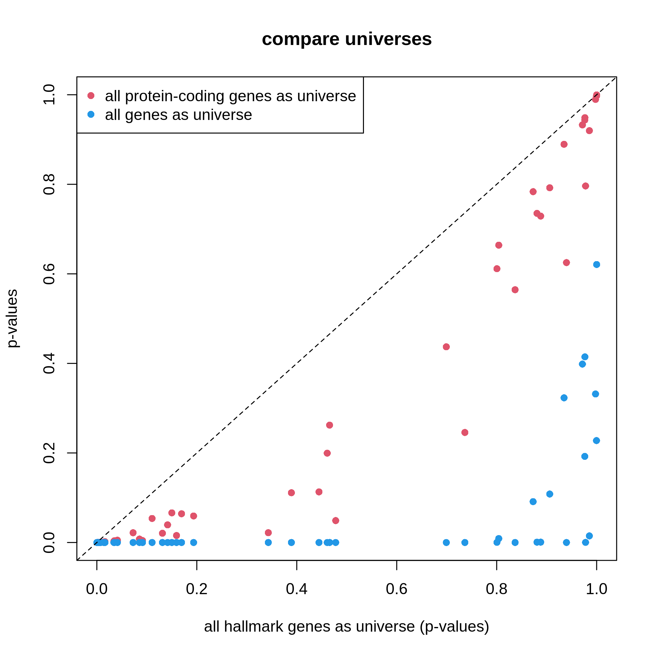
It is very straightforward to see, with a larger universe, there are more significant gene sets, which may produce potentially more false positives. This is definitely worse when using all genes in the genome as universe.
Based on the discussion in this section, the recommendation of using universe is:
- using protein-coding genes,
- using measured genes,
- or using a conservative way with clusterProfiler.
Visualization
clusterProfiler provides a rich set of visualization methods on the GSEA results, from simple visualization to complex ones. Complex visualizations are normally visually fancy but do not transfer too much useful information, and they should only be applied in very specific scenarios under very specific settings; while simple graphs normally do better jobs. Recently the visualization code in clusterProfiler has been moved to a new package enrichplot. Let’s first load the enrichplot package. The full sets of visualizations that enrichplot supports can be found from https://yulab-smu.top/biomedical-knowledge-mining-book/enrichplot.html.
We first re-generate the enrichment table.
R
library(enrichplot)
resTimeGO = enrichGO(gene = timeDEgenes,
keyType = "SYMBOL",
ont = "BP",
OrgDb = org.Mm.eg.db,
pvalueCutoff = 1,
qvalueCutoff = 1)
resTimeGOTable = as.data.frame(resTimeGO)
head(resTimeGOTable)
OUTPUT
ID Description GeneRatio BgRatio RichFactor
GO:0050900 GO:0050900 leukocyte migration 50/965 408/28832 0.1225490
GO:0006935 GO:0006935 chemotaxis 54/965 475/28832 0.1136842
GO:0042330 GO:0042330 taxis 54/965 477/28832 0.1132075
GO:0030595 GO:0030595 leukocyte chemotaxis 35/965 242/28832 0.1446281
GO:0060326 GO:0060326 cell chemotaxis 41/965 337/28832 0.1216617
GO:0071674 GO:0071674 mononuclear cell migration 32/965 229/28832 0.1397380
FoldEnrichment zScore pvalue p.adjust qvalue
GO:0050900 3.661485 10.075346 2.751321e-15 1.053782e-11 7.745382e-12
GO:0006935 3.396625 9.800882 5.186751e-15 1.053782e-11 7.745382e-12
GO:0042330 3.382383 9.763475 6.190224e-15 1.053782e-11 7.745382e-12
GO:0030595 4.321158 9.654694 3.373742e-13 4.307425e-10 3.165991e-10
GO:0060326 3.634975 9.054313 1.137629e-12 1.161974e-09 8.540597e-10
GO:0071674 4.175053 8.976588 8.861995e-12 6.891923e-09 5.065617e-09
geneID
GO:0050900 Tnfsf18/Sell/Slamf9/Fut7/Itga4/Mdk/Grem1/Ada/Prex1/Edn3/P2ry12/Il12a/S100a8/S100a9/Nbl1/Padi2/Bst1/Cxcl5/Ppbp/Pf4/Cxcl1/Ptn/Alox5/Trpm4/Hsd3b7/Itgam/Adam8/Ascl2/Gdf15/Calr/Enpp1/Aire/Ccl2/Ccl7/Ccl5/Ccr7/Aoc3/Itgb3/Ccl28/Lgals3/Ptk2b/Emp2/Apod/Retnlg/Plg/Fpr2/Dusp1/Ager/Il33/Ch25h
GO:0006935 Tnfsf18/Sell/Slamf9/Mdk/Grem1/Prex1/Edn3/P2ry12/Il12a/S100a7a/S100a8/S100a9/Lpar1/Ptgr1/Nbl1/Padi2/Bst1/Cxcl5/Ppbp/Pf4/Cxcl1/Ptn/Alox5/Ntf3/Trpm4/Hsd3b7/Itgam/Adam8/Lsp1/Calr/Ccl17/Robo3/Cmtm7/Ccl2/Ccl7/Ccl5/Ccl6/Ccr7/Itgb3/Tubb2b/Ccl28/Lgals3/Cmtm5/Ptk2b/Nr4a1/Casr/Retnlg/Fpr2/Dusp1/Ager/Stx3/Ch25h/Plxnb3/Nox1
GO:0042330 Tnfsf18/Sell/Slamf9/Mdk/Grem1/Prex1/Edn3/P2ry12/Il12a/S100a7a/S100a8/S100a9/Lpar1/Ptgr1/Nbl1/Padi2/Bst1/Cxcl5/Ppbp/Pf4/Cxcl1/Ptn/Alox5/Ntf3/Trpm4/Hsd3b7/Itgam/Adam8/Lsp1/Calr/Ccl17/Robo3/Cmtm7/Ccl2/Ccl7/Ccl5/Ccl6/Ccr7/Itgb3/Tubb2b/Ccl28/Lgals3/Cmtm5/Ptk2b/Nr4a1/Casr/Retnlg/Fpr2/Dusp1/Ager/Stx3/Ch25h/Plxnb3/Nox1
GO:0030595 Tnfsf18/Sell/Slamf9/Mdk/Grem1/Prex1/Edn3/Il12a/S100a8/S100a9/Nbl1/Padi2/Bst1/Cxcl5/Ppbp/Pf4/Cxcl1/Ptn/Alox5/Trpm4/Hsd3b7/Itgam/Adam8/Calr/Ccl2/Ccl7/Ccl5/Ccr7/Ccl28/Lgals3/Ptk2b/Retnlg/Fpr2/Dusp1/Ch25h
GO:0060326 Tnfsf18/Sell/Slamf9/Mdk/Grem1/Prex1/Edn3/Il12a/S100a8/S100a9/Lpar1/Nbl1/Padi2/Bst1/Cxcl5/Ppbp/Pf4/Cxcl1/Ptn/Alox5/Trpm4/Hsd3b7/Itgam/Adam8/Calr/Ccl17/Ccl2/Ccl7/Ccl5/Ccl6/Ccr7/Ccl28/Lgals3/Ptk2b/Nr4a1/Retnlg/Fpr2/Dusp1/Ch25h/Plxnb3/Nox1
GO:0071674 Tnfsf18/Slamf9/Fut7/Itga4/Mdk/Grem1/P2ry12/Il12a/Nbl1/Padi2/Alox5/Trpm4/Hsd3b7/Adam8/Ascl2/Calr/Enpp1/Aire/Ccl2/Ccl7/Ccl5/Ccr7/Itgb3/Lgals3/Ptk2b/Apod/Retnlg/Plg/Fpr2/Dusp1/Ager/Ch25h
Count
GO:0050900 50
GO:0006935 54
GO:0042330 54
GO:0030595 35
GO:0060326 41
GO:0071674 32barplot() and dotplot() generate plots for
a small number of significant gene sets. Note the two functions are
directly applied on resTimeGO returned by
enrichGO().
R
barplot(resTimeGO, showCategory = 20)
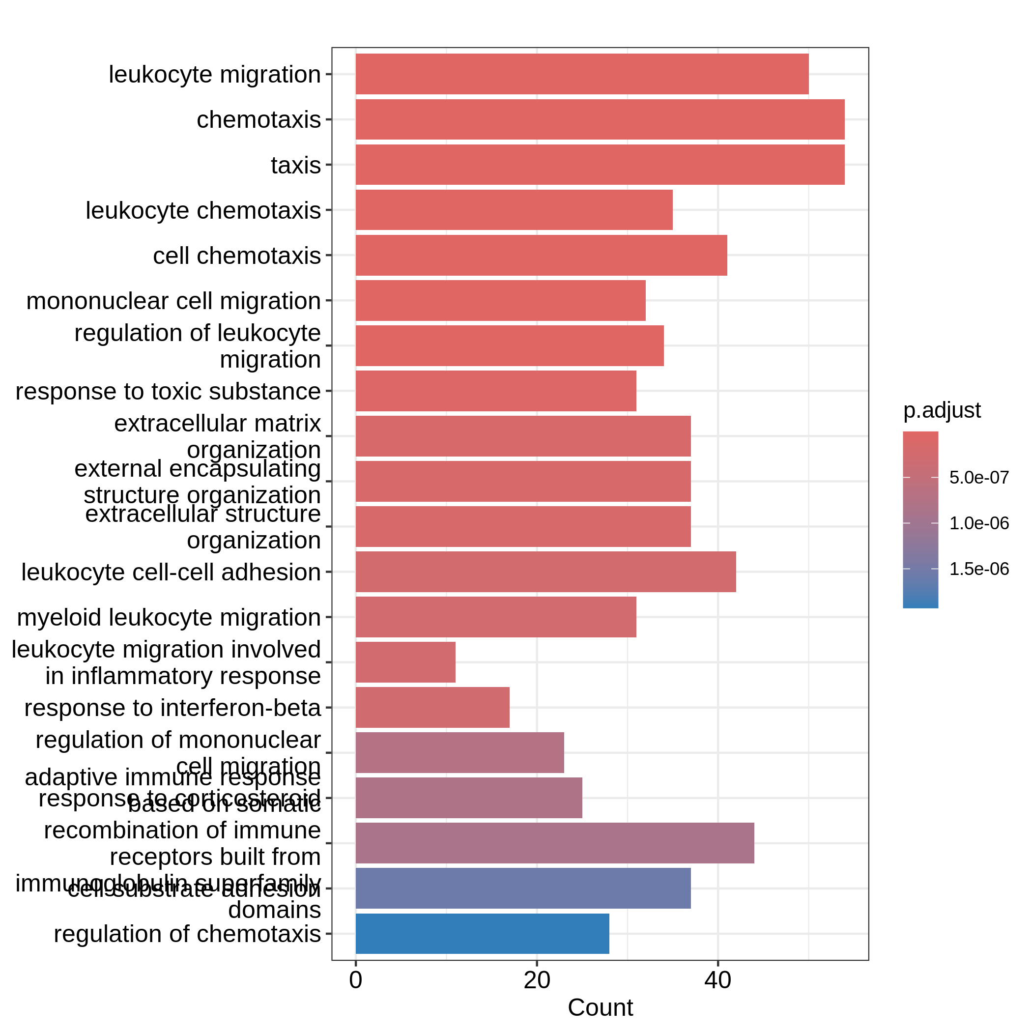
R
dotplot(resTimeGO, showCategory = 20)
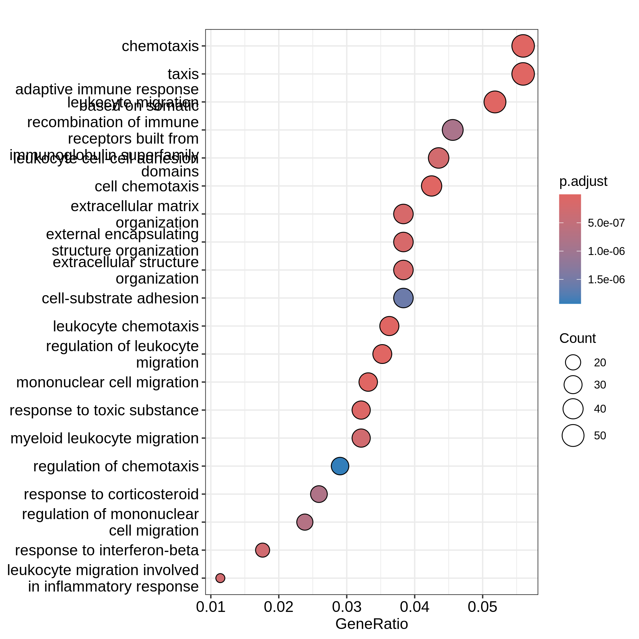
Barplots can map two variables to the plot, one to the height of bars
and the other to the colors of bars; while for dotplot, sizes of dots
can be mapped to a third variable. The variable names are in the colum
names of the result table. Both plots include the top 20 most
significant terms. On dotplot, terms are ordered by the values on x-axis
(the GeneRatio).
Now we need to talk about “what is a good visualization?”. The
essential two questions are “what is the key message a plot
transfers to readers?” and “what is the major graphical element
in the plot?”. In the barplot or dotplot, the major graphical
element which readers may notice the easiest is the height of bars or
the offset of dots to the origin. The most important message of the ORA
analysis is of course “the enrichment”. The two examples from
barplot() and dotplot() actually fail to
transfer such information to readers. In the first barplot where
"Count" is used as values on x-axis, the numer of DE genes
in gene sets is not a good measure of the enrichment because it has a
positive relation to the size of gene sets. A high value of
"Count" does not mean the gene set is more enriched.
It is the same reason for dotplot where "GeneRatio" is
used as values on x-axis. Gene ratio is calculated as the fraction of DE
genes from a certain gene set (GeneRatio = Count/Total_DE_Genes). The
dotplot puts multiple gene sets in the same plot and the aim is to
compare between gene sets, thus gene sets should be “scaled” to make
them comparable. "GeneRatio" is not scaled for different
gene sets and it still has a positive relation to the gene set size,
which can be observed in the dotplot where higher the gene ratio, larger
the dot size. Actually “GeneRatio” has the same effect as “Count”
(GeneRatio = Count/Total_DE_Genes), so as has been explained in the
previous paragraph, "GeneRatio" is not a good measure for
enrichment either.
Now let’s try to make a more reasonable barplot and dotplot to show the enrichment of ORA.
First, let’s define some metrics which measure the “enrichment” of DE genes on gene sets. Recall the denotations in the 2x2 contingency table (we are too far from that!). Let’s take these numbers from the enrichment table.
R
n_11 = resTimeGOTable$Count
n_10 = 983 # length(intersect(resTimeGO@gene, resTimeGO@universe))
n_01 = as.numeric(gsub("/.*$", "", resTimeGOTable$BgRatio))
n = 28943 # length(resTimeGO@universe)
Instead of using GeneRatio, we use the fraction of DE
genes in the gene sets which are kind of like a “scaled” value for all
gene sets. Let’s calculate it:
R
resTimeGOTable$DE_Ratio = n_11/n_01
resTimeGOTable$GS_size = n_01 # size of gene sets
Then intuitively, if a gene set has a higher DE_Ratio
value, we could say DE genes have a higher enrichment6 in it.
We can measure the enrichment in two other ways. First, the log2 fold enrichment, defined as:
\[ \log_2(\mathrm{Fold\_enrichment}) = \frac{n_{11}/n_{10}}{n_{01}/n} = \frac{n_{11}/n_{01}}{n_{10}/n} = \frac{n_{11}n}{n_{10}n_{01}} \]
which is the log2 of the ratio of DE% in the gene set and DE% in the universe or the log2 of the ratio of gene_set% in the DE genes and gene_set% in the universe. The two are identical.
R
resTimeGOTable$log2_Enrichment = log( (n_11/n_10)/(n_01/n) )
Second, it is also common to use z-score which is
\[ z = \frac{n_{11} - \mu}{\sigma} \]
where \(\mu\) and \(\sigma\) are the mean and standard deviation of the hypergeometric distribution. They can be calculated as:
R
hyper_mean = n_01*n_10/n
n_02 = n - n_01
n_20 = n - n_10
hyper_var = n_01*n_10/n * n_20*n_02/n/(n-1)
resTimeGOTable$zScore = (n_11 - hyper_mean)/sqrt(hyper_var)
We will use log2 fold change as the primary variable to map to bar
heights and DE_Ratio as the secondary variable to map to
colors. This can be done directly with the ggplot2
package. We also add the adjusted p-values as labels on the
bars.
In resTimeGOTable, gene sets are already ordered by the
significance, so we take the first 10 gene sets which are the 10 most
significant gene sets.
R
library(ggplot2)
ggplot(resTimeGOTable[1:10, ],
aes(x = log2_Enrichment, y = factor(Description, levels = rev(Description)),
fill = DE_Ratio)) +
geom_bar(stat = "identity") +
geom_text(aes(x = log2_Enrichment,
label = sprintf("%.2e", p.adjust)), hjust = 1, col = "white") +
ylab("")
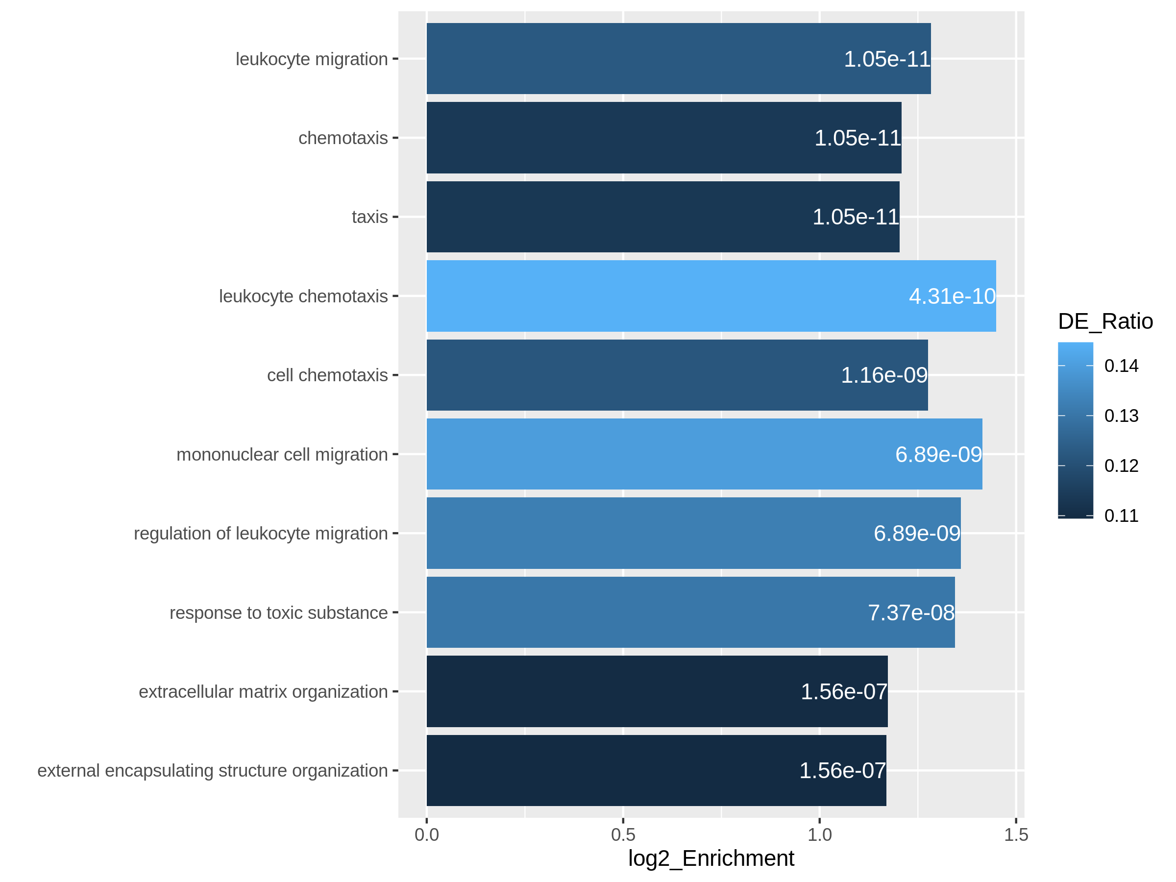
In the next example, we use z-score as the primary variable
to map to the offset to origin, DE_Ratio and
Count to map to dot colors and sizes.
R
ggplot(resTimeGOTable[1:10, ],
aes(x = zScore, y = factor(Description, levels = rev(Description)),
col = DE_Ratio, size = Count)) +
geom_point() +
ylab("")
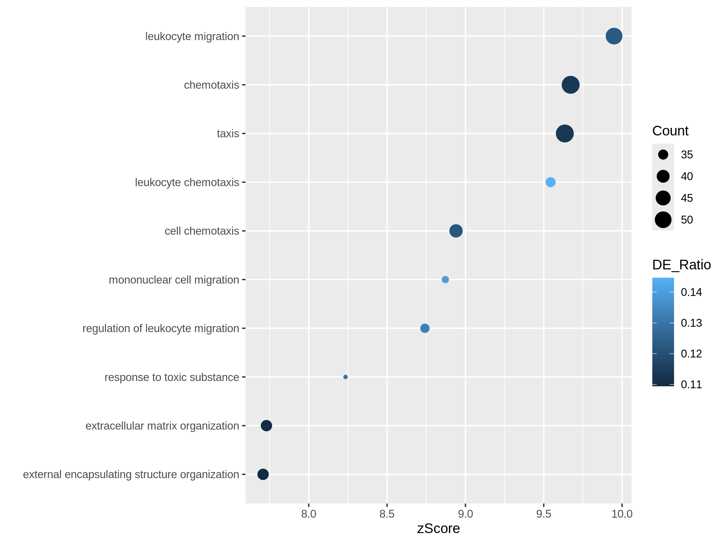
Both plots can highlight the gene set “leukocyte migration involved in inflammatory response” is relatively small but highly enriched.
Another useful visualization is the volcano plot. You may be aware of in differential expression analysis, in the volcano plot, x-axis corresponds to log2 fold changes of the differential expression, and y-axis corresponds to the adjusted p-values. It is actually similar here where we use log2 fold enrichment on x-axis.
Since we only look at the over-representation, the volcano plot is one-sided. We can set two cutoffs on the log2 fold enrichment and adjusted p-values, then the gene sets on the top right region can be thought as being both statistically significant and also biologically sensible.
R
ggplot(resTimeGOTable,
aes(x = log2_Enrichment, y = -log10(p.adjust),
color = DE_Ratio, size = GS_size)) +
geom_point() +
geom_hline(yintercept = -log10(0.01), lty = 2, col = "#444444") +
geom_vline(xintercept = 1.5, lty = 2, col = "#444444")
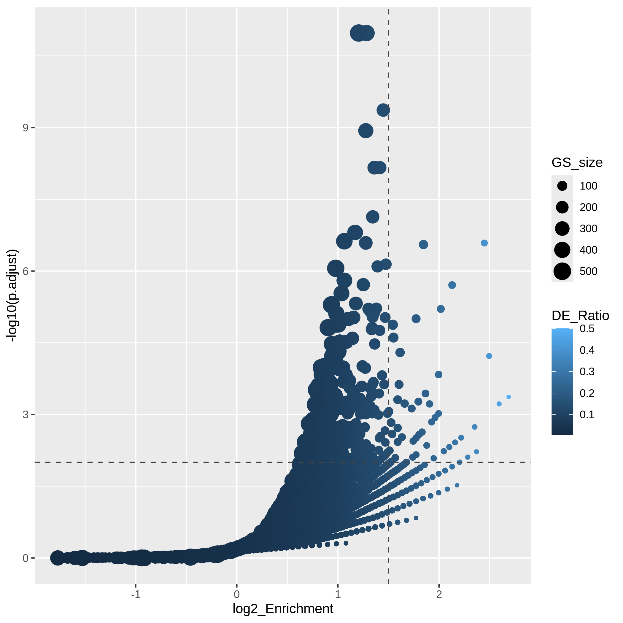
In the “volcano plot”, we can observe the plot is composed by a list
of curves. The trends are especially clear in the right bottom of the
plot. Actually each “curve” corresponds to a same "Count"
value (number of DE genes in a gene set). The volcano plot shows very
clearly that the enrichment has a positive relation to the gene set size
where a large gene set can easily reach a small p-value with a
small DE_ratio and a small log2 fold enrichment, while a small gene set
needs to have a large DE ratio to be significant.
It is also common that we perform ORA analysis on up-regulated genes and down-regulated separately. And we want to combine the significant gene sets from the two ORA analysis in one plot. In the following code, we first generate two enrichment tables for up-regulated genes and down-regulated separately.
R
# up-regulated genes
timeDEup <- as.data.frame(subset(resTime, padj < 0.05 & log2FoldChange > log2(1.5)))
timeDEupGenes <- rownames(timeDEup)
resTimeGOup = enrichGO(gene = timeDEupGenes,
keyType = "SYMBOL",
ont = "BP",
OrgDb = org.Mm.eg.db,
universe = rownames(se),
pvalueCutoff = 1,
qvalueCutoff = 1)
resTimeGOupTable = as.data.frame(resTimeGOup)
n_11 = resTimeGOupTable$Count
n_10 = length(intersect(resTimeGOup@gene, resTimeGOup@universe))
n_01 = as.numeric(gsub("/.*$", "", resTimeGOupTable$BgRatio))
n = length(resTimeGOup@universe)
resTimeGOupTable$log2_Enrichment = log( (n_11/n_10)/(n_01/n) )
# down-regulated genes
timeDEdown <- as.data.frame(subset(resTime, padj < 0.05 & log2FoldChange < -log2(1.5)))
timeDEdownGenes <- rownames(timeDEdown)
resTimeGOdown = enrichGO(gene = timeDEdownGenes,
keyType = "SYMBOL",
ont = "BP",
OrgDb = org.Mm.eg.db,
universe = rownames(se),
pvalueCutoff = 1,
qvalueCutoff = 1)
resTimeGOdownTable = as.data.frame(resTimeGOdown)
n_11 = resTimeGOdownTable$Count
n_10 = length(intersect(resTimeGOdown@gene, resTimeGOdown@universe))
n_01 = as.numeric(gsub("/.*$", "", resTimeGOdownTable$BgRatio))
n = length(resTimeGOdown@universe)
resTimeGOdownTable$log2_Enrichment = log( (n_11/n_10)/(n_01/n) )
As an example, let’s simply take the first 5 most significant terms for up-regulated genes and the first 5 most significant terms for down-regulated genes. The following ggplot2 code should be easy to read.
R
# The name of the 3rd term is too long, we wrap it into two lines.
resTimeGOupTable[3, "Description"] = paste(strwrap(resTimeGOupTable[3, "Description"]), collapse = "\n")
direction = c(rep("up", 5), rep("down", 5))
ggplot(rbind(resTimeGOupTable[1:5, ],
resTimeGOdownTable[1:5, ]),
aes(x = log2_Enrichment, y = factor(Description, levels = rev(Description)),
fill = direction)) +
geom_bar(stat = "identity") +
scale_fill_manual(values = c("up" = "red", "down" = "darkgreen")) +
geom_text(aes(x = log2_Enrichment,
label = sprintf("%.2e", p.adjust)), hjust = 1, col = "white") +
ylab("")
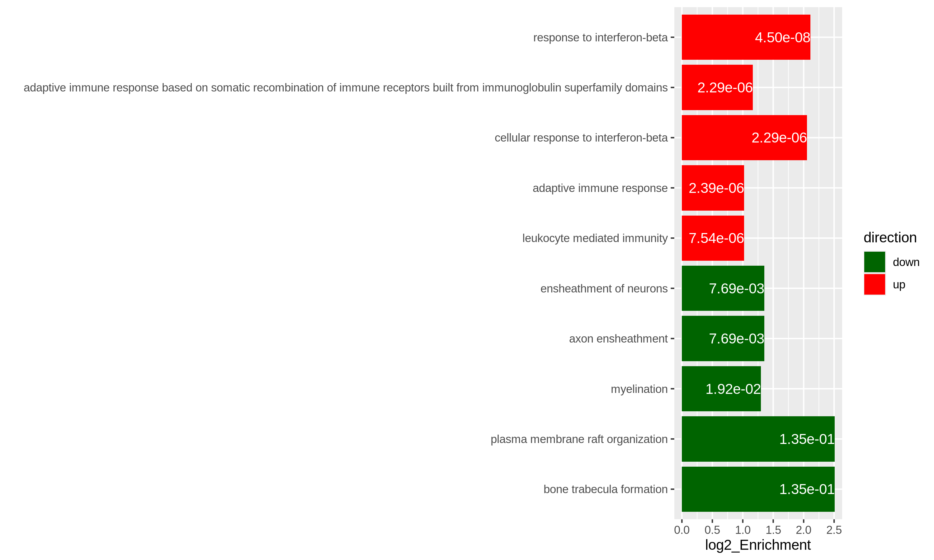
Specifically for GO enrichment, it is often that GO enrichment returns a long list of significant GO terms (e.g. several hundreds). This makes it difficult to summarize the common functions from the long list. The last package we will introduce is the simplifyEnrichment package which partitions GO terms into clusters based on their semantic similarity7 and summarizes their common functions via word clouds.
The input of the simplifyGO() function is a vector of GO
IDs. It is recommended to have at least 100 GO IDs for summarization and
visualization.
R
GO_ID = resTimeGOTable$ID[resTimeGOTable$p.adjust < 0.1]
library(simplifyEnrichment)
simplifyGO(GO_ID)
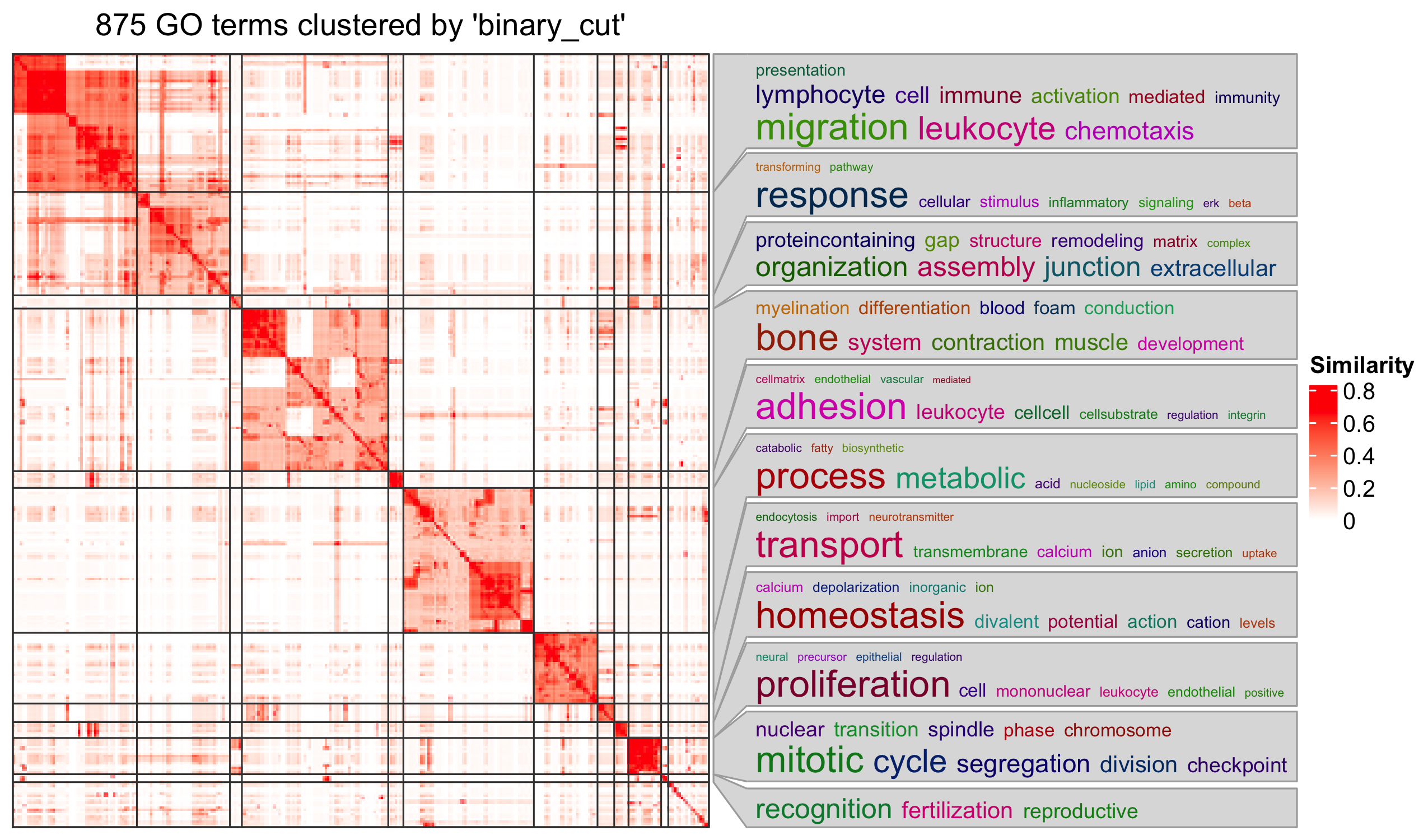
Further reading
ORA analysis actually applies a binary conversion on genes where genes pass the cutoff are set as 1 (DE gene) and others are set as 0 (non-DE gene). This binary transformation over-simplifies the problem and a lot of information are lost. There is second class of gene set enrichment analysis methods which takes the continuous gene-level score as input and weights the importance of a gene in the gene set. Please refer to Subramanian et. al. Gene set enrichment analysis: A knowledge-based approach for interpreting genome-wide expression profiles, PNAS 2005 for more information.
- ORA analysis is based on the gene counts and it is based on Fisher’s exact test or the hypergeometric distribution.
- In R, it is easy to obtain gene sets from a large number of sources.
Genes must be unique in each vector.↩︎
Also note
phyper()can be vectorized.↩︎The definition is from Wikipedia: https://en.wikipedia.org/wiki/Biological_pathway.↩︎
This is actually not true. Indeed
as.data.frame(resTimeGO)only returns the significant GO terms, but the complete enrichment table is still stored inresTimeGO@result. However, directly retrieving the slot of an S4 object is highly unrecommended.↩︎You can also use
select()function:select(org.Mm.eg.db, keys = timeDEgenes, keytype = "SYMBOL", column = "ENTREZID")↩︎If here the term “enrichment” does mean statistically.↩︎
The semantic similarity between GO terms considers the topological relations in the GO hierarchy.↩︎
Content from Next steps
Last updated on 2025-11-13 | Edit this page
Estimated time 20 minutes
Overview
Questions
- How to go further from here?
- What other types of analyses can be done with RNA-seq data?
Objectives
- Get an overview of usages of RNA-seq data that are not covered in this workshop.
Transcript-level analyses
The analyses covered in this workshop all assumed that we have generated a matrix with read counts for each gene. Some questions, however, require expression estimates on a more fine-grained level, typically individual transcript isoforms. This is the case, for example, if we would like to look for differences in expression of individual isoforms, or changes in splicing patterns induced by a specific treatment. As already mentioned in episode 1, some quantification tools (such as Salmon, kallisto and RSEM) do in fact estimate abundances on the transcript level. To perform transcript-level differential expression analysis, these estimates would be used directly, without aggregating them on the gene level. Some caution is warranted, however, as expression estimates for individual transcripts are often more noisy than after aggregation to the gene level. This is due to the high similarity often observed between different isoforms of a gene, which leads to higher uncertainty when mapping reads to transcripts. For this reason, several approaches have been developed specifically for performing differential expression analysis on the transcript level [@Zhu2019-swish, @Baldoni2023-catchsalmon].
Analysis of differential splicing, or differential transcript usage, differs from the differential expression analyses mentioned so far as it is concerned with changes in the relative abundances of the transcripts of a gene. Hence, considering the transcripts in isolation is no longer sufficient. A good resource for learning more about differential transcript usage with Bioconductor is provided by @Love2018-swimming.
De novo transcript assembly
In this lesson, we have assumed that we are working with a well-annotated transcriptome, that is, that we know the sequence of all expressed isoforms and how they are grouped together into genes. Depending on the organism or disease type we are interested in, this may or may not be a reasonable assumption. In situations where we do not believe that the annotated transcriptome is complete enough, we can use the RNA-seq data to assemble transcripts and create a custom annotation. This assembly can be performed either guided by a genome sequence (if one is available), or completely de novo. It should be noted that transcript assembly is a challenging task, which requires a deeply sequenced library to get the best results. In addition, data from more recent long-read sequencing technologies can be very helpful, as they are in principle able to sequence entire transcript molecules, thus circumventing the need for assembly. Methods for transcript assembly represent an active area of research. Recent review are provided e.g. by @Raghavan2022-denovo and @Amarasinghe2020-longread.
- RNA-seq data is very versatile and can be used for a number of different purposes. It is important, however, to carefully plan one’s analyses, to make sure that enough data is available and that abundances for appropriate features (e.g., genes, transcripts, or exons) are quantified.
Content from Additional material: High throughput RNA-sequencing
Last updated on 2025-11-16 | Edit this page
Estimated time 60 minutes
Overview
Questions
How does high throughput RNA-sequencing work?
What is a fastq file?
Objectives
- Explain what RNA-seq is.
- Provide an overview of the procedure to go from the raw data to the read count matrix that will be used for downstream analysis.
This episode is based on the course Omics data analysis.
RNA-seq library preparation
The starting point of a RNA-seq experiment is the cDNA library preparation. RNA is first isolated from cells and purified to remove ribosomal RNA which constitute the majority of total RNA. This can be done by extracting poly(A) RNA or by depleting rRNA. Purified RNA is then fragmented, reverse transcribed and adapters are ligated to both extremities to allow for amplification and sequencing.
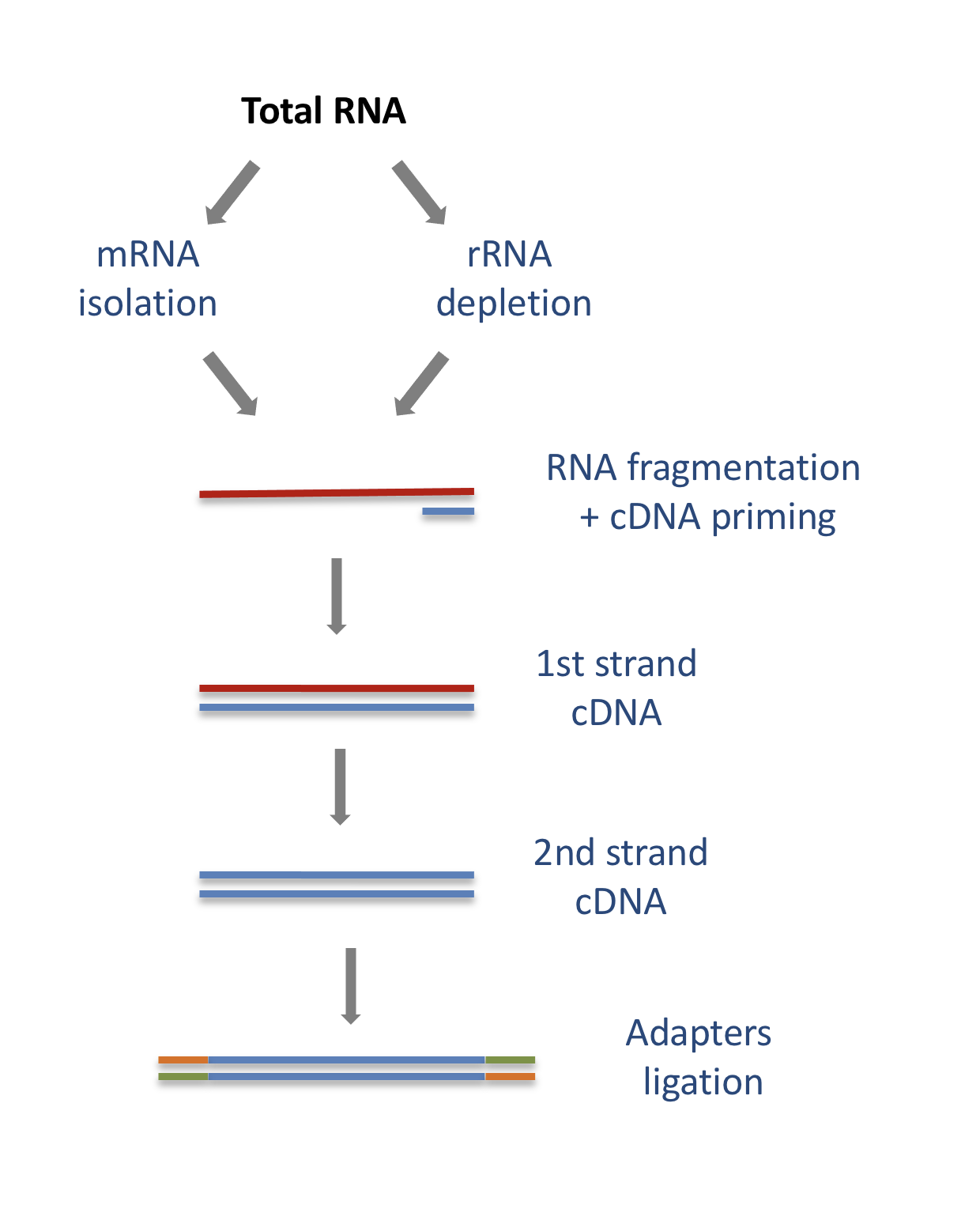
Stranded versus unstranded libraries
The library preparation presented above corresponds to an unstranded protocol.
As both cDNA strands will be amplified for sequencing, about half of the reads will be sequenced from the first cDNA strand, and half of the reads will be sequenced from the second strand cDNA. But we won’t know which strand was sequenced! So we lose the information about the orientation of the transcript.
This can be avoided by using a stranded protocol. In this case, dUTPs are added during the 2nd strand cDNA synthesis and the newly synthetized cDNA strand is degradated after the ligation step. This allows to infer the transcript orientation because only the first cDNA strand will be sequenced. Indeed, if the sequence of the read corresponds to the the sense strand of DNA, it means that the gene was originally transcribed in a sense orientation. On the contrary, if the read is complementary to the sense strand of DNA, it means that it was originally transcribed in antisense.
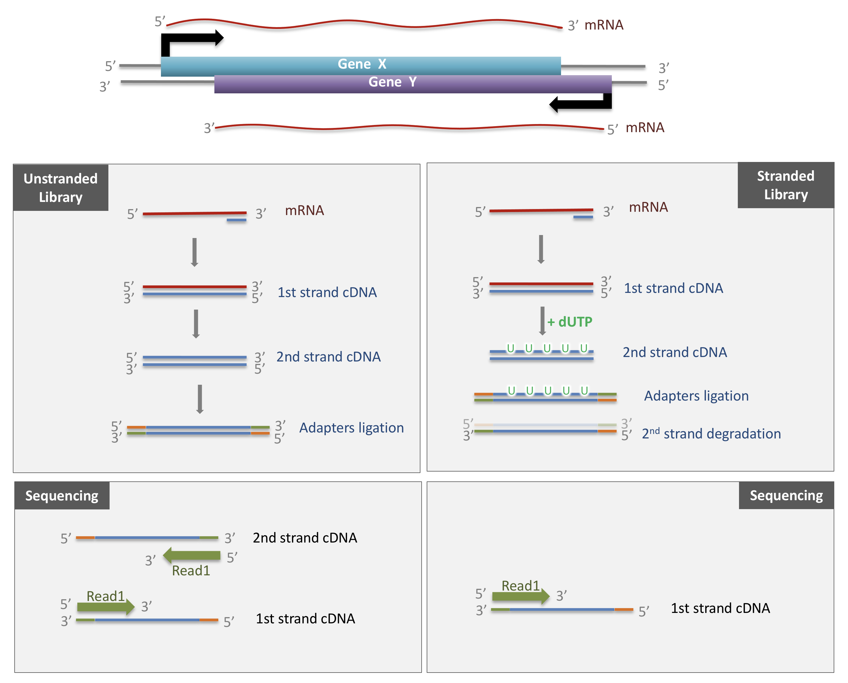
Strand-specificity leads to lower number of ambiguous reads.
Sequencing
SE vs PE sequencing
Once the library is ready, molecules from the library are sequenced in a high throughput manner to obtain short sequences from one end (single-end sequencing) or both ends (pair-end sequencing). Single-end sequencing is cheaper, but Paired-end sequencing improves the ability to localise the fragment in the genome and resolve mapping close to repeat regions, resulting in less multimapping reads.
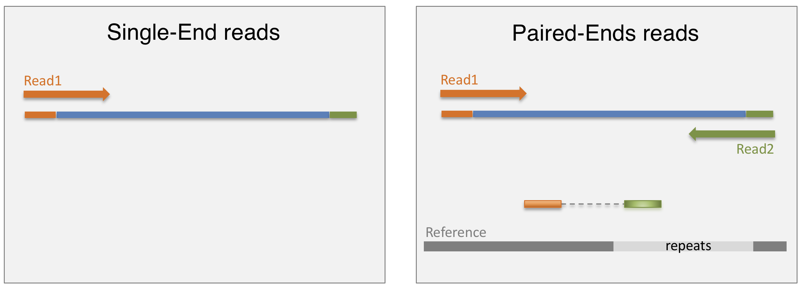
cluster amplification
The sequencing is done by a cluster amplification process.
The library preparation is hybridized to a flow cell coated with immobilized oligonucleotides that serve as support to hold the DNA strands in place during sequencing. The templates are copied from the hybridized primers by 3’ extension using a high-fidelity DNA polymerase. The original templates are denatured, leaving the copies immobilized on the flow cell surface.
Immobilized DNA template copies are then amplified by bridge amplification. The templates loop over to hybridize to adjacent oligonucleotides. DNA polymerase copies the templates from the hybridized oligonucleotides, forming dsDNA bridges, which are denatured to form two ssDNA strands. These two strands loop over and hybridize to adjacent oligonucleotides and are extended again to form two new dsDNA loops. The process is repeated on each template by cycles of denaturation and amplification to create millions of individual, dense clonal clusters containing ~2,000 molecules.
Each cluster of dsDNA bridges is denatured, and the reverse strand is removed by specific base cleavage, leaving the forward DNA strand. The 3’-ends of the DNA strands and flow cell-bound oligonucleotides are blocked to prevent interference with the sequencing reaction. The sequencing primer is hybridised to the Illumina adapter. Clusters are ready for sequencing.
The sequencing process is done by synthesis. A polymerase adds a fluorescently tagged dNTP to the DNA strand (only one base is able to be added per round due to the fluorophore acting as a blocking group, but the blocking group is reversible). Each of the four bases has a unique fluorophore, and after each round, the machine records which base was added. The fluorophore is then washed away and the process is repeated.
For a dynamic view of the cluster amplification process, watch the Illumina video.
fastq files
The sequence data generated from the sequencer are received in text
files called fastq files. For a single-end run, one fastq
file is created for each sample. For a paired-end run, two separated
fastq files are generated, each containing sequences from one end.
What does a FASTQ file look like?
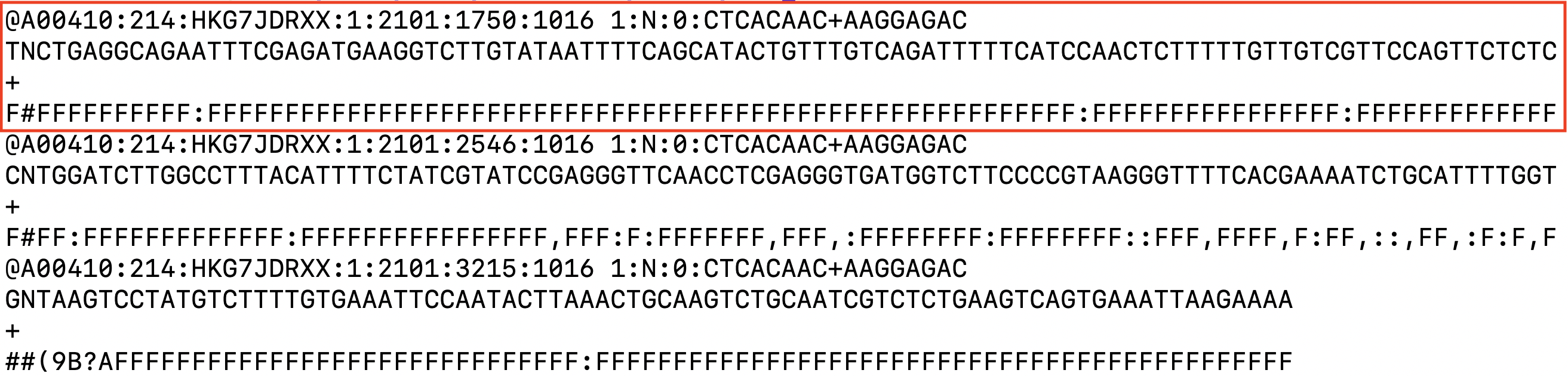
Each entry in a fastq file consists of 4 lines:
- A sequence identifier (by convention preceded by ‘@’) with information about the sequencing run
- The sequence
- A delimiter, always starting by the sign ‘+’
- The base call quality scores. These are Phred scores, encoded using ASCII characters to represent the numerical quality scores. Each character is assigned a quality score between 0 and 40. Quality scores represent the probability that the corresponding nucleotide call is correct.
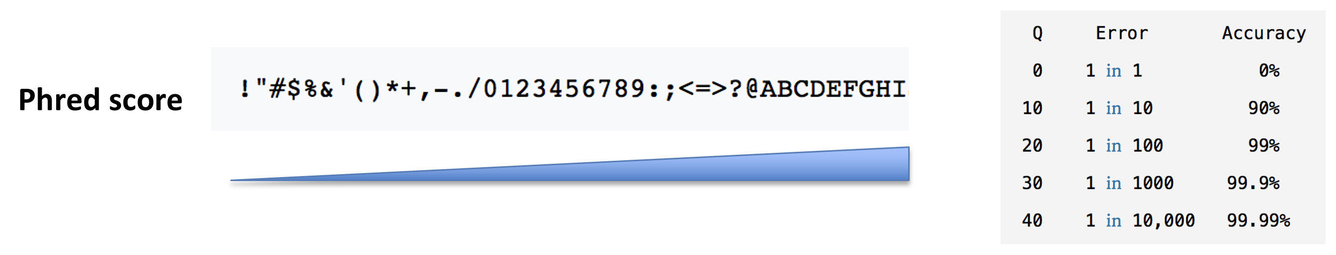
Overview
Questions
What do you think of the quality of the last sequence presented in the fastq file above?
Objectives
- Explain what RNA-seq is.
- Provide an overview of the procedure to go from the raw data to the read count matrix that will be used for downstream analysis.
Processing pipeline
The raw reads from fastq files will need to pass through a different tools to yield ultimately a count table, representing a snapshot of individual gene expression levels. The execution of this set of tools in a specified order is commonly referred to as a pipeline.
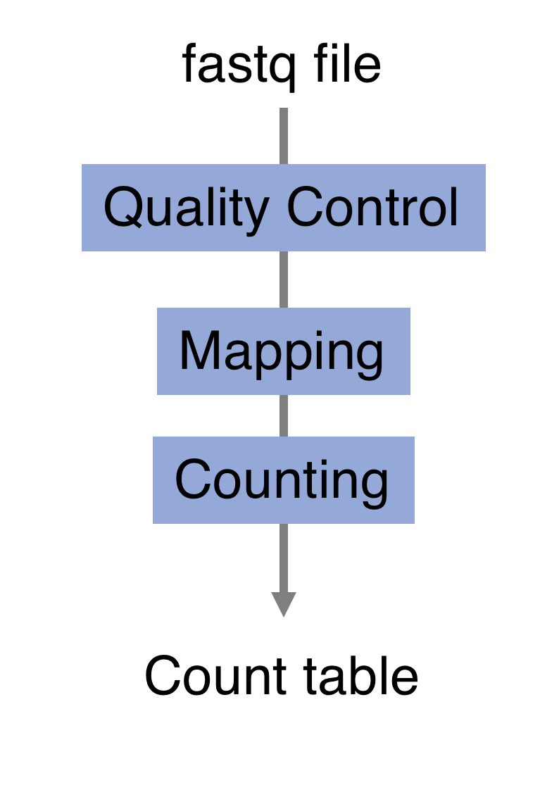
Quality control
Of course, no one will analyse the sequences from the fastq file one by one to check their quality… Rather, a software called FastQC can be used. Then, another program such as Trimmomatics can help to clean the reads.
- FastQC
FastQC allows to analyse different features of the reads and generates a report that includes several diagnostic plots to highlight any problem the data may have.
FastQC is run from the command line:
Discussion:
Try to interpret the different plots of this fastQC report from a real RNA-seq fastq file.
Another report corresponding to bad quality data can be used as a point of comparison.
- Trimmomatics
FastQC gives a global vision the quality of the sample. If it is not optimal, it is advisable to use Trimmomatics software to filter poor quality reads and trim residual adapters.
Trimmomatics has a variety of options to clean the reads. Read the manual for more information. However, a command for Trimmomatics could look something like the command below. In this case it would perform adapter removal, and perform a scan of the read with a 10-base wide sliding window, cutting when the average quality per base drops below 20.
$ java -jar trimmomatic.jar \
PE \ # paired-end
-threads 4 \ # number of threads
SampleName_1.fastq \ # fastq file for fw reads
SampleName_2.fastq \ # fastq file for rev reads
SampleName_1_clean.fastq \ # clean fastq for fw reads
SampleName_1_unpaired.fastq \ # fastq for unpaired remaining fw reads
SampleName_2_clean.fastq \ # clean fastq for rev reads
SampleName_2_unpaired.fastq \ # fastq for unpaired remaining rev reads
ILLUMINACLIP:TruSeq3-PE.fa:2:30:10 \ # cut adapter from the read.
SLIDINGWINDOW:10:20 # sliding window trimmingDiscussion:
How could you check that the trimming performed well?
Alignment
Next step is to map the reads to determine where in the genome the reads originated from. Many different aligners are available such as HISAT2, STAR, BWA, Salmon, Subread… There is no gold standard, but some tools are better suited for particular NGS analyses [@Baruzzo:2017]… In the case of RNA-seq, it is important to use an aligner able to handle spliced reads.
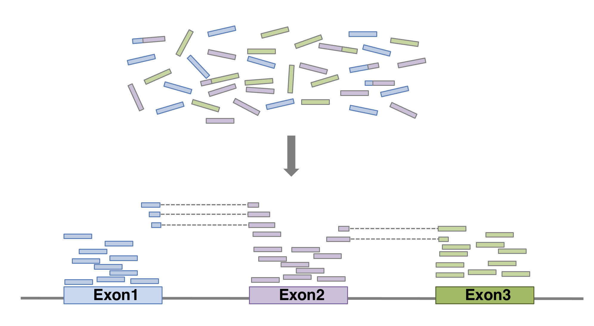
Here we show an example of what the command could look like when
using HISAT2
aligner, launched with default parameters. In this basic configuration,
mandatory parameters are of course the fastq file(s) and the sequence of
the genome on which the reads have to be aligned. In practical, the
genome’s sequence is not given as it is but in an indexed form 1. Of course
many of other parameters can be fine tuned (see the manual for
more details). The alignment output file data is a sam file
(see below).
$ hisat2 \
-p 6 \ # number of threads
-x genome_index \ # index for the reference genome
-1 SampleName_1_clean.fastq \ # clean fastq_file for fw reads
-2 SampleName_2_clean.fastq \ # clean fastq_file for rev reads
-S SampleName.sam # sam file nameIt is recommended to pay attention to the HISAT2 report to check the alignment rate. For a PE-end alignment it could look like this:
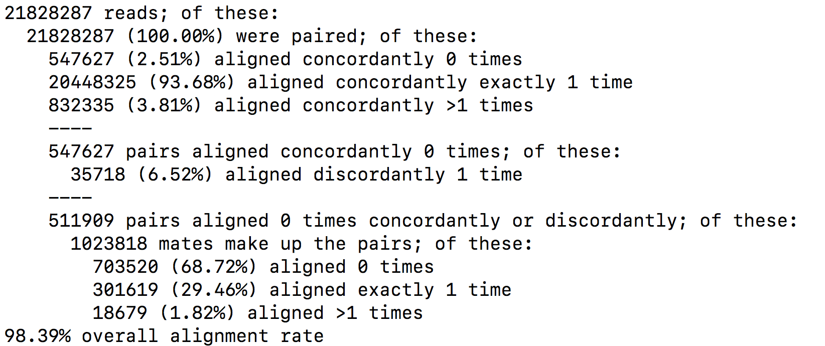
SAM format
The SAM format is a generic format for storing large nucleotide sequence alignments. In a SAM file, each entry gives the alignment information for a single read. Each entry has 11 mandatories fields for essential mapping information and a variable number of other fields for aligner specific information. An example of few entries from a SAM file is displayed below.
OUTPUT
DRR016707.26395247 147 1 19626495 60 101M = 19626490 -106 GTAACAATGTTATCAGTAATGCTTTAAACTCCAGCACCTGGTTATGCATTTGAAACCAAGTCTGTTTCTTGTTTTGTATTTTCTCTCTGGAAGTTGTAAGG DDDDDDDDDDDDDEEEEEEEFFFFFFHCHHHJJJHHJJJJJJJJJJJJIHFJJIHJJJJJJJJJJJJJJJJJJJJJJJJJJJJIJJJJHHHHHFFFFFCCC AS:i:0 XN:i:0 XM:i:0 XO:i:0 XG:i:0 NM:i:0 MD:Z:101 YS:i:0 YT:Z:CP NH:i:1
DRR016707.26395247 99 1 19626490 60 101M = 19626495 106 CTTCTGTAACAATGTTATCAGTAATGCTTTAAACTCCAGCACCTGGTTATGCATTTGAAACCAAGTCTGTTTCTTGTTTTGTATTTTCTCTCTGGAAGTTG CCCFFFFFHHHHHJIJJJJIJJJJJJJJJJIJJJJJJJJJJJJJJJHHIHIJJJIJJHIJJJIIIIIIJGIJJJJDHJJJHHHHHHHFFFFFFEDACEEDD AS:i:0 XN:i:0 XM:i:0 XO:i:0 XG:i:0 NM:i:0 MD:Z:101 YS:i:0 YT:Z:CP NH:i:1
DRR016707.34969377 163 1 19626487 60 101M = 19626493 107 ATTCTTCTGTAACAATGTTATCAGTAATGCTTTAAACTCCAGCACCTGGTTATGCATTTGAAACCAAGTCTGTTTCTTGTTTTGTATTTTCTCTCTGGAAG CC@FFFFFHFHFFHGGJCIFJGHIIIIGIIIIJIIJJJIGIIIIIIGII?:BFHGHIIIIGEHHHGIIDGGH@GGIGHJGHHHHCEHDEFDDFFEEECCEC AS:i:0 XN:i:0 XM:i:0 XO:i:0 XG:i:0 NM:i:0 MD:Z:101 YS:i:0 YT:Z:CP NH:i:1
DRR016707.34969377 83 1 19626493 60 101M = 19626487 -107 CTGTAACAATGTTATCAGTAATGCTTTAAACTCCAGCACCTGGTTATGCATTTGAAACCAAGTCTGTTTCTTGTTTTGTATTTTCTCTCTGGAAGTTGTAA CDDDDDDDDDDDDECEEEEEFFFFD?=HHHHGIIGEGIGIIIHIGDIHHGGGIIHGHIIIIGIIIGIGEIIGGGIIIIGIIIIGHDIIFHHHHFFBDD?C@ AS:i:0 XN:i:0 XM:i:0 XO:i:0 XG:i:0 NM:i:0 MD:Z:101 YS:i:0 YT:Z:CP NH:i:1
DRR016707.42561021 161 1 19626495 60 100M1S = 19626494 0 GTAACAATGTTATCAGTAATGCTTTAAACTAAAGCACCTGGTTATGCATTTGAAACCAAGTCTGTTTCTTGTTTTGTATTTTCTCTCTGGAAGTTGTAAGA ?8?B1:BDD,,2<:C<2A<<,+A?CBFFAE<+<+2A?EEBD99:D<*?B:*:D9B:DD/BDED@)=8=B;@=)).=(=@;7A)7.==>;3);@AAA>A@3; AS:i:-8 XN:i:0 XM:i:2 XO:i:0 XG:i:0 NM:i:2 MD:Z:30C0C68 YT:Z:UP NH:i:1
DRR016707.42561021 81 1 19626494 60 101M = 19626495 0 TGTAACAATGTTATCAGTAATGCTTTAAACTCCAGCACCTGGTTATGCATTTGACACCAAGTCTGTTTCTTGTTTTGTATTTTCGCTCTGGAAGTTGTAAG (9(??==3??>==;5(55((6.((9>;..;67>)>).5(A;;>=/))8.=>9)((?AB?92=00*;=::1)=:3=74=A7<)0<+<AAAB?=<+4AA<;== AS:i:-5 ZS:i:-19 XN:i:0 XM:i:2 XO:i:0 XG:i:0 NM:i:2 MD:Z:54A29T16 YT:Z:UP NH:i:1
DRR016707.43465443 163 1 19626483 60 101M = 19626486 104 TGCCATTCTTCTGTAACAATGTTATCAGTAATGCTTTAAACTCCAGCACCTGGTTATGCATTTGAAACCAAGTCTGTTTCTTGTTTTGTATTTTCTCTCTG B@@FAFFFHHHHHHIIIIJJJHJJIJJIIJJJJJJJFJJJJJJJJJJJJJHIJFHJJIJJJIJJIIJIJJHIHHIIIJJJJJHEHHHFEFFFFFEDEEEEE AS:i:0 XN:i:0 XM:i:0 XO:i:0 XG:i:0 NM:i:0 MD:Z:101 YS:i:-1 YT:Z:CP NH:i:1
DRR016707.43465443 83 1 19626486 60 100M1S = 19626483 -104 CATTCTTCTGTAACAATGTTATCAGTAATGCTTTAAACTCCAGCACCTGGTTATGCATTTGAAACCAAGTCTGTTTCTTGTTTTGTATTTTCTCTCTGGAG DDDDDDCDDDDCCDEEEEDFFFFFDBHHHHHGJJGHDJIJJIGIHJGGJJJJJJJJJJJJJHG?JJJJJJJJJJJIIJJJJIJJJJJIGHGHHFFFFFCCC AS:i:-1 ZS:i:-12 XN:i:0 XM:i:0 XO:i:0 XG:i:0 NM:i:0 MD:Z:100 YS:i:0 YT:Z:CP NH:i:1
DRR016707.64407509 147 1 19626484 60 101M = 19626484 -101 GCCATTCTTCTGTAACAATGTTATCAGTAATGCTTTAAACTCCAGCACCTGGTTATGCATTTGAAACCAAGTCTGTTTCTTGTTTTGTATTTTCTCTCTGG DDDDDCDDDDDDEEDEEEEFFFFFFHHHHHHJJIJIGHFIHJJJIHFIHHFJJJJJIJJJJJJJIHJJJJJIJJJJJJJJJJJJJJJJHHHHHFFFFFBB@ AS:i:0 XN:i:0 XM:i:0 XO:i:0 XG:i:0 NM:i:0 MD:Z:101 YS:i:0 YT:Z:CP NH:i:1
DRR016707.64407509 99 1 19626484 60 101M = 19626484 -101 GCCATTCTTCTGTAACAATGTTATCAGTAATGCTTTAAACTCCAGCACCTGGTTATGCATTTGAAACCAAGTCTGTTTCTTGTTTTGTATTTTCTCTCTGG CCCFFFFFHHHHHJJJJJJJIJJJJJJJJJJJJJJJJJJJJJIJJJJJJIJJDGIJJJJJJJJCGIJJJIIHHJJJHHIJJJHHHHHDFFFFFFEEEEEED AS:i:0 XN:i:0 XM:i:0 XO:i:0 XG:i:0 NM:i:0 MD:Z:101 YS:i:0 YT:Z:CP NH:i:1Field 1: Sequence ID
Field 2: SAM Flag. It gives information about the read (is it paired, aligned, is the mate read properly aligned…)
Field 3: Chromosome where alignment occurs
Field 4: Position of alignment
Field 5: Mapping quality score (read uniquely mapped (60), multiply mapped (1) or unmapped (0))
Field 6: CIGAR string. It is a representation of alignment indicating positions of match/mismatch/deletion/insertion compared to the reference.
Field 7: Reference name of the mate (Set to ‘=’ if the mate’s reference sequence is the same as this alignment’s)
Field 8: Position of mate
Field 9: Inferred fragment length
Field 10: Read sequence (reverse-complemented if aligned to the reverse strand)
Field 11: Base quality (Phred score)
Field 12: Optional. See hisat2 manual for more information.
BAM format
The BAM file is a compressed binary version of SAM file. SAM files can be easily converted into BAM files using samtools software, and it is sometimes mandatory to sort the SAM/BAM by chromosomal coordinates for downstream applications.
samtools view -Sb SampleName.sam | samtools sort > SampleName.bamAlignment visualisation
Alignements described in BAM files can easily be viewed using IGV (Integrative Genomics Viewer), a very useful interactive tool for the visual exploration of genomic data.
Visualising the alignments is not part of the processing pipeline but sometimes it can be useful..
IGV requires that BAM files have an associated index file2. Samtools can be used to index the BAM file. The following command would create the indexed SampleName.bam.bai file.
samtools index SampleName.bamBam file can be loaded in IGV3. Below is an example of visualisation of a bam file using IGV, focusing on CDKN1A gene.
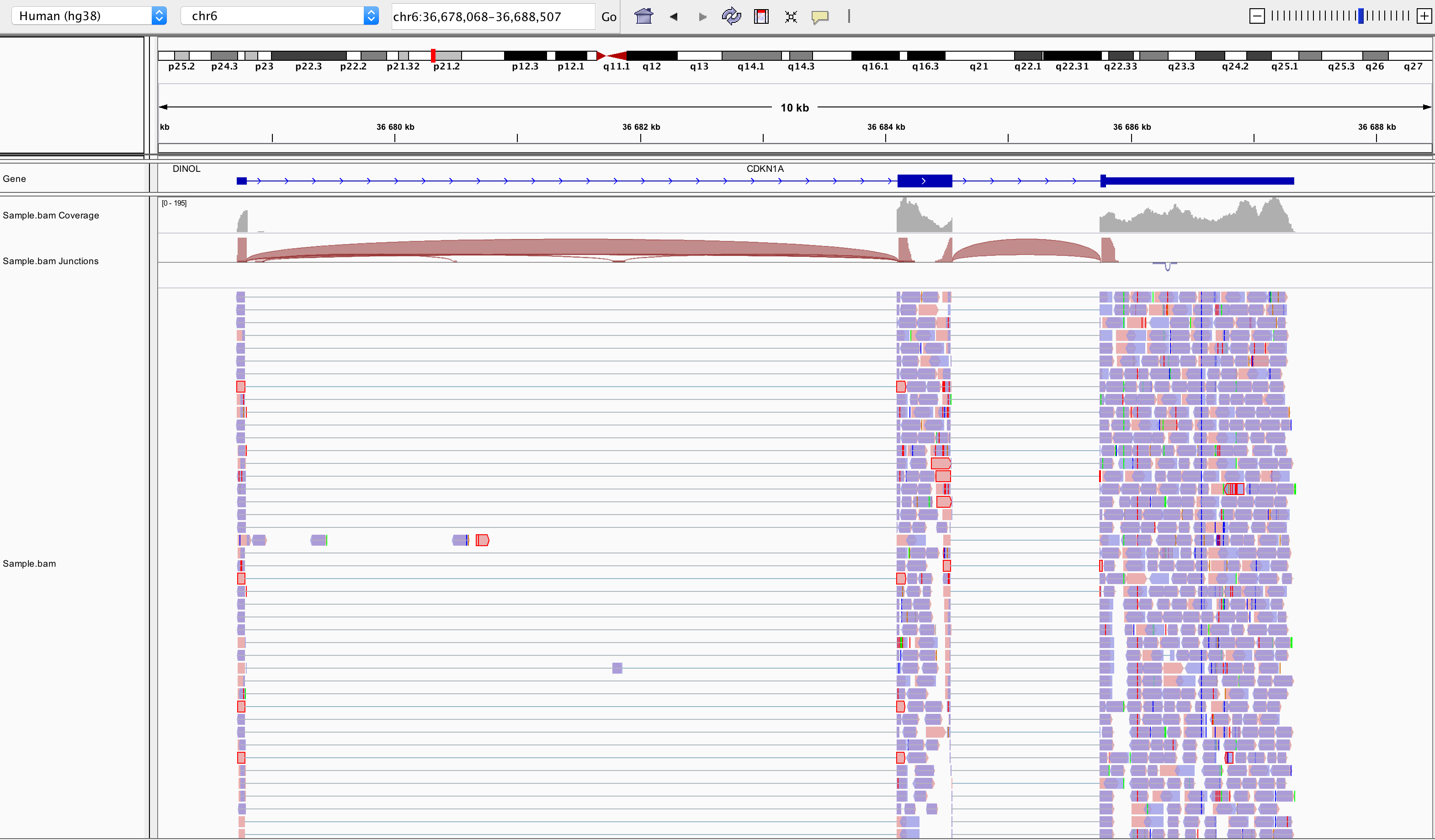
Loading a BAM file creates 3 associated tracks:
Coverage Track to view depth of coverage
Splice Junction Track which provides an alternative view of reads spanning splice junctions
Alignment Track to view individual aligned reads
Counting
Now comes the quantification step. It can be performed with several tools such as htseq-count or FeatureCounts. We will describe the latter as it runs much faster. It was developed for counting reads to genomic features such as genes, exons, promoters and genomic bins. FeatureCounts takes as input SAM/BAM files and an annotation file (such as a gtf file) containing chromosomal coordinates of features.
The Gene Transfer Format (GTF) is a widely used format for storing gene annotations. Human and mouse GTF files can be downloaded easily from Ensembl or from the UCSC table browser. The first few lines of gtf annotation file for human genome assembly GRCh38 look like this:
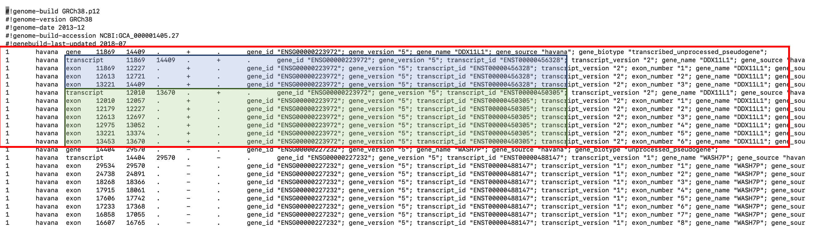
FeatureCounts will count the number of uniquely mapped reads assigned to features (e.g. an exon) or meta-features (e.g. a gene) of the gtf file. When summarizing reads at gene level, read counts obtained for exons belonging to the same gene will be added up to yield the read count for the corresponding gene. Note that an exon-spanning read will be counted only once for the corresponding gene even if it overlaps with more than one exon.
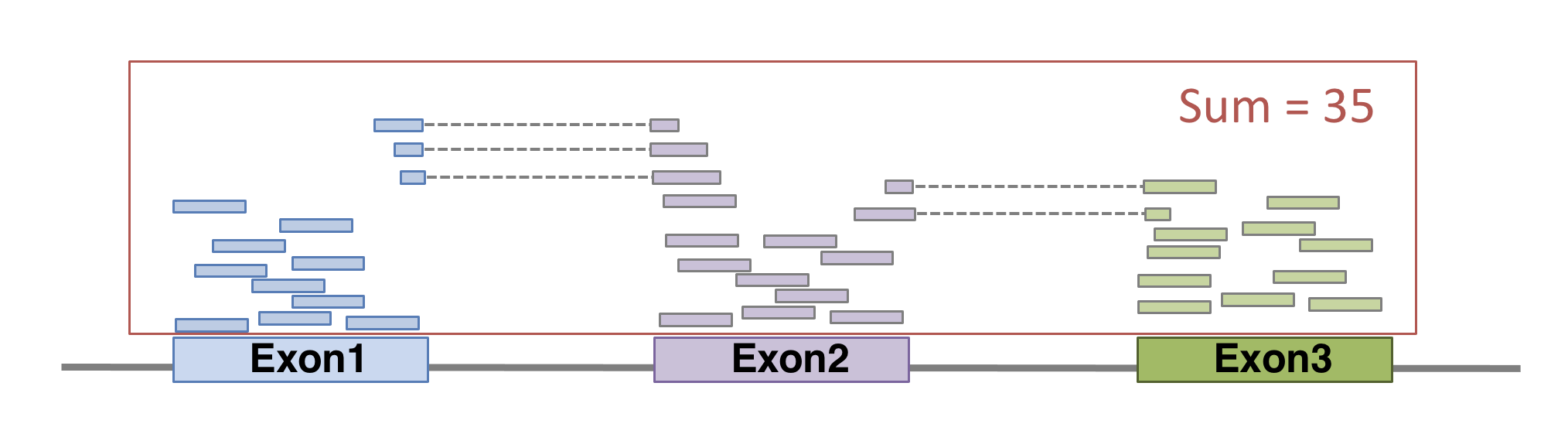
FeatureCounts could be launched with the following command. As usual, many of other parameters can be fine-tuned (see the manual for more details).
featureCounts \
-p \ # paired-end
--countReadPairs \ # fragments counted instead of reads
-a annotations.gtf \ # name of the annotation file
-t exon \ # feature type in GTF annotation
-g gene_id \ # Meta-features used in GTF annotation
-s 0 \ # strand-specificity
-o SampleName_counts.tsv \ # Name of the output file
SampleName.bam # bam fileThe featurecounts output file will give us the raw counts of each gene in that sample. This is how the first lines of featurecounts output could look like:
OUTPUT
Geneid Chr
1 ENSG00000223972 1;1;1;1;1;1;1;1;1
2 ENSG00000227232 1;1;1;1;1;1;1;1;1;1;1
3 ENSG00000278267 1
4 ENSG00000243485 1;1;1;1;1
5 ENSG00000284332 1
6 ENSG00000237613 1;1;1;1;1
Start
1 11869;12010;12179;12613;12613;12975;13221;13221;13453
2 14404;15005;15796;16607;16858;17233;17606;17915;18268;24738;29534
3 17369
4 29554;30267;30564;30976;30976
5 30366
6 34554;35245;35277;35721;35721
End
1 12227;12057;12227;12721;12697;13052;13374;14409;13670
2 14501;15038;15947;16765;17055;17368;17742;18061;18366;24891;29570
3 17436
4 30039;30667;30667;31109;31097
5 30503
6 35174;35481;35481;36073;36081
Strand Length sample.bam
1 +;+;+;+;+;+;+;+;+ 1735 0
2 -;-;-;-;-;-;-;-;-;-;- 1351 14
3 - 68 8
4 +;+;+;+;+ 1021 0
5 + 138 0
6 -;-;-;-;- 1219 0Preparing the count matrix
The aim of an RNA-seq experiment is often to compare different types of cells, or to compare treated cells to control cells, to see if some genes are differentially expressed.
Once fastq files from each sample have been processed into raw counts, results can be merged in a single count matrix, were each column represents a sample, and each line represents a gene. This count matrix will be the starting point of a differential expression analysis.
R
counts <- read.csv("data/GSE96870_counts_cerebellum.csv",
row.names = 1)
head(counts)
OUTPUT
GSM2545336 GSM2545337 GSM2545338 GSM2545339 GSM2545340 GSM2545341
Xkr4 1891 2410 2159 1980 1977 1945
LOC105243853 0 0 1 4 0 0
LOC105242387 204 121 110 120 172 173
LOC105242467 12 5 5 5 2 6
Rp1 2 2 0 3 2 1
Sox17 251 239 218 220 261 232
GSM2545342 GSM2545343 GSM2545344 GSM2545345 GSM2545346 GSM2545347
Xkr4 1757 2235 1779 1528 1644 1585
LOC105243853 1 3 3 0 1 3
LOC105242387 177 130 131 160 180 176
LOC105242467 3 2 2 2 1 2
Rp1 3 1 1 2 2 2
Sox17 179 296 233 271 205 230
GSM2545348 GSM2545349 GSM2545350 GSM2545351 GSM2545352 GSM2545353
Xkr4 2275 1881 2584 1837 1890 1910
LOC105243853 1 0 0 1 1 0
LOC105242387 161 154 124 221 272 214
LOC105242467 2 4 7 1 3 1
Rp1 3 6 5 3 5 1
Sox17 302 286 325 201 267 322
GSM2545354 GSM2545362 GSM2545363 GSM2545380
Xkr4 1771 2315 1645 1723
LOC105243853 0 1 0 1
LOC105242387 124 189 223 251
LOC105242467 4 2 1 4
Rp1 3 3 1 0
Sox17 273 197 310 246Genome indexing allows the aligner to quickly find potential alignment sites for query sequences in a genome, which saves considerable time during alignment. Frequently used genome (human, mouse, rat…) already have indexed versions that can be downloaded directly. When working with another reference genome, a specific indexed genome has to be built.↩︎
Indexing a BAM file allows IGV to quickly extract alignments overlapping particular genomic regions↩︎
Note that the index file must reside in the same directory as the bam file that it indexes, and it must have the same basename↩︎
Content from Additional material: Linear models and FDR
Last updated on 2025-11-19 | Edit this page
Estimated time 20 minutes
Overview
Questions
What are linear models?
What is a FDR?
Objectives
Explore linear models and learn how to interpret coefficients
Address the multiple testing issue
Parts of this chapter are based on the courses WSBIM1322 and Omics data analysis.
Multifactorial design and linear models
The outcome of an experiment, such as a gene expression level in the case of an RNA-seq, can be seen as the sum of several factors:
the treatments effects (these are the effects you actually want to study)
biological effects (representing natural biological differences between samples that you might also have to consider)
technical effects (that come from the experimental process itself and that could potentially influence the measurements)
and lastly, outcome will also reflect an error, which represent the random variability (or experiment noise) that cannot be explain be any of the known factors.
(figure from Lazic (2017)).
Single-factor design
Let’s start by a simple design, and let’s say we have the gene expression values of 3 control samples and 3 samples treated with a drug, assuming that there is no other biological effect or batch effect to consider.
We can use the following linear model to modelise the expression values:
\[y = \beta_0 + \beta_1 . x\]
In this equation,
\(y\) would be the measured expression level of a gene
the design factor \(x\) is a binary indicator variable representing the two groups of our experiment. It will take the value of 0 if we are considering the control samples, and a value of 1 when considering treated samples.
When considering a control sample, the \(x\) factor is set to 0.
The \(\beta_1 . x\) term is hence equal to 0, so the equation can be written:
\[y = \beta_0\]
This means that the \(\beta_0\) term represents the expression level of the gene in the control samples, this coefficient is usually called the intercept
When considering a treated sample, the \(x\) factor is set to 1.
The equation becomes:
\[y = \beta_0 + \beta_1\]
Assuming our expression values are in a log scale then
\[\beta_1 = y - \beta_0 = log(expression_{Treated\_cells}) - log(expression_{Control\_cells})\]
\[\beta_1 = log(\frac{expression_{Treated\_cells}}{expression_{Control\_cells}})\]
The \(\beta_1\) term represents hence the logFoldchange between the treated and the control samples (the treatment effect).
The goal is now to estimate the coefficients and test their significance
The \(\beta_0\) and \(\beta_1\) coefficients can be estimated from the data using the expression values in the control and in the treated samples.
A statistical test can then be applied, to test if the \(\beta_1\) coefficient (the logFC due to the treatment effect) is significantly different from 0.
The null hypothesis is that there is no difference across the sample groups, which is the same as saying that the \(\beta_1\) = 0.
- \(H_0\): \(\beta_1 = 0\) (the logFC = 0)
- \(H_1\): \(\beta_1 \neq 0\) (the logFC \(\neq\) 0)
Example
We are going to use as a toy example a subsetted version of the rna dataset. Let’s focus only on the first gene, the gene Asl, and let’s subset the table to keep only female mice at time 0 and 8.
R
rna <- read_csv("data/rnaseq.csv")
rna1 <- rna %>%
filter(gene %in% c("Asl"), time %in% c(0,8), sex == "Female") %>%
mutate(expression_log = log(expression)) %>%
select(gene, sample, expression_log, time, infection, sex) %>%
arrange(infection)
Let’s also convert the infection column into a factor,
in order to set the NonInfected condition as the reference
level.
R
rna1$infection <- factor(rna1$infection, levels = c("NonInfected", "InfluenzaA"))
Assuming the expression values follow a normal distribution (even
though, as we’ll see later, this isn’t actually true!) and let’s use the
lm() function to fit a linear model to compare infected
mice to non-infected mice.
In this case the design of our experiment would be :
\[design \sim infection\]
R
mod1 <- lm(expression_log ~ infection, data = rna1)
mod1
OUTPUT
Call:
lm(formula = expression_log ~ infection, data = rna1)
Coefficients:
(Intercept) infectionInfluenzaA
6.0941 0.8358 The lm() function has estimated the coefficients of the linear model:
The estimate for the \(\beta_0\) coefficient (the
Intercept) is 6.0941The estimate for the \(\beta_1\) coefficient (annotated as the
infectionInfluenzaAcoefficient) is 0.8358
We can visualise this linear model with:
R
rna1 %>%
ggplot(aes(x = infection, y = expression_log)) +
geom_jitter() +
geom_boxplot(alpha = 0) +
geom_point(aes(x = "NonInfected", y = 6.094074), color = "blue", size = 4) +
geom_point(aes(x = "InfluenzaA", y = 6.094074 + 0.8357904), color = "red", size = 4)
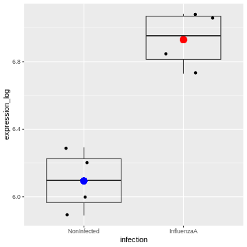
And indeed, we see that
– the intercept (the \(\beta_0\)
coefficient) corresponds to the mean expression level of the gene in the
Noninfected group corresponds (the blue dot)
– the sum of the \(\beta_0\) and the
\(\beta_1\) coefficients (the intercept
+ the logFC) corresponds to the mean expression level of the gene in the
InfluenzaA group (the red dot)
We can also extract the p-value associated with the
infectionInfluenzaA coefficient:
R
summary(mod1)
OUTPUT
Call:
lm(formula = expression_log ~ infection, data = rna1)
Residuals:
Min 1Q Median 3Q Max
-0.20520 -0.12727 0.01064 0.13955 0.19934
Coefficients:
Estimate Std. Error t value Pr(>|t|)
(Intercept) 6.09407 0.08991 67.782 6.94e-10 ***
infectionInfluenzaA 0.83579 0.12715 6.573 0.000594 ***
---
Signif. codes: 0 '***' 0.001 '**' 0.01 '*' 0.05 '.' 0.1 ' ' 1
Residual standard error: 0.1798 on 6 degrees of freedom
Multiple R-squared: 0.8781, Adjusted R-squared: 0.8578
F-statistic: 43.21 on 1 and 6 DF, p-value: 0.0005944We can see that the coefficient infectionInfluenzaA is
highly significant.
Two-factor design
Let’s consider a slightly more complex design. We now have the gene expression values of 6 control and 6 treated samples, but the experiment was conducted in 2 different cell types (cells A and cells B). We hence have 3 controls and 3 treated samples for each cell type.
To take into account the treatment effect while controlling the cell origin, we should use the following design: \[design \sim Treatment + Cell\]
in the following linear model:
\[y = \beta_0 + \beta_1 . x_1 + \beta_2 . x_2\]
We could rewrite this equation as:
\[y = \beta_0 + Treatment. x_1 + Cell . x_2\]
In this equation,
the \(\beta_0\) term represents the
intercept, i.e, the expression level of the gene in the reference sample, for instance the untreated cell type A.the design factor \(x_1\) is a binary indicator variable representing the two treatment conditions of our experiment. It will take the value of 0 if we are considering the untreated samples, and a value of 1 when considering treated samples.
The
Treatmentterm represents the logFoldchange due to treatment.the design factor \(x_2\) is another binary indicator variable representing the two cell types of our experiment. It will take the value of 0 if we are considering the cell type A, and a value of 1 when considering cell type B.
The
Cellterm represents the logFoldchange due to celltype.
The following figure (generated with the
ExploreModelMatrix package) illustrates the value of the
linear predictor of a linear model for each combination of input
variables.
OUTPUT
[[1]]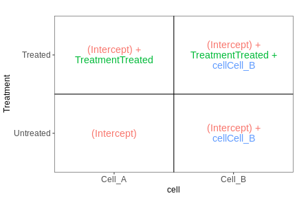
From this figure, we can see how the genes log expression values are modelised in the different samples:
In
untreated cells A: \(y\) = \(\beta_0\)In
treated cells A: \(y\) = \(\beta_0\) + TreatmentIn
untreated cells B: \(y\) = \(\beta_0\) + CellIn
treated cells B: \(y\) = \(\beta_0\) + Treatment + Cell
Example
Let’s subset the rna dataset as below to keep only on the gene Ddx3x, and mice at time 0 and 8.
R
rna2 <- rna %>%
filter(gene %in% c("Ddx3x"), time %in% c(0,8)) %>%
mutate(expression_log = log(expression)) %>%
select(gene, sample, expression_log, time, infection, sex) %>%
arrange(infection)
#set the `NonInfected` condition as the reference level.
rna2$infection <- factor(rna2$infection, levels = c("NonInfected", "InfluenzaA"))
We will start by fitting a linear model that only accounts for the infection effect, ignoring the sex effect.
Our design would hence be \[design \sim infection\]
R
mod2 <- lm(expression_log ~ infection, data = rna2)
summary(mod2)
OUTPUT
Call:
lm(formula = expression_log ~ infection, data = rna2)
Residuals:
Min 1Q Median 3Q Max
-0.20156 -0.15940 0.02542 0.14115 0.19720
Coefficients:
Estimate Std. Error t value Pr(>|t|)
(Intercept) 9.94523 0.06150 161.710 <2e-16 ***
infectionInfluenzaA 0.15182 0.08697 1.746 0.106
---
Signif. codes: 0 '***' 0.001 '**' 0.01 '*' 0.05 '.' 0.1 ' ' 1
Residual standard error: 0.1627 on 12 degrees of freedom
Multiple R-squared: 0.2025, Adjusted R-squared: 0.136
F-statistic: 3.047 on 1 and 12 DF, p-value: 0.1064The Infection Effect is not significant.
R
rna2 %>%
ggplot(aes(x = infection, y = expression_log)) +
geom_jitter(size = 3, aes(color = sex)) +
geom_boxplot(alpha = 0) +
theme(legend.position = "bottom")
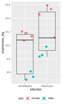
Challenge:
Try to figure our what is wrong with this model
The model only accounts for the infection effect. It ignores the sex effect.
Male and female values are mixed, even though they clearly don’t start at the same baseline.
Challenge:
Use the lm() function to fit a linear model that would
now account for infection and sex.
Interprete the results.
R
mod3 <- lm(expression_log ~ infection + sex, data = rna2)
summary(mod3)
OUTPUT
Call:
lm(formula = expression_log ~ infection + sex, data = rna2)
Residuals:
Min 1Q Median 3Q Max
-0.163831 -0.019300 0.005398 0.030459 0.076010
Coefficients:
Estimate Std. Error t value Pr(>|t|)
(Intercept) 10.06641 0.02789 360.888 < 2e-16 ***
infectionInfluenzaA 0.15182 0.03364 4.513 0.000882 ***
sexMale -0.28277 0.03399 -8.319 4.49e-06 ***
---
Signif. codes: 0 '***' 0.001 '**' 0.01 '*' 0.05 '.' 0.1 ' ' 1
Residual standard error: 0.06294 on 11 degrees of freedom
Multiple R-squared: 0.8906, Adjusted R-squared: 0.8707
F-statistic: 44.79 on 2 and 11 DF, p-value: 5.175e-06The coefficients infectionInfluenzaA (representing the
Infection Effect) and the coefficient sexMale,
representing the Sex Effect, are both significant.
R
rna2 %>%
ggplot(aes(x = infection, y = expression_log)) +
geom_jitter(size = 3, aes(color = sex)) +
geom_boxplot(alpha = 0) +
facet_wrap(~ sex)+
theme(legend.position = "bottom")
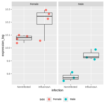
The model now adjusts for the baseline difference between males and females.
It prevents sex differences from biasing the infection effect.
Design with interaction
Coming back to the previous experimental design were we considered 3 controls and 3 treated samples for each cell type (cells A and cells B). An interaction term could be added to the linear model, to modelise a treatment effect that would differ across the cell types.
Our design would hence be : \[design \sim Treatment*Cell\]
The linear model could be written
\[y = \beta_0 + \beta_1 . x_1 + \beta_2 . x_2 + \beta_{12}.x_1.x_2.\]
We could rewrite this equation as:
\[y = \beta_0 + Treatment. x_1 + Cell . x_2 + Treatment.Cell.x_1.x_2\]
In this equation,
the \(\beta_0\) term represents the
intercept, i.e, the expression level of the gene in the reference sample, for instance the untreated cell type A.the design factor \(x_1\) will take the value of 0 if we are considering the untreated samples, and a value of 1 when considering treated samples.
The
Treatmentterm represents the treatment effect in the reference cell type. In this case it would represent the logFoldchange between treated and untreated celltype A.the design factor \(x_2\) will take the value of 0 if we are considering the cell type A, and a value of 1 when considering cell type B.
The
Cellterm represents the Celltype effect in the untreated cells. In this case it would represent the logFoldchange between untreated celltype A and untreated celltype A.The
Treatment.Cellterm represents the treatment effect that would be different in cell type B compared to cell type A. This term will only be considered in the equation when we are referring to treated celltype B (i.e. when \(x_1\) = 1 and \(x_2\) = 1)
The following figure (generated with the
ExploreModelMatrix package) illustrates the value of the
linear predictor of a linear model for each combination of input
variables.
OUTPUT
[[1]]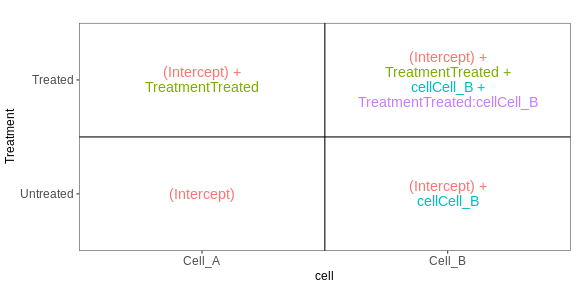
From this figure, we can see how the genes log expression values are modelised in the different samples:
In
untreated cells A: \(y\) = \(\beta_0\)In
treated cells A: \(y\) = \(\beta_0\) + TreatmentIn
untreated cells B: \(y\) = \(\beta_0\) + CellIn
treated cells B: \(y\) = \(\beta_0\) + Treatment + Cell + Treatment.Cell
Challenge:
Not let’s consider the exp dataset. Fit a linear model
with an interaction between condition and cell.
Interprete the results.
R
exp <- structure(list(
gene = c("geneX", "geneX", "geneX", "geneX", "geneX", "geneX", "geneX",
"geneX", "geneX", "geneX", "geneX", "geneX"),
cell = c("cellA", "cellA", "cellA", "cellA", "cellA", "cellA", "cellB",
"cellB", "cellB", "cellB", "cellB", "cellB"),
condition = c("CTL", "CTL", "CTL", "treated", "treated", "treated",
"CTL", "CTL", "CTL", "treated", "treated", "treated"),
expression_log = c(10.3490970690873, 10.1575190636127, 10.4868623968153,
11.6188348660566, 12.7138479539555, 12.6343779570465,
10.0898526422682, 9.70416016607923, 10.4827957238796,
7.79590981240408, 8.18400846690037, 8.17157903656578)),
class = c("tbl_df", "tbl", "data.frame"), row.names = c(NA, -12L))
exp
OUTPUT
# A tibble: 12 × 4
gene cell condition expression_log
<chr> <chr> <chr> <dbl>
1 geneX cellA CTL 10.3
2 geneX cellA CTL 10.2
3 geneX cellA CTL 10.5
4 geneX cellA treated 11.6
5 geneX cellA treated 12.7
6 geneX cellA treated 12.6
7 geneX cellB CTL 10.1
8 geneX cellB CTL 9.70
9 geneX cellB CTL 10.5
10 geneX cellB treated 7.80
11 geneX cellB treated 8.18
12 geneX cellB treated 8.17R
mod4 <- lm(expression_log ~ condition * cell, data = exp)
summary(mod4)
OUTPUT
Call:
lm(formula = expression_log ~ condition * cell, data = exp)
Residuals:
Min 1Q Median 3Q Max
-0.70352 -0.19388 0.06951 0.19478 0.39149
Coefficients:
Estimate Std. Error t value Pr(>|t|)
(Intercept) 10.3312 0.2237 46.188 5.33e-11 ***
conditiontreated 1.9912 0.3163 6.295 0.000234 ***
cellcellB -0.2389 0.3163 -0.755 0.471771
conditiontreated:cellcellB -4.0330 0.4473 -9.015 1.83e-05 ***
---
Signif. codes: 0 '***' 0.001 '**' 0.01 '*' 0.05 '.' 0.1 ' ' 1
Residual standard error: 0.3874 on 8 degrees of freedom
Multiple R-squared: 0.9581, Adjusted R-squared: 0.9424
F-statistic: 60.99 on 3 and 8 DF, p-value: 7.452e-06The interaction term is significant. This indicates that the Treatement effect is significantly different in Cells A and cells B.
And indeed looking at the count values, we can see that the treatment increases the gene expression level in cells A, but it has an opposite effect in cells B.
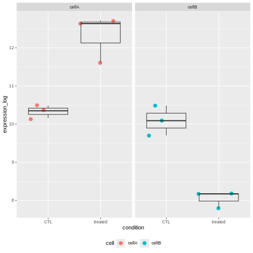
Challenge:
Subset the rna dataset as below to keep only on the gene Ddx3x, and mice at time 0 and 8.
Re-use the previous rna2 dataset and fit a linear model
with an interaction between infection and sex.
Interprete the results.
R
mod3 <- lm(expression_log ~ infection * sex, data = rna2)
summary(mod3)
OUTPUT
Call:
lm(formula = expression_log ~ infection * sex, data = rna2)
Residuals:
Min 1Q Median 3Q Max
-0.155912 -0.025986 0.005398 0.032198 0.083929
Coefficients:
Estimate Std. Error t value Pr(>|t|)
(Intercept) 10.07433 0.03256 309.431 < 2e-16 ***
infectionInfluenzaA 0.13598 0.04604 2.953 0.014451 *
sexMale -0.30125 0.04973 -6.057 0.000122 ***
infectionInfluenzaA:sexMale 0.03696 0.07033 0.525 0.610714
---
Signif. codes: 0 '***' 0.001 '**' 0.01 '*' 0.05 '.' 0.1 ' ' 1
Residual standard error: 0.06512 on 10 degrees of freedom
Multiple R-squared: 0.8936, Adjusted R-squared: 0.8616
F-statistic: 27.99 on 3 and 10 DF, p-value: 3.529e-05The coefficients infectionInfluenzaA (representing the
Infection Effect) and the coefficient sexMale,
representing the Sex Effect, are both significant.
But the interaction term is not. This indicates that the Infection Effect is not significantly different between males and females
This is not surprising because the effect is consistent in both sexes.
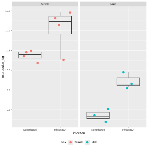
Multiple testing issue
In the few examples of linear model that we have seen in the previous
section, the lm() function was always applied to a single
gene. In a real RNA-seq experiment, we will have a few thousand tests to
perform, as each gene is going to be tested.
Let’s use the following dataset that provides log expression values for 20,000 genes in 6 samples, three in groupA and three in groupB.
R
if (!file.exists("data/exp.rda")) {
dir.create("data", showWarnings = FALSE)
download.file(
url = "https://github.com/UCLouvain-BIOINFO/bioc-rnaseq/tree/main/episodes/data/exp.rda?raw=true",
destfile = "data/exp.rda"
)
}
load("data/exp.rda")
exp
OUTPUT
# A tibble: 20,000 × 7
Gene A1 A2 A3 B1 B2 B3
<chr> <dbl> <dbl> <dbl> <dbl> <dbl> <dbl>
1 Gene1 4.72 4.89 4.51 4.00 4.66 4.67
2 Gene2 4.61 4.96 4.58 4.53 4.21 4.78
3 Gene3 4.75 4.70 4.75 4.55 4.89 4.31
4 Gene4 4.83 4.83 4.43 4.53 4.38 4.55
5 Gene5 4.68 4.33 4.84 4.58 4.64 4.92
6 Gene6 4.57 4.74 4.68 4.84 4.42 4.96
7 Gene7 4.68 4.47 4.50 4.55 4.23 4.67
8 Gene8 4.59 4.81 4.44 4.45 4.20 4.61
9 Gene9 4.53 4.84 4.51 4.53 4.61 4.59
10 Gene10 4.74 4.09 4.61 4.33 4.72 4.61
# ℹ 19,990 more rowsLet’s apply a t.test on all these genes
R
res <- exp %>%
rowwise() %>%
mutate(pval = t.test(c(A1, A2, A3), c(B1,B2,B3))$p.value) %>%
ungroup() # to revert the rowwise()
res
OUTPUT
# A tibble: 20,000 × 8
Gene A1 A2 A3 B1 B2 B3 pval
<chr> <dbl> <dbl> <dbl> <dbl> <dbl> <dbl> <dbl>
1 Gene1 4.72 4.89 4.51 4.00 4.66 4.67 0.367
2 Gene2 4.61 4.96 4.58 4.53 4.21 4.78 0.362
3 Gene3 4.75 4.70 4.75 4.55 4.89 4.31 0.474
4 Gene4 4.83 4.83 4.43 4.53 4.38 4.55 0.249
5 Gene5 4.68 4.33 4.84 4.58 4.64 4.92 0.632
6 Gene6 4.57 4.74 4.68 4.84 4.42 4.96 0.679
7 Gene7 4.68 4.47 4.50 4.55 4.23 4.67 0.682
8 Gene8 4.59 4.81 4.44 4.45 4.20 4.61 0.286
9 Gene9 4.53 4.84 4.51 4.53 4.61 4.59 0.689
10 Gene10 4.74 4.09 4.61 4.33 4.72 4.61 0.773
# ℹ 19,990 more rowsChallenge:
- How many significant genes did we obtained ? Which genes are of possible biological interest?
R
table(res$pval < 0.05)
OUTPUT
FALSE TRUE
19324 676 R
res %>% filter(pval < 0.05) %>%
arrange(pval)
OUTPUT
# A tibble: 676 × 8
Gene A1 A2 A3 B1 B2 B3 pval
<chr> <dbl> <dbl> <dbl> <dbl> <dbl> <dbl> <dbl>
1 Gene13793 4.41 4.38 4.42 4.75 4.74 4.73 0.0000613
2 Gene35 4.47 4.45 4.42 4.79 4.75 4.79 0.000104
3 Gene5006 4.79 4.78 4.75 4.56 4.59 4.57 0.000194
4 Gene8102 4.31 4.30 4.35 4.60 4.67 4.64 0.000258
5 Gene11686 4.58 4.60 4.61 4.77 4.74 4.75 0.000266
6 Gene18641 4.35 4.42 4.35 4.78 4.70 4.78 0.000432
7 Gene1936 4.47 4.54 4.49 4.79 4.86 4.86 0.000437
8 Gene14972 4.07 4.15 4.20 4.67 4.55 4.68 0.000963
9 Gene3211 4.74 4.81 4.75 4.38 4.30 4.42 0.00122
10 Gene10421 4.44 4.48 4.47 4.56 4.59 4.57 0.00153
# ℹ 666 more rowsThe data above have been generated with the rnorm()
function for all samples.
This is the code that generated the data:
R
set.seed(2025)
exp <- matrix(rnorm(20000*6, mean = 100, sd = 20), ncol = 6)
rownames(exp) <- paste0("Gene", 1:20000)
colnames(exp) <- c(paste0("A", 1:3), paste0("B", 1:3))
exp <- log(exp)
exp <- as_tibble(exp, rownames = "Gene")
Challenge:
Do you still think any of the features show significant differences?
Why do we obtain genes with a p-value < 0.05?
A pvalue of 0.05 means that there is only 5% chance of getting this data if no real difference existed (if the null hypothesis was really true). In other words, choosing a cut off of 0.05 means there is 5% chance that the wrong decision is made (resulting in a false positive).
Challenge: Discuss
- If you were to visualize the p-value distribution using a histogram, how would you expect it to look like?
R
res %>%
ggplot(aes(x = pval)) +
geom_histogram(binwidth = 0.05, boundary = 0, color = "gray")
Now, let’s slightly modify our simulated expression data.
In a typical RNA-seq experiment, we may test around 20,000 genes, but only a fraction of them are expected to be truly differentially expressed. We could imagine a drug treatment that would modify the expression of about 1000 genes, but that would have no impact on the other ones.
To mimic this, we are going to simulate an up-regulation for the first 1,000 genes by increasing their expression values in group B.
R
exp_modified <- exp
exp_modified[1:1000, c("B1", "B2", "B3")] <- log(matrix(rnorm(1000*3, mean = 300, sd = 20), ncol = 3))
exp_modified <- exp_modified %>%
mutate(DE = c(rep(TRUE, 1000), rep(FALSE, 19000)))
exp_modified
OUTPUT
# A tibble: 20,000 × 8
Gene A1 A2 A3 B1 B2 B3 DE
<chr> <dbl> <dbl> <dbl> <dbl> <dbl> <dbl> <lgl>
1 Gene1 4.72 4.89 4.51 5.59 5.78 5.71 TRUE
2 Gene2 4.61 4.96 4.58 5.73 5.76 5.73 TRUE
3 Gene3 4.75 4.70 4.75 5.76 5.78 5.73 TRUE
4 Gene4 4.83 4.83 4.43 5.64 5.66 5.75 TRUE
5 Gene5 4.68 4.33 4.84 5.68 5.69 5.69 TRUE
6 Gene6 4.57 4.74 4.68 5.63 5.79 5.84 TRUE
7 Gene7 4.68 4.47 4.50 5.68 5.74 5.74 TRUE
8 Gene8 4.59 4.81 4.44 5.78 5.68 5.74 TRUE
9 Gene9 4.53 4.84 4.51 5.72 5.69 5.56 TRUE
10 Gene10 4.74 4.09 4.61 5.72 5.76 5.73 TRUE
# ℹ 19,990 more rowsLet’s run a t-test on this new dataset:
R
res_modified <- exp_modified %>%
rowwise() %>%
mutate(pval = t.test(c(A1, A2, A3), c(B1, B2, B3), var = TRUE)$p.value) %>%
ungroup()
table(res_modified$pval < 0.05)
OUTPUT
FALSE TRUE
18115 1885 Challenge: Discuss
How do think the histogram of the p-values of the first 1000 would look like?
What about the histogram of all p-values?
The figure on the right illustrates the principle behind the FDR adjustment. The False discovery rate (FDR) is the expected proportion of false positives among all the results considered as “significant” (i.e. pval < 0.05). The adjustment procedure estimate the proportion of hypothesis that are null and then adjust the p-values accordingly.
Adjustment for multiple testing
The False discovery rate (FDR) computes the expected fraction of false positives among all discoveries. It allows us to choose n results with a given FDR. Widely used examples are Benjamini-Hochberg or q-values.
let’s use the p.adjust() function to adjust the
pvalues.
R
res_modified <- res_modified %>%
mutate(padj = p.adjust(pval, method = "BH"))
table(sign_padj = res_modified$padj < 0.05, sign_pval = res_modified$pval < 0.05)
OUTPUT
sign_pval
sign_padj FALSE TRUE
FALSE 18115 1055
TRUE 0 830Only 830 were found to be significant after FDR correction.
Challenge:
- How many genes would you expect to remain significant after FDR correction in the first dataset?
R
res <- res %>%
mutate(padj = p.adjust(pval, method = "BH"))
table(res$pval < 0.05)
OUTPUT
FALSE TRUE
19324 676 R
table(res$padj < 0.05)
OUTPUT
FALSE
20000 Content from Additional material: PCA
Last updated on 2025-11-19 | Edit this page
Estimated time 40 minutes
Overview
Questions
- What is a PCA?
Objectives
Understand why we use PCA
Get an intuition for how it works
What can PCA reveal from RNA-seq data?
Parts of this episode is based on the course WSBIM1322.
Introduction to PCA
Principal Component Analysis (PCA) is a dimensionality reduction method, whose aim is to transform a high-dimensional data into data of lesser dimensions while minimising the loss of information.
We are going to use a small dataset to illustrate some important concepts related to PCA. This dataset represents the measurement of genes x and y in 20 samples. We will be using the scaled and centered version of this dataset, to place the 2 genes on the same scale.
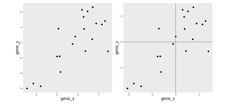
Lower-dimensional projections
The goal of dimensionality reduction is to reduce the number of dimensions in a way that the new data remains useful. One way to reduce a 2-dimensional data is by projecting the data onto a line. Below, we project our data on the x and y axes. These are called linear projections.
In general, and in particular in the projections above, we lose information when reducing the number of dimensions (above, from 2 (plane) to 1 (line)). In the first example above (left), we lose all the measurements of gene y. In the second example (right), we lose all the measurements of gene x.
The goal of dimensionality reduction is to limit this loss.
Instead of projecting the points on the x or the y axis, we could think about a linear regression. We could use the lm() to predict the value of gene_y, based on the expression on gene_x, or to predict the value of gene_x, based on the expression on gene_y.
But the relationship differs depending on the gene we choose to be the predictor or the response.
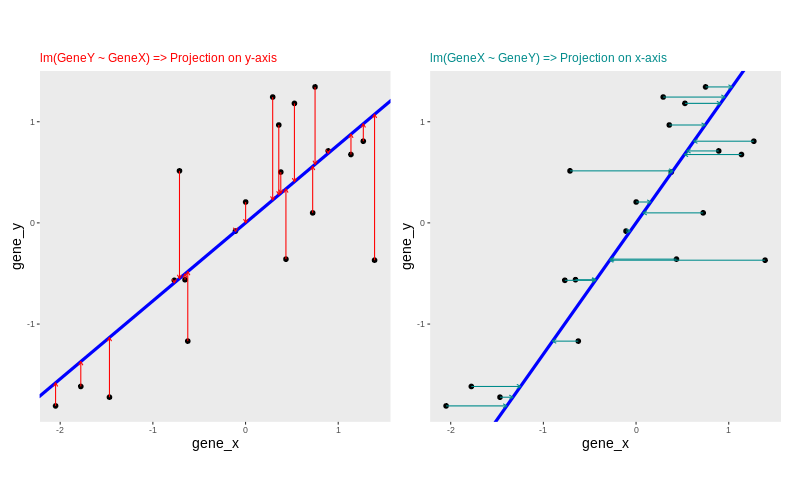
Another option would be to put both genes on equal footing and find the axis that best fits the cloud of points in all directions. This line would be the axis that minimises distances in both directions, minimising the sum of squares of the orthogonal projections.
By definition, this line is also the one that maximises the variance of the projections, and hence the one that captures the maximum of variability. This line is called first principal component (PC1).
The second principal component (PC2) is then chosen to be orthogonal to the first one. In this case, there is only one possibility.
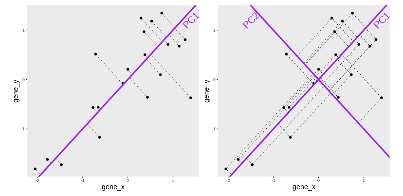
After rotating the plot such that PC1 becomes the horizontal axis, we obtain the PCA plot:
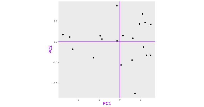
In this example the variance along the PCs are 1.77 and 0.23 respectively. The first one explains 88.6% or that variance, and the second one merely 11.4%.
To account for these differences in variation along the different PCs, it is better to represent a PCA plot as a rectangle, using an aspect ratio that is illustrative of the respective variances.
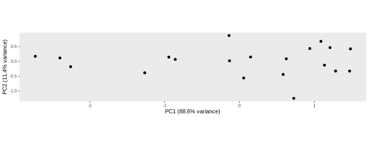
Starting from a (slightly) higher number of dimensions
Let’s know use another toy dataset, a small table called
tiny_dataset that gives the expression values of 5 genes in
two groups of cells (control and treated cells). Since we have the
expression values of 5 genes (5 dimensions), we cannot represent them on
a single plot.
R
tiny_dataset <- structure(list(
GeneA = c(30, 30, 31, 30, 30, 31, 30, 29, 30, 30),
GeneB = c(6, 5, 5, 5, 4, 1179, 1050, 803, 1070, 953),
GeneC = c(75, 79, 75, 76, 77, 983, 1008, 1002, 989, 1013),
GeneD = c(504, 497, 509, 509, 508, 507, 506, 499, 497, 496),
GeneE = c(797, 799, 794, 811, 806, 49, 50, 50, 51, 50)),
class = "data.frame",
row.names = c("CTL_1", "CTL_2", "CTL_3", "CTL_4", "CTL_5", "Treated_1",
"Treated_2", "Treated_3", "Treated_4", "Treated_5"))
R
tiny_dataset
OUTPUT
GeneA GeneB GeneC GeneD GeneE
CTL_1 30 6 75 504 797
CTL_2 30 5 79 497 799
CTL_3 31 5 75 509 794
CTL_4 30 5 76 509 811
CTL_5 30 4 77 508 806
Treated_1 31 1179 983 507 49
Treated_2 30 1050 1008 506 50
Treated_3 29 803 1002 499 50
Treated_4 30 1070 989 497 51
Treated_5 30 953 1013 496 50This table is not too big, so by quickly inspecting it by eye, we can see that the treatment seems to have a strong impact on the expression of GeneB, GeneC, and GeneE but had little or no effect on genes GeneA and GeneD.
Challenge:
What do you think a PCA based on this small dataset should look like?
Now let’s use the prcomp() function to do a PCA on this
dataset. The output of prcomp is an object of class prcomp.
R
pca <- prcomp(tiny_dataset, center = TRUE, scale = TRUE)
str(pca)
OUTPUT
List of 5
$ sdev : num [1:5] 1.8097 1.1269 0.6684 0.0903 0.012
$ rotation: num [1:5, 1:5] 0.173 -0.524 -0.542 0.329 0.542 ...
..- attr(*, "dimnames")=List of 2
.. ..$ : chr [1:5] "GeneA" "GeneB" "GeneC" "GeneD" ...
.. ..$ : chr [1:5] "PC1" "PC2" "PC3" "PC4" ...
$ center : Named num [1:5] 30.1 508 537.7 503.2 425.7
..- attr(*, "names")= chr [1:5] "GeneA" "GeneB" "GeneC" "GeneD" ...
$ scale : Named num [1:5] 0.568 538.511 486.328 5.371 396.05
..- attr(*, "names")= chr [1:5] "GeneA" "GeneB" "GeneC" "GeneD" ...
$ x : num [1:10, 1:5] 1.53 1.1 2.14 1.86 1.79 ...
..- attr(*, "dimnames")=List of 2
.. ..$ : chr [1:10] "CTL_1" "CTL_2" "CTL_3" "CTL_4" ...
.. ..$ : chr [1:5] "PC1" "PC2" "PC3" "PC4" ...
- attr(*, "class")= chr "prcomp"Variance explained by each component
A summary of prcomp output shows that
- PC1 was able to capture about 65 % of the total variability in the data,
- PC2 was able to capture about 25 % of the total variability in the data.
- Together, PC1 and PC2 retained 90.9 % of the total variability in the data
R
summary(pca)
OUTPUT
Importance of components:
PC1 PC2 PC3 PC4 PC5
Standard deviation 1.810 1.127 0.66843 0.09027 0.01202
Proportion of Variance 0.655 0.254 0.08936 0.00163 0.00003
Cumulative Proportion 0.655 0.909 0.99834 0.99997 1.00000PCA’s coordinates
The x element of the prcomp output is a table that gives
the sample coordinates in the new space of components.
R
pca$x
OUTPUT
PC1 PC2 PC3 PC4 PC5
CTL_1 1.530853 0.5998082 0.03211405 -0.04333816 0.012017799
CTL_2 1.101755 1.3149717 1.03361796 -0.05297607 -0.001282981
CTL_3 2.137962 -1.2491805 0.40292280 0.16960843 0.005643376
CTL_4 1.855819 0.0948888 -0.67982286 -0.04608819 -0.011799781
CTL_5 1.787647 0.1952147 -0.53825215 -0.04048310 -0.004765655
Treated_1 -1.158454 -2.2218446 0.16948928 -0.05140699 0.009137305
Treated_2 -1.424846 -0.7244170 -0.77089802 -0.03889461 -0.011127400
Treated_3 -1.910324 1.4547787 -0.83626777 0.11348866 0.014786818
Treated_4 -1.972497 0.1912046 0.52074789 -0.10252219 0.008786148
Treated_5 -1.947915 0.3445754 0.66634882 0.09261222 -0.021395630These values can be used to draw the PCA plot
R
as_tibble(pca$x, rownames = "sample") %>%
mutate(group = sub(pattern = "_.*", x = sample, replacement = '')) %>%
ggplot(aes(x = PC1, y = PC2, color = group)) +
geom_point(size = 3) +
theme(aspect.ratio = .4)
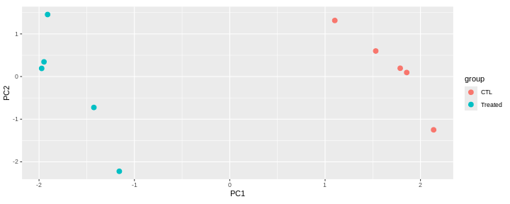
This PCA is a representation in 2 dimensions (PC1 and PC2) of our 5-dimensions dataset.
The new axes (PC1 and PC2) captured 90.9 % of the total variability of the data).
This PCA plot shows that the samples cluster into two distinct groups along PC1. This separation indicates that the “CTL” and “Treated” samples have different overall expression profiles.
The Loadings
Principal components provide a new coordinate system. They are linear combinations of the variables that were originally measured.
PC1 in the previous example is a linear combination of the 5 genes:
\[ PC1 = c_{1}.Gene_{A} + c_{2}.Gene_{B} + c_{3}.Gene_{C} + c_{4}.Gene_{D} + c_{5}.Gene_{E}\]
The coefficients \(c_1\), \(c_2\), \(c_3\), \(c_4\), and \(c_5\), also called loadings, represent the weight of each gene in PC1.
Loadings are stored in the rotation slot of the prcomp
output. Genes with the largest absolute PC1 loadings are the ones that
contribute most to that component (GeneB, GeneC and GeneE in this
case).
R
pca$rotation
OUTPUT
PC1 PC2 PC3 PC4 PC5
GeneA 0.1727214 -0.7592258 0.61713747 0.113206827 -0.008310904
GeneB -0.5242436 -0.2719533 -0.04021536 -0.805844662 -0.014392984
GeneC -0.5422152 -0.1513032 -0.12128968 0.422355853 -0.700010235
GeneD 0.3286462 -0.5486505 -0.76868178 0.009661531 0.003041904
GeneE 0.5415998 0.1603357 0.10927583 -0.399150076 -0.713932902Loadings can be visualised on a biplot, where the arrows show the contribution of each gene to the principal components.
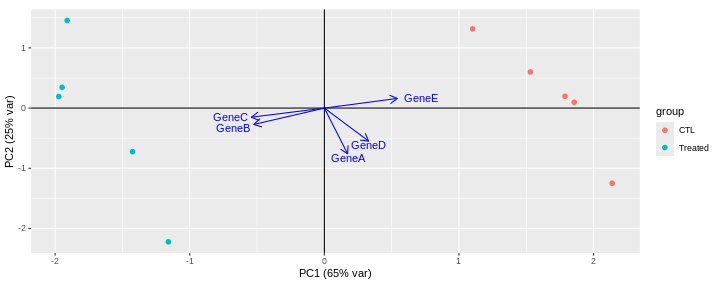
This biplot shows that:
PC1 is mostly driven by GeneB, GeneC and GeneE.
GeneB and GeneC are pointing in the same direction, which means that they are highly correlated. They are in contrast pointing in the opposite direction to GeneE indicating an inverse correlation.
The GeneA arrow is almost perpendicular to GeneB, GeneC and GeneE arrows, indicating that GeneA is not correlated to the 3 other genes.
PC2 is mainly driven by GeneA and GeneD (GeneB, GeneC and GeneE only have a low contibution).
Challenge: Compare the PCA with the original dataset.
Are principal components effectively representing the main patterns and structure of the dataset?
What can PCA reveal from RNA-seq data?
In real RNA-seq datasets, the data usually consists of tens of thousands of dimensions (genes), which are impossible to explore by eye. In this context, PCA is extremely useful, as it summarizes the data into a smaller number of dimensions, making it easier to explore.
What insights can PCA provide for RNA-seq data?
Which samples are similar or distinct to each other?
What are the main sources of variability in the data?
Does the PCA fit to the expectation from the experimental design?
Are there any batch effects or other technical confounders that should be included in linear model?
Are they any outliers which may need to be explored further?
Challenge: Interprete the following PCAs.
Here are a few examples of PCAs corresponding to different experimental designs. How would you interprete them and what impact would they have on the analysis?
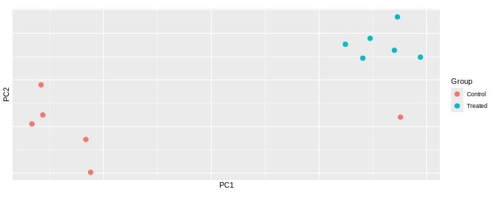
Content from Additional material: GSEA
Last updated on 2025-11-16 | Edit this page
Estimated time 40 minutes
Overview
Questions
- What is the aim of performing gene set enrichment analysis?
- What are the commonly-used gene set databases?
Objectives
- Learn how to obtain gene sets from various resources in R.
- Learn how to perform ORA and GSEA analyses
Objectives of an enrichment analysis
Once we have obtained a list of differentially expressed (DE) genes, the next question naturally to ask is what biological functions these DE genes may affect.
Gene set enrichment analyses (GSEA) evaluate the associations of a list of DE genes to a collection of pre-defined gene sets, where each gene set has a specific biological meaning. A geneset significantly enrichiched among DE genes could suggest that the corresponding biological process or pathway is significantly affected.
There are a huge amount of methods available for GSEA analysis. In this episode, we will focus on two widely used methods: the over-representation analysis (ORA) and the Gene set enrichment analysis (GSEA).
GeneSets
The definition of a gene set is very flexible and the construction of gene sets is straightforward. In most cases, gene sets are from public databases where huge efforts from scientific curators have already been made to carefully categorize genes into gene sets with clear biological meanings. For example, in a “cell cycle” gene set, all the genes are involved in the cell cycle process. Thus, if DE genes are significantly enriched in the “cell cycle” gene set, which means there are significantly more cell cycle genes differentially expressed than expected, we can conclude that the normal function of cell cycle process may be affected.
Nevertheless, gene sets can also be self-defined from individual studies, such as a set of genes in a network module from a co-expression network analysis, or a set of genes that are up-regulated in a certain disease.
The MSigDB database contains a collection of annotated gene sets such as
Gene Ontology (GO)
Gene Ontology defines concepts/classes used to describe gene function, and relationships between these concepts. GO terms are organized in a directed acyclic graph, where edges between terms represent parent-child relationship. It classifies functions along three aspects:
– MF: Molecular Function: molecular activities of gene
products
– CC: Cellular Component: where gene products are
active
– BP: Biological Process pathways and larger processes
made up of the activities of multiple gene products.
Hallmark gene setsare curated gene sets that represent well-defined biological states or processes (e.g. “Apoptosis”, “KRAS signaling”, “DNA repair”).Kyoto Encyclopedia of Genes and Genomes (KEGG)
KEGG is a collection of manually drawn pathway maps representing molecular interaction and reaction networks. These pathways cover a wide range of biochemical processes.
Other gene sets
Other gene sets include but are not limited to Positional gene sets, wikiPathways, Oncogenic signatures, Immunologic signatures…
Access the gene sets from MSigDB
The msigdbr CRAN package provides the MSigDB gene sets in a standard R data frame with key-value pairs.
One can use msigdbr_collections() to see the available collections
R
msigdbr_collections()
OUTPUT
# A tibble: 25 × 4
gs_collection gs_subcollection gs_collection_name num_genesets
<chr> <chr> <chr> <int>
1 C1 "" Positional 302
2 C2 "CGP" Chemical and Genetic Perturbati… 3538
3 C2 "CP" Canonical Pathways 19
4 C2 "CP:BIOCARTA" BioCarta Pathways 292
5 C2 "CP:KEGG_LEGACY" KEGG Legacy Pathways 186
6 C2 "CP:KEGG_MEDICUS" KEGG Medicus Pathways 658
7 C2 "CP:PID" PID Pathways 196
8 C2 "CP:REACTOME" Reactome Pathways 1787
9 C2 "CP:WIKIPATHWAYS" WikiPathways 885
10 C3 "MIR:MIRDB" miRDB 2377
# ℹ 15 more rowsR
GO_BP <- msigdbr(species = "Mus musculus", collection = "C5", subcollection = "BP") %>%
dplyr::select(gs_name, gene_symbol)
OUTPUT
Using human MSigDB with ortholog mapping to mouse. Use `db_species = "MM"` for mouse-native gene sets.
This message is displayed once per session.Challenge:
How many genes belong to the
GOBP_REGULATION_OF_LYMPHOCYTE_MIGRATION geneset?
R
GO_BP %>%
filter(gs_name == "GOBP_REGULATION_OF_LYMPHOCYTE_MIGRATION")
OUTPUT
# A tibble: 69 × 2
gs_name gene_symbol
<chr> <chr>
1 GOBP_REGULATION_OF_LYMPHOCYTE_MIGRATION Abl1
2 GOBP_REGULATION_OF_LYMPHOCYTE_MIGRATION Abl2
3 GOBP_REGULATION_OF_LYMPHOCYTE_MIGRATION Adam10
4 GOBP_REGULATION_OF_LYMPHOCYTE_MIGRATION Adam17
5 GOBP_REGULATION_OF_LYMPHOCYTE_MIGRATION Adam8
6 GOBP_REGULATION_OF_LYMPHOCYTE_MIGRATION Adtrp
7 GOBP_REGULATION_OF_LYMPHOCYTE_MIGRATION Aif1
8 GOBP_REGULATION_OF_LYMPHOCYTE_MIGRATION Aire
9 GOBP_REGULATION_OF_LYMPHOCYTE_MIGRATION Akt1
10 GOBP_REGULATION_OF_LYMPHOCYTE_MIGRATION Apod
# ℹ 59 more rowsChallenge:
Retrieve Hallmarks genesets
R
hallmarks <- msigdbr(species = "Mus musculus", collection = "H") %>%
dplyr::select(gs_name, gene_symbol)
Input data
We will use the differential expression analysis comparing infected mice at day8 and uninfected mice (day0). The following code performs DESeq2 analysis which you should have already learnt in the previous episode. We will focus on the genes that have an adjusted p-value (those that have been tested).
R
se <- readRDS("data/GSE96870_se.rds")
dds <- DESeqDataSet(se, design = ~ sex + time)
dds <- DESeq(dds)
res <- results(dds, name ="time_Day8_vs_Day0")
res_tbl <- as_tibble(res, rownames = "gene")
res_tbl <- res_tbl %>%
filter(!is.na(padj))
ORA
Principle
The idea behind the ORA is to test whether your list of differentially expressed genes (DE) is enriched in certain biological categories (such as genesets from Gene Ontology terms, KEGG pathways, or Reactome pathways), i.e, if it contains more genes from these categories than would be expected by chance.
Step 1: selection of DE genes
To perform an over representation analysis, we first need to define the genes we will consider as differentially expressed (DE).
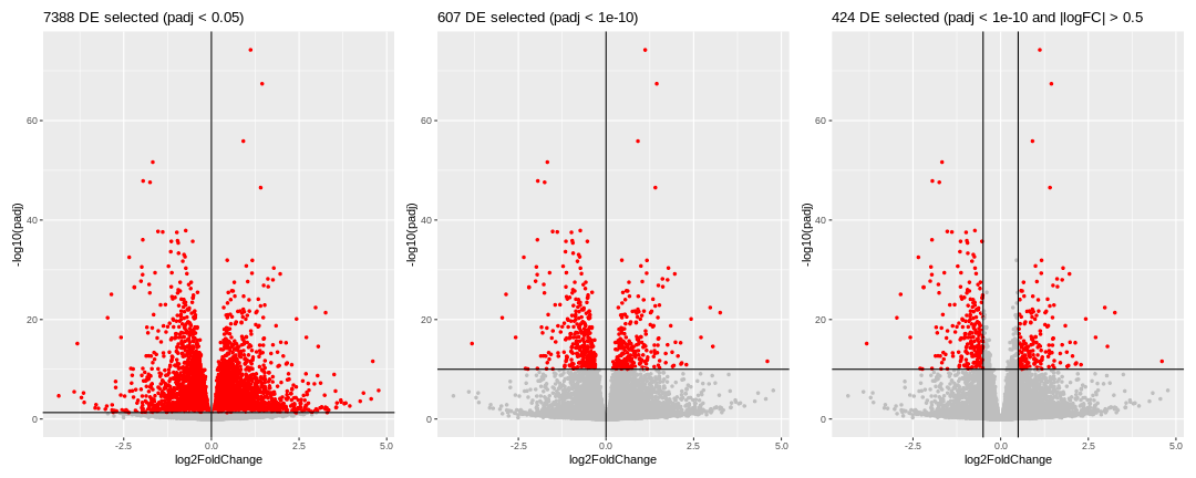
We could consider all genes that have a p-adjusted value < 0.05 (left volcano), in this case we would select 7388 genes. This number is probably too large, so we should probably be more restrictive and select a smaller set of genes, using a more stringent filtering on the p-adjusted value. We could also consider filtering using the logFC, which could also make biological sense.
Whatever thresholds are used, the idea here is to start from a selection of genes that we will consider as our DE genes. The selection is a choice the user has to make.
Here, we will apply the selection criteria illustrated in the third volcano. Hence, among all the genes (called the universe), we will consider the 424 genes with a p-adjusted value < 10^{-10} and an absolute logFoldChange > 0.5 as our genes of interest or DE genes.
Step2: Counting
For each biological category, we can count how many genes from our DE genes are in that category, and how many are not.
Let’s say we want to test the enrichment of the
GOBP_LEUKOCYTE_CHEMOTAXIS geneset.
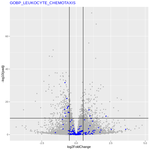
We will count the number of DE genes from that are in
GOBP_LEUKOCYTE_CHEMOTAXIS geneset, and how many are
not.
| GO | not_GO | |
|---|---|---|
| DE | 13 | 411 |
| not_DE | 180 | 23306 |
Step3: Statistical test
We can now apply a Fisher’s exact (or hypergeometric test) that will test whether there is a significant enrichment of DE genes in the GO term.
R
fisher.test(count_mat, alternative = "greater")
OUTPUT
Fisher's Exact Test for Count Data
data: count_mat
p-value = 4.378e-05
alternative hypothesis: true odds ratio is greater than 1
95 percent confidence interval:
2.362979 Inf
sample estimates:
odds ratio
4.094913 Running an ORA with clusterProfiler package
In practice, the analysis presented above can be executed using any of the very many packages that are available.
Here, we will use the clusterProfiler package to test if any GO terms from the Biological Process is enriched among our DE genes.
R
# Define our DE genes
padj_thr <- 1e-10
log2FC_thr <- 0.5
geneList <- res_tbl$gene
genes_DE <- res_tbl$gene[res_tbl$padj <= padj_thr &
abs(res_tbl$log2FoldChange) >= log2FC_thr]
ORA_res <- enricher(gene = genes_DE,
universe = geneList,
pAdjustMethod = "BH",
qvalueCutoff = 1,
pvalueCutoff = 1,
TERM2GENE = GO_BP)
ORA_res_tbl <- as_tibble(ORA_res) %>% filter(p.adjust < 0.05)
ORA_res_tbl %>%
select(ID, GeneRatio, BgRatio, pvalue, p.adjust)
OUTPUT
# A tibble: 6 × 5
ID GeneRatio BgRatio pvalue p.adjust
<chr> <chr> <chr> <dbl> <dbl>
1 GOBP_ENSHEATHMENT_OF_NEURONS 17/284 148/13271 1.76e-8 4.66e-5
2 GOBP_MYELIN_ASSEMBLY 7/284 20/13271 1.17e-7 1.54e-4
3 GOBP_SECONDARY_ALCOHOL_METABOLIC_PROCESS 13/284 136/13271 6.92e-6 6.12e-3
4 GOBP_ALCOHOL_METABOLIC_PROCESS 19/284 294/13271 1.89e-5 1.25e-2
5 GOBP_STEROL_BIOSYNTHETIC_PROCESS 8/284 61/13271 4.39e-5 2.19e-2
6 GOBP_STEROID_METABOLIC_PROCESS 17/284 262/13271 4.96e-5 2.19e-2In the output data frame, there are the following columns:
-
ID: ID of the gene set. In this example analysis, it is the GO ID. -
Description: Readable description. Here it is the name of the GO term. -
GeneRatio: Number of DE genes in the gene set / total number of DE genes. -
BgRatio: Size of the gene set / total number of genes. -
pvalue: p-value calculated from the hypergeometric distribution. -
p.adjust: Adjusted p-value by the BH method. -
qvalue: q-value which is another way for controlling false positives in multiple testings. -
geneID: A list of DE genes in the gene set. -
Count: Number of DE genes in the gene set.
You may have noticed the total number of DE genes changes. We defined 424 DE genes, but only 284 DE genes are included in the enrichment result table (in the GeneRatio column). Similarly, our universe had 23910 genes, but the total number of tested genes was only 13271 in the result table. The main reason is by default DE genes not annotated to any GO gene set are filtered out.
Visualisation
The clusterProfiler documentation provides a chapter on the visualization of functional enrichment results .
Another useful visualisation, that links the enrichment results back to the whole set of results is to highlight the genes in a particular set of interest on the volcano plot.
Let’s inspect genes from the GOBP_MYELINATIONon the
volcano
R
my_geneset <- "GOBP_ENSHEATHMENT_OF_NEURONS"
genes_from_geneset <- GO_BP %>%
filter(gs_name == my_geneset) %>%
pull(gene_symbol)
padj_thr <- 1e-10
log2FC_thr <- 0.5
res_tbl %>%
ggplot(aes(x = log2FoldChange, y = -log10(padj))) +
geom_point(color = "gray80", size = 1) +
geom_point(data = res_tbl %>% filter(gene %in% genes_from_geneset), color = "purple", size = 1) +
theme(legend.position = "none") +
geom_hline(yintercept = -log10(padj_thr)) +
geom_vline(xintercept = log2FC_thr) +
geom_vline(xintercept = -log2FC_thr) +
ggtitle(paste0(length(genes_DE2), " DE selected (padj < ", padj_thr, ")")) +
ggtitle(my_geneset) +
theme(title = element_text(color = "purple"),
axis.title = element_text(color = "black"))
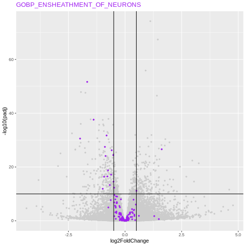
Conclusion about ORA method
This approach is straightfoward and very fast. Its major drawback however is that we need to define a cutoff to differentiate DE from non-DE genes. Setting this threshold might have an effect on the results.
Challenge:
Test a different threshold to define the group of ‘DE genes’ and check if, in the cases above, this has and effect on the GO terms of interest.
R
# Define our DE genes
padj_thr <- 1e-20
log2FC_thr <- 0
geneList <- res_tbl$gene
genes_DE <- res_tbl$gene[res_tbl$padj <= padj_thr &
abs(res_tbl$log2FoldChange) >= log2FC_thr]
res_tbl %>%
ggplot(aes(x = log2FoldChange, y = -log10(padj))) +
geom_point(aes(color = gene %in% genes_DE), size = 1) +
scale_color_manual(values = c("gray", "red")) +
theme(legend.position = "none") +
geom_hline(yintercept = -log10(padj_thr)) +
geom_vline(xintercept = log2FC_thr) +
ggtitle(paste0(length(genes_DE), " DE selected (padj < ", padj_thr, ")"))
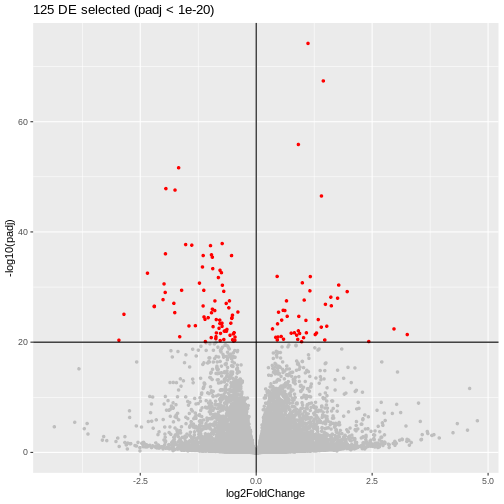
R
ORA_res_new_thr <- enricher(gene = genes_DE,
universe = geneList,
pAdjustMethod = "BH",
qvalueCutoff = 1,
pvalueCutoff = 1,
TERM2GENE = GO_BP)
ORA_res_new_thr_tbl <- as_tibble(ORA_res_new_thr) %>% filter(p.adjust < 0.05)
ORA_res_new_thr_tbl %>%
select(ID, GeneRatio, BgRatio, pvalue, p.adjust)
OUTPUT
# A tibble: 8 × 5
ID GeneRatio BgRatio pvalue p.adjust
<chr> <chr> <chr> <dbl> <dbl>
1 GOBP_ENSHEATHMENT_OF_NEURONS 9/102 148/13… 1.98e-6 0.00294
2 GOBP_NEURON_PROJECTION_REGENERATION 6/102 55/132… 3.80e-6 0.00294
3 GOBP_RESPONSE_TO_AXON_INJURY 6/102 76/132… 2.52e-5 0.0130
4 GOBP_REGENERATION 8/102 162/13… 3.44e-5 0.0133
5 GOBP_ALCOHOL_METABOLIC_PROCESS 10/102 294/13… 8.62e-5 0.0267
6 GOBP_GLUTAMINE_FAMILY_AMINO_ACID_BIOSYNTHE… 3/102 14/132… 1.51e-4 0.0389
7 GOBP_ORGANIC_ACID_BIOSYNTHETIC_PROCESS 9/102 273/13… 2.49e-4 0.0492
8 GOBP_CELLULAR_COMPONENT_ASSEMBLY_INVOLVED_… 6/102 115/13… 2.54e-4 0.0492 R
library(Vennerable)
geneset_list <- list(prev_thr = ORA_res_tbl$ID,
new_thr = ORA_res_new_thr_tbl$ID)
plot(Venn(geneset_list))
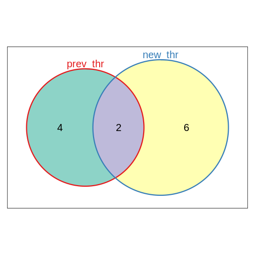
Challenge:
Repeat the ORA analysis using this time the Hallmarks genesets.
R
hallmarks <- msigdbr(species = "Mus musculus", collection = "H") %>%
dplyr::select(gs_name, gene_symbol)
ORA_hallmarks <- enricher(gene = genes_DE,
universe = geneList,
pAdjustMethod = "BH",
qvalueCutoff = 1,
pvalueCutoff = 1,
TERM2GENE = hallmarks)
ORA_hallmarks_tbl <- as_tibble(ORA_hallmarks) #%>% filter(p.adjust < 0.05)
ORA_hallmarks_tbl %>%
select(ID, GeneRatio, BgRatio, pvalue, p.adjust)
OUTPUT
# A tibble: 31 × 5
ID GeneRatio BgRatio pvalue p.adjust
<chr> <chr> <chr> <dbl> <dbl>
1 HALLMARK_XENOBIOTIC_METABOLISM 4/35 185/4049 0.0733 0.830
2 HALLMARK_FATTY_ACID_METABOLISM 3/35 148/4049 0.134 0.830
3 HALLMARK_PEROXISOME 2/35 95/4049 0.198 0.830
4 HALLMARK_ANDROGEN_RESPONSE 2/35 99/4049 0.210 0.830
5 HALLMARK_BILE_ACID_METABOLISM 2/35 101/4049 0.217 0.830
6 HALLMARK_IL2_STAT5_SIGNALING 3/35 187/4049 0.218 0.830
7 HALLMARK_TNFA_SIGNALING_VIA_NFKB 3/35 187/4049 0.218 0.830
8 HALLMARK_MTORC1_SIGNALING 3/35 196/4049 0.239 0.830
9 HALLMARK_APICAL_SURFACE 1/35 42/4049 0.307 0.830
10 HALLMARK_KRAS_SIGNALING_DN 2/35 153/4049 0.384 0.830
# ℹ 21 more rowsGSEA
Principle
Gene set enrichment analysis refers to a broad family of tests. Here, we will define the principles based on Subramanian et al. 2005 keeping in mind that the exact implementation will differ in different tools.
Gene Set Enrichment Analysis (GSEA) is a statistical method used to determine whether predefined sets of genes (for example, genes belonging to a GO term) show systematic differences in expression between two biological conditions. Instead of focusing only on individual genes, GSEA evaluates the collective behavior of gene groups.
The major advantage of GSEA approaches is that they don’t rely on defining DE genes.
Step 1: Gene ranking
The first step is to order the genes of interest. Genes could be ranked for example by the value of the test statistic or by their p-value.
Depending on the metric used for the ranking, genes will be ordered from the most up-regulated to the most down-regulated (if the test statistic is used for instance) or by the most significantly DE (no matter if they are up or down-regulated) to genes not differentially expressed.
Step 2: Check where the genes of a specific geneset appear
For a given gene set (a GO-term for example), The idea is to check if these genes tend to appear toward the top or bottom of the ranked list, rather than being randomly scattered.
Step 3: Compute an Enrichment Score (ES)
The algorithm walks down the ranked list, increasing a running-sum statistic when it encounters a gene from the set, and decreasing it otherwise.
The positive score is defined by \(\frac{n_{genes} - n_{genes~in~set}}{n_{genes~in~set}}\), and the decreasing score by -1, so that the sum of all genes in the set and those not in the set becomes zero.
The maximum deviation from zero is the Enrichment Score (ES), reflecting how strongly the gene set is enriched at either end of the ranking.
Step 4: Assess significance by permutation
To evaluate whether the observed ES is greater than expected by chance, GSEA performs permutations (of either gene labels or sample labels). This generates a null distribution to compute a p-value.
An Enrichment score is recomputed for each permutation. The p-value is given by the proportion of permutations where the permuted ES is at least as extreme as the observed ES:
\[p = \frac{\#\{ ES_{\text{permuted}} \ge ES_{\text{observed}} \}}{\text{total number of permutations}}\]
Running a GSEA with clusterProfiler package
Here, we will re-use the clusterProfiler package to run a GSEA this time, using GO terms from the Biological Process.
R
# Ranking our DE results by the statistic value used in DESeq2
geneList <- res_tbl$stat
names(geneList)<- res_tbl$gene
geneList <- geneList[order(geneList, decreasing = TRUE)]
set.seed(1)
GSEA_res <- GSEA(geneList,
seed = TRUE,
TERM2GENE = GO_BP,
verbose = FALSE,
by = "fgsea",
pvalueCutoff = 1,
pAdjustMethod = "BH",
eps = 0)
GSEA_res_tbl <- as_tibble(GSEA_res) %>% filter(p.adjust < 0.05)
GSEA_res_tbl %>% select(ID, setSize, enrichmentScore, NES, pvalue, p.adjust)
OUTPUT
# A tibble: 92 × 6
ID setSize enrichmentScore NES pvalue p.adjust
<chr> <int> <dbl> <dbl> <dbl> <dbl>
1 GOBP_CYTOPLASMIC_TRANSLATION 164 0.487 2.12 1.16e-9 3.87e-6
2 GOBP_PROTEIN_FOLDING 200 -0.470 -2.05 1.55e-9 3.87e-6
3 GOBP_AXON_DEVELOPMENT 499 -0.363 -1.73 1.99e-8 3.31e-5
4 GOBP_SUBSTANTIA_NIGRA_DEVELOP… 43 -0.694 -2.34 2.81e-8 3.51e-5
5 GOBP_ENSHEATHMENT_OF_NEURONS 148 -0.490 -2.05 4.72e-8 4.71e-5
6 GOBP_NEURAL_NUCLEUS_DEVELOPME… 63 -0.614 -2.24 2.41e-7 2.01e-4
7 GOBP_MIDBRAIN_DEVELOPMENT 87 -0.545 -2.10 6.88e-7 4.91e-4
8 GOBP_REGULATION_OF_ADAPTIVE_I… 183 0.426 1.89 9.67e-7 5.62e-4
9 GOBP_REGULATION_OF_LEUKOCYTE_… 205 0.409 1.84 1.01e-6 5.62e-4
10 GOBP_REGULATION_OF_LYMPHOCYTE… 149 0.454 1.95 1.37e-6 6.87e-4
# ℹ 82 more rowsIn the output data frame, there are the following columns:
-
ID: ID of the gene set. In this example analysis, it is the GO ID. -
Description: Readable description. Here it is the name of the GO term. -
setSize: Number of genes in this gene set that are present in your universe of tested genes. -
enrichmentScore: Raw enrichment score calculated from the running-sum statistic. -
NES: ES normalized by gene set size. T -
pvalue: p-value calculated from the hypergeometric distribution. -
p.adjust: Adjusted p-value by the BH method. -
qvalue: q-value which is another way for controlling false positives in multiple testings. -
rank: Position in the ranked gene list where the running score reaches its maximum (the ES). -
leadingEdge: List of genes in the set contributing most to the ES (genes before the peak), often called the core enrichment.
The GSEA plot can be drawn with the gseaplot() function
R
gseaplot(GSEA_res, GSEA_res_tbl$ID[1], by = "runningScore", title = GSEA_res_tbl$ID[1])
Challenge:
Think about the different ways to order the genes for the GSEA analysis. What impact could the ranking method have on the GSEA analysis?
Compare GSEA and ORA methods, what are pros and cons of both methods?
Compare the results obtained using ORA and GSEA on GO terms (BP)
R
library(Vennerable)
geneset_list <- list(ORA = ORA_res_tbl$ID,
GSEA = GSEA_res_tbl$ID)
plot(Venn(geneset_list))