Additional material: PCA
Last updated on 2025-11-19 | Edit this page
Estimated time 40 minutes
Overview
Questions
- What is a PCA?
Objectives
Understand why we use PCA
Get an intuition for how it works
What can PCA reveal from RNA-seq data?
Parts of this episode is based on the course WSBIM1322.
Introduction to PCA
Principal Component Analysis (PCA) is a dimensionality reduction method, whose aim is to transform a high-dimensional data into data of lesser dimensions while minimising the loss of information.
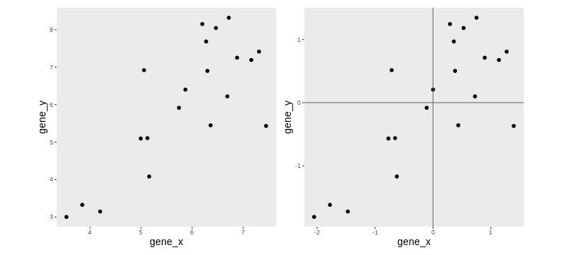
We are going to use a small dataset to illustrate some important concepts related to PCA. This dataset represents the measurement of genes x and y in 20 samples. We will be using the scaled and centered version of this dataset, to place the 2 genes on the same scale.
Lower-dimensional projections
The goal of dimensionality reduction is to reduce the number of dimensions in a way that the new data remains useful. One way to reduce a 2-dimensional data is by projecting the data onto a line. Below, we project our data on the x and y axes. These are called linear projections.
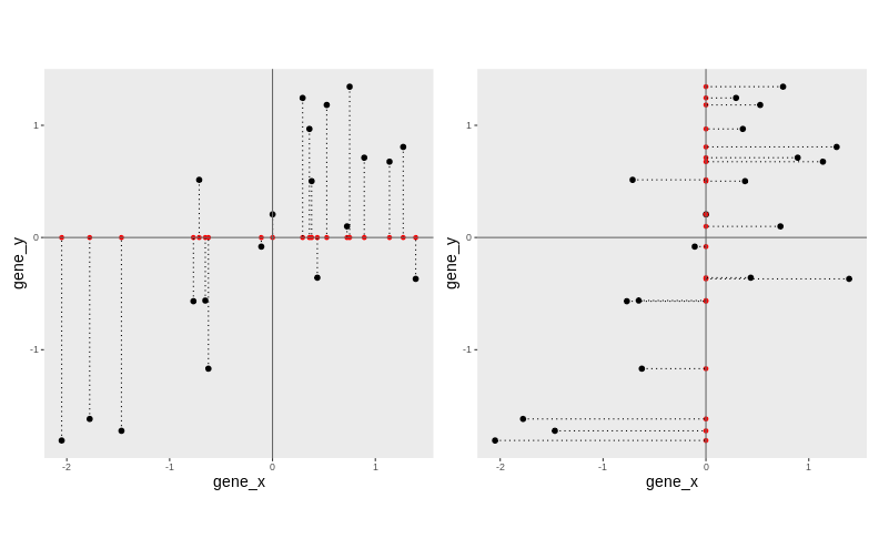
In general, and in particular in the projections above, we lose information when reducing the number of dimensions (above, from 2 (plane) to 1 (line)). In the first example above (left), we lose all the measurements of gene y. In the second example (right), we lose all the measurements of gene x.
The goal of dimensionality reduction is to limit this loss.
Instead of projecting the points on the x or the y axis, we could think about a linear regression. We could use the lm() to predict the value of gene_y, based on the expression on gene_x, or to predict the value of gene_x, based on the expression on gene_y.
But the relationship differs depending on the gene we choose to be the predictor or the response.
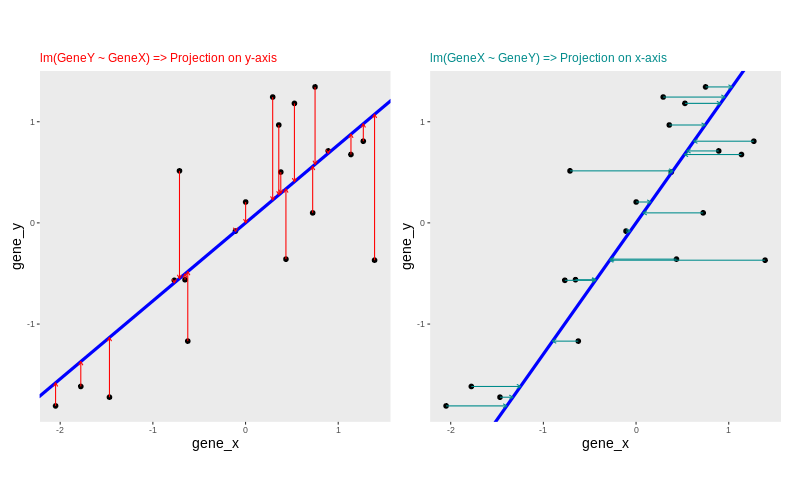
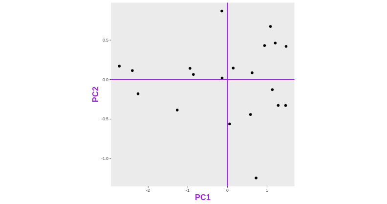
Another option would be to put both genes on equal footing and find the axis that best fits the cloud of points in all directions. This line would be the axis that minimises distances in both directions, minimising the sum of squares of the orthogonal projections.
By definition, this line is also the one that maximises the variance of the projections, and hence the one that captures the maximum of variability. This line is called first principal component (PC1).
The second principal component (PC2) is then chosen to be orthogonal to the first one. In this case, there is only one possibility.
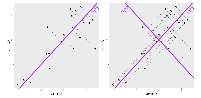
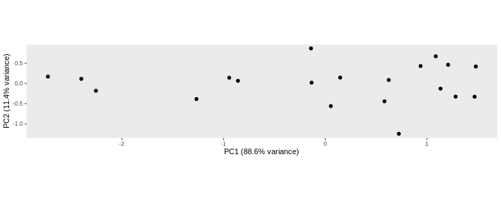
After rotating the plot such that PC1 becomes the horizontal axis, we obtain the PCA plot:
In this example the variance along the PCs are 1.77 and 0.23 respectively. The first one explains 88.6% or that variance, and the second one merely 11.4%.
To account for these differences in variation along the different PCs, it is better to represent a PCA plot as a rectangle, using an aspect ratio that is illustrative of the respective variances.
Starting from a (slightly) higher number of dimensions
Let’s know use another toy dataset, a small table called
tiny_dataset that gives the expression values of 5 genes in
two groups of cells (control and treated cells). Since we have the
expression values of 5 genes (5 dimensions), we cannot represent them on
a single plot.
R
tiny_dataset <- structure(list(
  GeneA = c(30, 30, 31, 30, 30, 31, 30, 29, 30, 30),
  GeneB = c(6, 5, 5, 5, 4, 1179, 1050, 803, 1070, 953),
  GeneC = c(75, 79, 75, 76, 77, 983, 1008, 1002, 989, 1013),
  GeneD = c(504, 497, 509, 509, 508, 507, 506, 499, 497, 496),
  GeneE = c(797, 799, 794, 811, 806, 49, 50, 50, 51, 50)),
  class = "data.frame",
  row.names = c("CTL_1", "CTL_2", "CTL_3", "CTL_4", "CTL_5", "Treated_1",
                "Treated_2", "Treated_3", "Treated_4", "Treated_5"))
R
tiny_dataset
OUTPUT
          GeneA GeneB GeneC GeneD GeneE
CTL_1        30     6    75   504   797
CTL_2        30     5    79   497   799
CTL_3        31     5    75   509   794
CTL_4        30     5    76   509   811
CTL_5        30     4    77   508   806
Treated_1    31  1179   983   507    49
Treated_2    30  1050  1008   506    50
Treated_3    29   803  1002   499    50
Treated_4    30  1070   989   497    51
Treated_5    30   953  1013   496    50
This table is not too big, so by quickly inspecting it by eye, we can see that the treatment seems to have a strong impact on the expression of GeneB, GeneC, and GeneE but had little or no effect on genes GeneA and GeneD.
Challenge:
What do you think a PCA based on this small dataset should look like?
Now let’s use the prcomp() function to do a PCA on this
dataset. The output of prcomp is an object of class prcomp.
R
pca <- prcomp(tiny_dataset, center = TRUE, scale = TRUE)
str(pca)
OUTPUT
List of 5
 $ sdev    : num [1:5] 1.8097 1.1269 0.6684 0.0903 0.012
 $ rotation: num [1:5, 1:5] 0.173 -0.524 -0.542 0.329 0.542 ...
  ..- attr(*, "dimnames")=List of 2
  .. ..$ : chr [1:5] "GeneA" "GeneB" "GeneC" "GeneD" ...
  .. ..$ : chr [1:5] "PC1" "PC2" "PC3" "PC4" ...
 $ center  : Named num [1:5] 30.1 508 537.7 503.2 425.7
  ..- attr(*, "names")= chr [1:5] "GeneA" "GeneB" "GeneC" "GeneD" ...
 $ scale   : Named num [1:5] 0.568 538.511 486.328 5.371 396.05
  ..- attr(*, "names")= chr [1:5] "GeneA" "GeneB" "GeneC" "GeneD" ...
 $ x       : num [1:10, 1:5] 1.53 1.1 2.14 1.86 1.79 ...
  ..- attr(*, "dimnames")=List of 2
  .. ..$ : chr [1:10] "CTL_1" "CTL_2" "CTL_3" "CTL_4" ...
  .. ..$ : chr [1:5] "PC1" "PC2" "PC3" "PC4" ...
 - attr(*, "class")= chr "prcomp"
Variance explained by each component
A summary of prcomp output shows that
- PC1 was able to capture about 65 % of the total variability in the data,
- PC2 was able to capture about 25 % of the total variability in the data.
- Together, PC1 and PC2 retained 90.9 % of the total variability in the data
R
summary(pca)
OUTPUT
Importance of components:
                         PC1   PC2     PC3     PC4     PC5
Standard deviation     1.810 1.127 0.66843 0.09027 0.01202
Proportion of Variance 0.655 0.254 0.08936 0.00163 0.00003
Cumulative Proportion  0.655 0.909 0.99834 0.99997 1.00000
PCA’s coordinates
The x element of the prcomp output is a table that gives
the sample coordinates in the new space of components.
R
pca$x
OUTPUT
                PC1        PC2         PC3         PC4          PC5
CTL_1      1.530853  0.5998082  0.03211405 -0.04333816  0.012017799
CTL_2      1.101755  1.3149717  1.03361796 -0.05297607 -0.001282981
CTL_3      2.137962 -1.2491805  0.40292280  0.16960843  0.005643376
CTL_4      1.855819  0.0948888 -0.67982286 -0.04608819 -0.011799781
CTL_5      1.787647  0.1952147 -0.53825215 -0.04048310 -0.004765655
Treated_1 -1.158454 -2.2218446  0.16948928 -0.05140699  0.009137305
Treated_2 -1.424846 -0.7244170 -0.77089802 -0.03889461 -0.011127400
Treated_3 -1.910324  1.4547787 -0.83626777  0.11348866  0.014786818
Treated_4 -1.972497  0.1912046  0.52074789 -0.10252219  0.008786148
Treated_5 -1.947915  0.3445754  0.66634882  0.09261222 -0.021395630
These values can be used to draw the PCA plot
R
as_tibble(pca$x, rownames = "sample") %>%
  mutate(group = sub(pattern = "_.*", x = sample, replacement = '')) %>%
  ggplot(aes(x = PC1, y = PC2, color = group)) +
  geom_point(size = 3) +
  theme(aspect.ratio = .4)
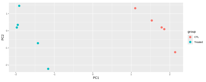
This PCA is a representation in 2 dimensions (PC1 and PC2) of our 5-dimensions dataset.
The new axes (PC1 and PC2) captured 90.9 % of the total variability of the data).
This PCA plot shows that the samples cluster into two distinct groups along PC1. This separation indicates that the “CTL” and “Treated” samples have different overall expression profiles.
The Loadings
Principal components provide a new coordinate system. They are linear combinations of the variables that were originally measured.
PC1 in the previous example is a linear combination of the 5 genes:
\[ PC1 = c_{1}.Gene_{A} + c_{2}.Gene_{B} + c_{3}.Gene_{C} + c_{4}.Gene_{D} + c_{5}.Gene_{E}\]
The coefficients \(c_1\), \(c_2\), \(c_3\), \(c_4\), and \(c_5\), also called loadings, represent the weight of each gene in PC1.
Loadings are stored in the rotation slot of the prcomp
output. Genes with the largest absolute PC1 loadings are the ones that
contribute most to that component (GeneB, GeneC and GeneE in this
case).
R
pca$rotation
OUTPUT
             PC1        PC2         PC3          PC4          PC5
GeneA  0.1727214 -0.7592258  0.61713747  0.113206827 -0.008310904
GeneB -0.5242436 -0.2719533 -0.04021536 -0.805844662 -0.014392984
GeneC -0.5422152 -0.1513032 -0.12128968  0.422355853 -0.700010235
GeneD  0.3286462 -0.5486505 -0.76868178  0.009661531  0.003041904
GeneE  0.5415998  0.1603357  0.10927583 -0.399150076 -0.713932902
Loadings can be visualised on a biplot, where the arrows show the contribution of each gene to the principal components.
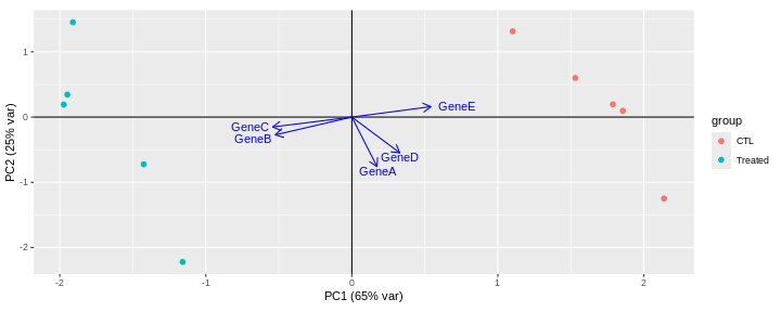
This biplot shows that:
PC1 is mostly driven by GeneB, GeneC and GeneE.
GeneB and GeneC are pointing in the same direction, which means that they are highly correlated. They are in contrast pointing in the opposite direction to GeneE indicating an inverse correlation.
The GeneA arrow is almost perpendicular to GeneB, GeneC and GeneE arrows, indicating that GeneA is not correlated to the 3 other genes.
PC2 is mainly driven by GeneA and GeneD (GeneB, GeneC and GeneE only have a low contibution).
Challenge: Compare the PCA with the original dataset.
Are principal components effectively representing the main patterns and structure of the dataset?
What can PCA reveal from RNA-seq data?
In real RNA-seq datasets, the data usually consists of tens of thousands of dimensions (genes), which are impossible to explore by eye. In this context, PCA is extremely useful, as it summarizes the data into a smaller number of dimensions, making it easier to explore.
What insights can PCA provide for RNA-seq data?
Which samples are similar or distinct to each other?
What are the main sources of variability in the data?
Does the PCA fit to the expectation from the experimental design?
Are there any batch effects or other technical confounders that should be included in linear model?
Are they any outliers which may need to be explored further?
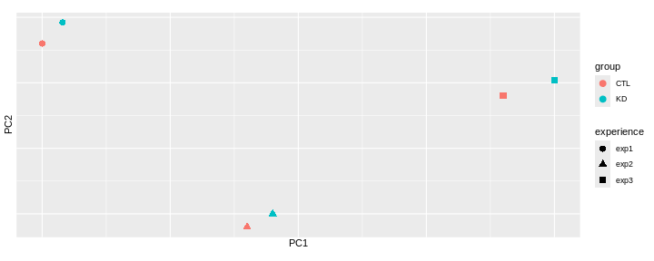
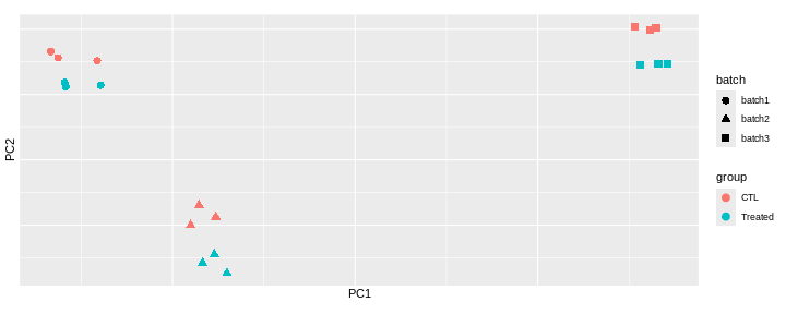
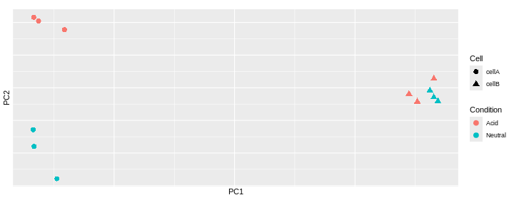
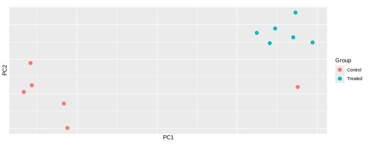
Challenge: Interprete the following PCAs.
Here are a few examples of PCAs corresponding to different experimental designs. How would you interprete them and what impact would they have on the analysis?